Table of Contents
Some links on The Justifiable are affiliate links, meaning we may earn a small commission at no extra cost to you. Read full disclaimer.
Ever wondered what makes a dropshipping website not just look good—but actually convert visitors into buyers?
The best dropshipping websites don’t just showcase products; they build trust, evoke curiosity, and make shopping feel effortless.
In this article, we’ll explore real-world dropshipping website examples that inspire creativity and deliver proven conversion results.
By the end, you’ll know exactly what design elements, features, and strategies make these online stores so effective—and how to apply those lessons to your own brand.
Best Dropshipping Website Designs That Drive Sales
The best dropshipping website designs don’t just look attractive—they strategically guide visitors toward action. I believe great design is less about decoration and more about direction.
When users can easily browse, feel inspired, and trust the brand, conversions follow naturally.
Clean and Minimal Layouts That Boost Conversions
A clutter-free design helps visitors focus on what truly matters: the products. A minimal layout gives breathing space, reduces distractions, and improves site speed—something Google and users both appreciate.
Example in action: Brands like Allbirds and Minimalist use neutral colors, white space, and large, bold product images. Their navigation bars are short and to the point—Shop, About, Contact. No unnecessary fluff.
Quick tip:
- Keep your homepage hero section simple—one image, one call-to-action (CTA).
- Limit main navigation links to 5 or fewer.
- Use consistent fonts and a limited color palette (ideally 2–3 tones).
This approach reduces cognitive overload. People make buying decisions faster when they aren’t overwhelmed.
Strategic Product Photography That Builds Trust
You can’t touch or feel an online product—but great photography bridges that gap. I always say: photos sell the experience, not just the item.
Best practices:
- Use natural lighting and neutral backgrounds.
- Include close-ups showing textures and details.
- Feature lifestyle photos that show products in use.
For example, Beardbrand showcases grooming products in real-life scenarios—guys using them at home, not just on white backgrounds. This builds authenticity and emotional connection, especially vital for first-time visitors.
Smart Navigation Menus That Reduce Bounce Rates
Navigation is your store’s map. If it’s confusing, users give up. I’ve seen dropshipping websites lose sales because of a poor menu structure—too many categories, unclear names, or misplaced links.
Keep it intuitive:
- Use broad categories like Men’s, Women’s, Accessories instead of Product Type A/B/C.
- Add a search bar at the top (use autocomplete to guide results).
- Include breadcrumb trails for easy backtracking.
A simple, well-labeled menu encourages exploration, while a cluttered one kills curiosity.
Responsive and Mobile-First Design Principles
With over 60% of eCommerce traffic coming from mobile devices, a non-responsive site is basically invisible. I always recommend testing mobile first, not as an afterthought.
A mobile-first dropshipping website should have:
- Vertical scrolling with clear CTAs spaced for thumb tapping.
- Images that resize gracefully (test with Google’s Mobile-Friendly Test).
- Fast load times—under 2.5 seconds ideally.
Sites like Gymshark are textbook examples. Their mobile versions load fast, feature tappable product tiles, and minimize text clutter—making checkout almost frictionless.
Inspiring Dropshipping Website Examples by Niche

Different niches demand different emotions and designs. I’ve found that tailoring design tone to audience expectations—color, typography, photography—can drastically increase engagement.
Fashion and Apparel Stores With Visual Storytelling
Fashion is visual storytelling at its core. Successful dropshipping stores like Mott & Bow sell a lifestyle, not just clothing.
They use:
- Full-width videos showing real people moving, not models posing.
- Copy that mirrors customer identity (e.g., “For the relentless” rather than “For athletes”).
- Dynamic lookbooks that pair outfits, helping buyers visualize combinations.
If you’re building a fashion dropshipping website, think mood first, then mechanics.
Home Décor and Lifestyle Brands That Spark Emotion
Home décor is about atmosphere. Stores like Nordic Nest tap into emotional comfort and aspiration.
Their winning traits:
- Earthy, muted color schemes reflecting calmness.
- “Shop the Room” sections that help users see full setups.
- Pop-up quizzes like “Find your interior style” to personalize shopping.
I suggest adding AR previews (augmented reality tools) if possible—letting shoppers visualize how a lamp or table fits in their own space.
Tech and Gadget Stores That Simplify Complex Products
Tech products can intimidate users. The best dropshipping websites simplify complexity through smart layout and plain language.
Examples:
- BlueCrate uses short, fun descriptions (“A light that follows you everywhere!”).
- Product videos replace lengthy text specs.
- Comparison tables highlight key features like battery life or compatibility.
When selling tech, remember: people buy convenience, not circuitry.
Beauty and Wellness Sites That Focus on Authenticity
In beauty, trust is everything. Dropshipping sites that win in this niche—like InspireUplift—do so by embracing transparency and self-care narratives.
Their approach includes:
- Real customer before-and-after photos.
- Ingredient transparency in descriptions.
- Testimonials with first names and short bios for credibility.
I believe showing real humans, not polished models, transforms browsers into believers.
High-Converting Dropshipping Websites and Why They Work
Now let’s break down real-world examples that have nailed both inspiration and conversion.
Gymshark: Building a Lifestyle Around Fitness
Gymshark started small but became an empire by selling identity—fitness, ambition, and community. Their website mirrors this mission through powerful imagery and simple design.
Why it works:
- Dark mode visuals create energy and focus.
- Minimalist CTAs (“Shop Now”) direct users cleanly.
- Influencer integration builds social proof.
Their UX (user experience) makes every step—browse, click, buy—feel like part of a shared fitness journey.
BlueCrate: Personalization That Keeps Customers Engaged
BlueCrate thrives on novelty and humor. Their personalized gift dropshipping model works because every page feels custom-made for the visitor.
Conversion boosters:
- Quirky headlines that make you smile.
- AI-driven recommendations (“You might also love…”).
- Playful color palettes encouraging impulse buys.
I’ve noticed their checkout flow is lightning-fast—no unnecessary steps. That’s key for impulse-based niches.
InspireUplift: Viral Marketing Meets Smart Design
InspireUplift built its empire through social media virality and UX that supports it. The site balances fun with professionalism.
What stands out:
- High-quality product GIFs showing real use.
- User-generated reviews and customer videos.
- Fast checkout integrated with Apple Pay and PayPal.
They know how to turn viral attention into long-term loyalty—something most dropshipping sites miss.
Warmly: Using Social Proof to Drive Emotional Purchases
Warmly focuses on home décor with an emotional touch. Their site feels cozy and trustworthy from the first scroll.
Why it converts:
- Testimonials and real-home photos dominate the homepage.
- “Shop by Mood” navigation makes discovery effortless.
- Smooth checkout experience with one-click payment options.
Warmly shows how empathy-driven design converts better than any sales pitch ever could.
Design Elements Every Successful Dropshipping Website Shares
When I study top-performing dropshipping websites, a few design elements show up again and again.
They’re not flashy tricks—they’re psychological triggers designed to build trust, reduce hesitation, and make buying effortless.
Let’s look at what separates the “good-looking” stores from the “high-converting” ones.
Attention-Grabbing Hero Sections With Clear CTAs
Your hero section—the banner at the top of your homepage—is your store’s first impression. I like to think of it as your five-second elevator pitch.
The most successful dropshipping websites use a single clear message, one visual focus, and a bold CTA (call-to-action).
For example, InspireUplift features a high-quality lifestyle image with a headline like “Products That Make Life Easier” and a button that simply says “Shop Now.”
Here’s what works best:
- A clean, full-width hero image that shows your product in use.
- One action-driven button (e.g., “Shop the Collection” or “Get Yours Today”).
- Consistent brand color for the CTA—contrast it with your background.
If your CTA is buried or unclear, visitors bounce. I recommend using tools like Hotjar to see where users click and whether they notice your hero section.
Easy-to-Scan Product Pages That Simplify Decisions
People don’t read online—they skim. That’s why your product page should make key information instantly visible. I suggest following the “three-glance rule”: within three glances, shoppers should know what the product is, why it’s valuable, and how to buy it.
Best practices include:
- Use bullet lists for product features (simple, not salesy).
- Include short, benefit-focused descriptions.
- Add comparison visuals or icons for clarity (e.g., “Eco-friendly,” “Free Shipping”).
Example: Gymshark uses size guides, fit videos, and short bullet points under every product. The simplicity doesn’t just look neat—it reduces buyer friction.
Seamless Checkout Processes That Reduce Cart Abandonment
Cart abandonment averages around 70%. That’s massive. The problem? Friction during checkout. I’ve seen dropshipping stores lose sales because of too many fields or missing payment options.
A seamless checkout should:
- Offer express pay options like Apple Pay, PayPal, or Google Pay.
- Display a progress bar (e.g., “Step 2 of 3: Shipping”).
- Use auto-fill for addresses and mobile-friendly forms.
I recommend testing your checkout flow monthly. Try buying something yourself—it’s the fastest way to spot user pain points.
Social Proof and Reviews That Build Instant Credibility
When visitors don’t know your brand, they rely on others to validate you. That’s why social proof—testimonials, star ratings, and user photos—is essential.
Good examples include Warmly and BlueCrate, which use real names and customer-uploaded photos next to reviews. This adds authenticity and instantly builds trust.
Quick ways to boost credibility:
- Display a few top reviews directly under product titles.
- Use “verified buyer” tags.
- Add a running counter like “12 people purchased this today.”
From what I’ve seen, authentic reviews can lift conversion rates by over 20%.
Expert Tips to Make Your Dropshipping Website Stand Out

Standing out in dropshipping isn’t about loud colors or gimmicks—it’s about memorability and connection. Here’s what I’ve learned from optimizing multiple store builds.
Use Branded Visuals to Build Recognition
A branded visual style helps people remember you even after they leave your site. That means your color palette, fonts, and imagery style should stay consistent across ads, packaging, and emails.
I suggest:
- Pick one accent color that matches your brand tone (trust = blue, luxury = black, eco = green).
- Use lifestyle imagery with consistent lighting and filters.
- Include your logo watermark subtly in social posts or banners.
Example: Gymshark’s matte-black visuals and muscular silhouettes scream identity. You don’t need to read the logo—you already know it’s them.
Integrate Storytelling Into Product Descriptions
Data is logical, but stories sell emotionally. Instead of listing specs, tell how your product improves life.
Example transformation: Instead of saying “Made of BPA-free material”, write “Stay hydrated safely—our bottle’s BPA-free design means pure water, every time.”
Here’s a simple structure I use for storytelling:
- Problem (what users struggle with).
- Transformation (how your product solves it).
- Result (how life improves after).
When your descriptions sound human, people connect—and conversion follows naturally.
Optimize Loading Speed and User Flow for Retention
A slow site feels untrustworthy. According to Google, 53% of mobile users leave a site that takes more than 3 seconds to load.
To fix this, I recommend:
- Compressing images using TinyPNG.
- Using a fast, lightweight Shopify or WooCommerce theme.
- Minimizing unnecessary plugins and scripts.
Think of user flow as your digital customer journey. Every click should feel intentional and smooth. Test it like a user, not a designer.
Continuously Test Design Variations for Conversion Insights
I’ve seen minor changes—like moving the “Add to Cart” button higher—double conversion rates. The secret? Testing, not guessing.
A/B testing tools like VWO can help you measure what really works. Start small:
- Test one change at a time.
- Run experiments for at least a week.
- Track not just clicks, but completed purchases.
When you iterate based on data, your dropshipping website evolves from “good-looking” to “profit-generating.”
Tools and Platforms to Build a Professional Dropshipping Website
The right tools can transform how efficiently you build, test, and scale your store.
I’ve used most of these personally or with clients, and they cover every key area—from setup to optimization.
Shopify and WooCommerce for Reliable Store Setup
Both platforms are powerful, but the choice depends on your comfort level.
- Shopify is perfect for beginners—it’s hosted, secure, and integrates easily with payment gateways. The UI path is simple: Dashboard → Online Store → Themes → Customize.
- WooCommerce is better for advanced users who want full control. It runs on WordPress, allowing deeper customization and SEO flexibility.
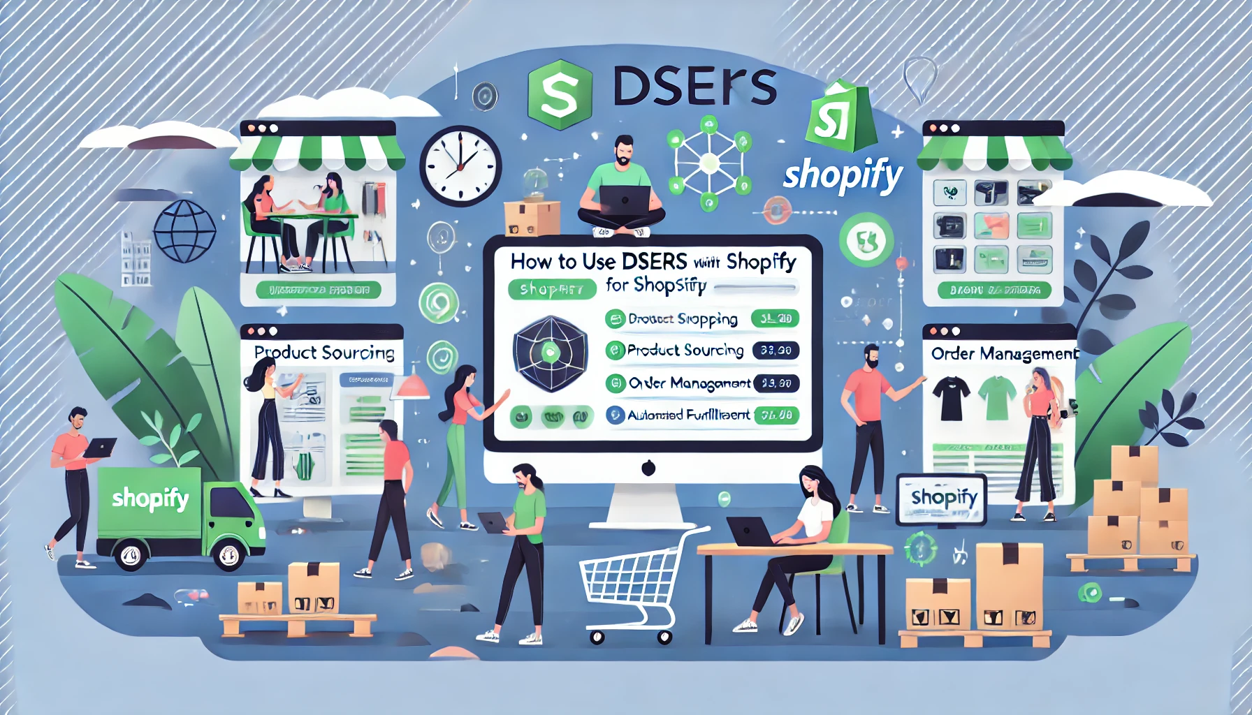
If you’re starting fresh, I recommend Shopify for its speed and plug-and-play dropshipping apps like DSers.
Canva and Figma for On-Brand Visual Design
Visual consistency is what separates an amateur store from a professional brand. Canva helps you quickly create branded banners, ads, and product mockups using drag-and-drop tools.
For advanced design collaboration, Figma lets teams create and preview web layouts interactively. You can design responsive pages and directly share prototypes with developers.
A quick trick: Create one master brand kit in Canva or Figma and reuse the same colors, logo, and typography for every visual asset.
Hotjar and Google Analytics for Behavior Insights
Understanding how users interact with your site is vital for growth.
- Hotjar provides heatmaps and session recordings—showing exactly where people click, scroll, or drop off.
- Google Analytics gives a macro view: user sources, bounce rates, and conversion paths.
I suggest checking your Hotjar heatmaps weekly. You’ll be surprised how often users ignore what you thought was important.
Klaviyo and Privy for Automated Marketing and Retargeting
Automation keeps your brand visible even when you’re asleep.
Klaviyo helps you send personalized emails based on user actions—like abandoned cart reminders or post-purchase thank-yous.
Privy complements it by handling on-site popups, discount offers, and exit-intent messages. Together, they create a seamless retention ecosystem.
An effective combo could be:
- Privy captures emails with a 10% welcome offer.
- Klaviyo sends a follow-up sequence introducing your brand story and top products.
This combination builds relationships beyond the first purchase—something every successful dropshipping website relies on.
Common Design Mistakes to Avoid in Dropshipping Websites
Even the most visually stunning dropshipping website can fail if key design mistakes slip through.
I’ve seen many beginners (and even seasoned sellers) unknowingly sabotage conversions with small, avoidable errors.
Let’s walk through what to avoid—and how to fix them with practical design improvements.
Overloading Pages With Too Many Visuals or Pop-Ups
Visuals are powerful, but too many can hurt performance. When every inch of a webpage competes for attention—sliders, pop-ups, flashing banners—it overwhelms the visitor.
Instead of inspiring them to shop, it pushes them away.
Here’s what usually happens when visuals are overused:
- Slow load times due to large image files.
- Users distracted from the main call-to-action (CTA).
- Visitors closing pop-ups instead of exploring your site.
I suggest following the one-focus-per-page rule. For instance, your homepage should guide visitors toward your main product collection or promotion—not ten different offers.
A clean visual hierarchy helps too:
- Use one primary banner image or hero video.
- Keep promotional pop-ups minimal (one exit-intent offer is enough).
- Compress all images with tools like TinyPNG before uploading.
In short, clarity sells better than clutter.
Ignoring Mobile Optimization and Page Speed
If your dropshipping website isn’t optimized for mobile, you’re already losing sales. Mobile users now make up over 60% of online shoppers, and Google penalizes slow-loading sites in search rankings.
When I review underperforming stores, two patterns always show up:
- Long load times (especially on image-heavy homepages).
- Mobile layouts that break—buttons overlap, text gets cut off, or images misalign.
To fix this quickly:
- Test your site on mobile using Google’s Mobile-Friendly Test.
- Keep file sizes small—under 500 KB for hero images.
- Enable lazy loading (images load only when users scroll).
- Choose a responsive theme like Shopify’s “Dawn” or a lightweight WooCommerce layout.
I always recommend checking how your site feels on a phone, not just how it looks. Try adding a product to your cart—if it feels clunky, so does the user experience.
Using Generic Templates Without Brand Identity
A dropshipping website without personality is forgettable. Using a pre-made Shopify or WordPress template is fine to start—but if you never customize it, your brand disappears in the crowd.
Your visitors should instantly recognize your brand tone, colors, and voice. That’s how trust and loyalty form.
Small changes that make a big difference:
- Replace stock photos with branded images or custom mockups.
- Use a consistent brand color scheme across your logo, CTA buttons, and ads.
- Write microcopy (like “Add to Bag” instead of “Buy Now”) that fits your tone.
For example, Gymshark uses clean, dark visuals to match its bold, athletic identity. In contrast, Warmly uses soft neutrals and cozy imagery for a homely vibe. Both use the same eCommerce structure—but their brand presence is unmistakable.
Skipping Trust Signals Like Reviews and Secure Badges
Trust is the currency of online sales. Yet, many dropshipping websites skip the simplest elements that build it—like verified reviews, trust badges, or clear shipping policies.
When users hesitate, it’s rarely about price—it’s about confidence. If they don’t see proof that others have bought safely before them, they leave.
I suggest adding:
- Product reviews under every item, with photos when possible.
- Security badges like “SSL Secure,” “Money-Back Guarantee,” or “Verified Checkout.”
- Social proof elements—like customer counts or testimonials on the homepage.
A small but effective touch is showing a mini-popup saying, “Sarah from London just purchased this!” It creates gentle urgency and credibility at the same time.
Key Takeaways From Top Dropshipping Website Examples
After studying hundreds of high-performing dropshipping websites, I’ve noticed they all follow a simple pattern: they prioritize user trust, emotional connection, and frictionless design.
Here’s how to translate inspiration into your own strategy.
What Makes a Website Truly “Convert-Ready”
A convert-ready site doesn’t just attract visitors—it guides them naturally toward purchase. It’s a blend of aesthetics, trust signals, and performance.
A few conversion-ready traits I always look for include:
- A strong hero section with one clear CTA.
- Fast, mobile-optimized browsing.
- Minimal distractions on checkout pages.
- Consistent branding across visuals and copy.
In essence, the website should feel effortless to navigate. If you can make someone think “this feels easy,” you’ve already won half the conversion battle.
How to Turn Inspiration Into Actionable Design Choices
Looking at other stores can be inspiring—but copying them blindly won’t work. The goal is to extract principles, not aesthetics.
Here’s my approach:
- Study structure, not colors. Focus on layout logic—how they arrange navigation, CTA buttons, and product sections.
- Analyze engagement triggers. What kind of storytelling, pop-ups, or social proof do they use?
- Adapt, don’t duplicate. Use their ideas as a framework, but inject your brand personality.
For example, if you admire InspireUplift’s fun, colorful tone, find your own voice that evokes similar warmth without copying their phrasing.
Why Consistent Optimization Is the Real Conversion Secret
Even the best website will fail if it stays static. User behavior changes constantly, and what worked last month might not work next. That’s why consistent testing and optimization are non-negotiable.
I always recommend setting a monthly review schedule:
- Use Google Analytics to check bounce and conversion rates.
- Watch Hotjar recordings to see where users drop off.
- Run one A/B test every month (e.g., new CTA color, headline, or layout).
Think of it as digital gardening—you prune, test, and refine to keep growth steady. The most successful dropshipping websites evolve with their users, not against them.
Pro Tip: Build your dropshipping website as if you were the shopper. Walk through every page, click every button, and ask: “Would I trust this site with my money?” That small shift in perspective is the biggest design upgrade you can make—because when your store feels honest, fast, and human, conversion takes care of itself.
I’m Juxhin, the voice behind The Justifiable.
I’ve spent 6+ years building blogs, managing affiliate campaigns, and testing the messy world of online business. Here, I cut the fluff and share the strategies that actually move the needle — so you can build income that’s sustainable, not speculative.

