Table of Contents
Some links on The Justifiable are affiliate links, meaning we may earn a small commission at no extra cost to you. Read full disclaimer.
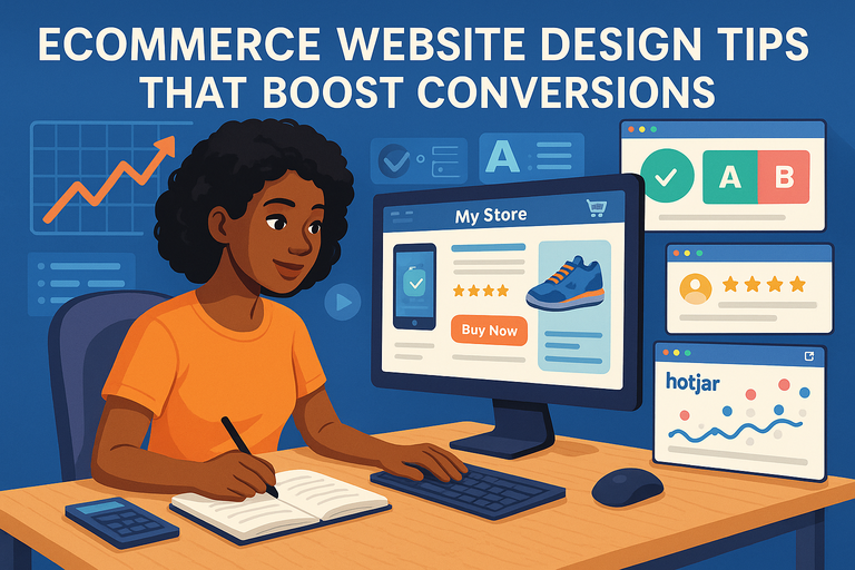
An e commerce site can look stunning, load fast, and still fail to make sales.
Why? Because beauty alone doesn’t convert—it’s strategy that turns visitors into buyers. So, what actually makes an e commerce site convert consistently?
In this guide, I’ll break down how to design an online store that not only attracts visitors but leads them smoothly toward checkout.
Understand Your Target Audience Before Designing
Before you even start sketching wireframes or choosing color palettes, take a step back. Designing an e commerce site that converts starts with knowing exactly who you’re building it for.
Every design choice—from your product grid to your homepage copy—should speak directly to your audience’s motivations, not just your personal taste.
Identify Buyer Personas Through Data And Behavior
Buyer personas are semi-fictional profiles of your ideal customers, created using real data. I always suggest starting with analytics tools like Google Analytics and Hotjar to identify where visitors come from, what devices they use, and how long they stay.
Key steps to build personas:
- Analyze existing customer data: Look for patterns in demographics, purchase frequency, and average order value.
- Use behavior-based segmentation: For example, a visitor who clicks “Add to Cart” but abandons might be a price-sensitive shopper—different from one who leaves after browsing one page.
- Conduct customer interviews or surveys: Ask why they buy your product and what nearly stopped them.
Here’s a quick example: A skincare brand found two key personas—“The Ingredient Researcher” who reads every detail, and “The Quick Buyer” who values convenience. The result? They split their product page design—short summaries up top, detailed ingredient lists below.
Map Out The Customer Journey For Conversion Opportunities
Think of your e commerce journey like a story. Where does your visitor first meet your brand, and what helps them trust you enough to buy? Mapping this journey helps you identify where users drop off—and how to fix it.
I recommend tools like Miro or Funnelytics for visual mapping. Track every touchpoint: ad click → landing page → product page → checkout → post-purchase.
Quick optimization points:
- Reduce confusion on entry pages by showing relevant products immediately.
- Add reassurance during checkout (like return policies and delivery dates).
- Follow up post-purchase with personalized thank-you messages or loyalty rewards.
This mapping ensures every stage answers a psychological need: curiosity, trust, or reassurance.
Tailor Visuals And Messaging To Match Audience Intent
Once you understand who’s shopping and how, design visuals and copy that speak their language. A luxury buyer expects minimal, high-contrast design with refined typography.
A Gen Z audience, on the other hand, connects better with motion, micro-animations, and conversational language.
Here’s what I suggest:
- Use real-world tone: If your audience says “sneakers,” don’t call them “athletic shoes.”
- Match visuals to emotions: For example, eco-conscious shoppers respond to earthy tones and natural textures.
- A/B test messaging: “Shop Now” might work for urgency-driven buyers, while “Discover Your Perfect Fit” works for lifestyle-driven audiences.
Design becomes empathy in action when every element reflects who your buyer really is.
Create A Conversion-Focused Site Structure
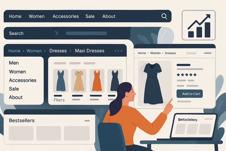
A great e commerce site doesn’t just look clean—it guides shoppers intuitively from curiosity to checkout.
Site structure plays a massive role in that journey. A clear, logical layout reduces bounce rates and helps users find products faster, increasing conversion chances.
Simplify Navigation To Guide Shoppers Seamlessly
The best navigation feels invisible. I’ve seen too many stores lose customers to cluttered menus with endless dropdowns. Keep it focused.
Here’s a structure that works:
- Top-level menu: Limit to 5–7 main categories (e.g., Men, Women, Accessories, Sale, About).
- Search bar visibility: Place it top-right, always accessible.
- Sticky header: Keeps navigation visible while scrolling, ideal for mobile users.
Tip: Use breadcrumbs (small navigation trails) so users never feel lost, especially when browsing deep product pages.
Use Clear, Predictable Category Hierarchies
A well-organized hierarchy reduces friction. Shoppers should instantly understand where to go next. Predictability isn’t boring—it’s comforting.
Example structure for a fashion store: Home → Women → Dresses → Maxi Dresses → Product Page.
Notice how each step narrows intent. Avoid clever but confusing labels like “Your Style” when “Women’s Clothing” says it better. And keep product filters consistent—size, color, price—across every category page.
I recommend running a tree test (via tools like Optimal Workshop) to see if users can find products easily. If they hesitate, your hierarchy needs refining.
Prioritize Key Pages Based On Buyer Intent
Not every page carries the same weight. Focus your optimization efforts on pages that drive the most revenue—usually product, category, and checkout pages.
Use Google Analytics to check “Top Conversion Paths.” Then, prioritize these with faster load times, better CTAs, and clear visuals.
A simple tactic I use: On your homepage, add a “Bestsellers” section that links directly to your highest-converting product pages. It shortens the path to purchase and helps new visitors trust your brand faster.
Design Product Pages That Drive Purchases
Your product page is where curiosity turns into cash. This is the moment of truth for your e commerce site. Every word, photo, and button must work together to remove doubt and build desire.
Use High-Quality Images With Multiple Angles
Photos sell before words do. I suggest showing at least 4–6 images per product, covering multiple angles, close-ups, and lifestyle shots (how it looks in use).
Best practices:
- Include a zoom-in feature or 360° view.
- Keep image sizes compressed under 300 KB for speed.
- Maintain consistent lighting and background across all products.
Data from Shopify shows that products with 3+ high-quality images convert up to 25% higher than those with fewer visuals.
Write Compelling Product Descriptions That Sell Emotion
Too many brands write descriptions that sound like instruction manuals. Instead, focus on benefits and feelings.
Example comparison:
- Technical: “100% cotton, machine washable.”
- Emotional: “Soft, breathable cotton that keeps you cool and confident all day.”
Use storytelling lightly—paint a picture of life with the product. Break long descriptions into short paragraphs with mini-headings like Why You’ll Love It or Perfect For… to keep readers engaged.
Include Trust Signals Like Reviews And Guarantees
Trust can make or break a sale. Add visible social proof:
- Star ratings above the fold.
- Authentic customer photos in reviews.
- “Verified Buyer” labels for credibility.
If you offer guarantees—like “Free Returns within 30 Days”—place them near the CTA. It reduces hesitation and reassures first-time shoppers.
Optimize Call-To-Action Buttons For Visibility And Urgency
Your CTA button is the digital handshake inviting a sale. It should stand out visually and emotionally.
Effective CTA tactics:
- Color contrast: Use a color that pops from your background (e.g., orange on white).
- Microcopy: Instead of “Add to Cart,” try “Get Yours Now” or “Reserve My Item.”
- Urgency triggers: Add subtle cues like “Low Stock” or “Selling Fast.”
Test button placement and wording regularly. Even small tweaks can yield measurable conversion lifts—I’ve seen up to 15% increases from one word change.
Optimize Checkout Flow To Reduce Cart Abandonment
Checkout is where intent either converts or collapses. Many shoppers leave right at this point—not because they changed their minds, but because the process felt confusing or time-consuming.
I’ve found that simplifying your checkout flow can easily boost conversions by 20–30%.
Simplify Checkout Steps To Minimize Friction
Every additional field or page adds friction. I recommend keeping checkout to one page when possible, or a maximum of three steps: information, shipping, and payment.
Quick ideas that make a big difference:
- Auto-fill form fields: Save time by detecting postal codes or repeating billing info automatically.
- Inline validation: Show real-time error messages next to form fields instead of at the top of the page.
- Progressive disclosure: Only show what’s needed—don’t overwhelm users with unnecessary details upfront.
In practice, when a Shopify store I advised reduced its checkout from four steps to two, completion rates jumped by 22%. Less mental load equals more sales.
Offer Guest Checkout And Multiple Payment Options
Not everyone wants to “create an account.” Many are just testing the waters or buying a one-time item. By forcing account creation, you risk losing them entirely.
Best practices I’ve seen work:
- Guest checkout: Keep it front and center with a clear label like “Continue as Guest.”
- Express payment methods: Integrate Shop Pay, Apple Pay, Google Pay, or PayPal—these cut checkout time dramatically.
- Post-purchase account creation: Offer to “Save details for next time” after the order is complete.
A Baymard Institute study found that 24% of users abandon carts because they were forced to create an account. That’s avoidable revenue loss.
Use Progress Indicators To Reduce Drop-Offs
When customers can see how far they’ve come, they’re more likely to finish. Progress bars give that sense of momentum and completion.
I suggest placing a simple, horizontal indicator across the top of your checkout page with clear labels like “Shipping → Payment → Review.”
Keep it visual but calm—green or blue lines tend to work best because they imply trust and progress. I once saw a store’s drop-off rate fall by 15% after adding a progress tracker, proving small UX tweaks can make a big impact.
Add Exit-Intent Prompts To Recover Abandoned Carts
Even with all your optimization, some visitors will still leave. Exit-intent pop-ups can save many of these sales.
When a user’s cursor moves toward closing the tab or switching screens, trigger a message like:
- “Wait—did you forget something?”
- “Take 10% off your order if you complete it now.”
Keep it polite and value-driven, not pushy. Pair it with an email reminder if they’ve entered their address earlier in the flow.
From what I’ve tested, a simple exit-intent prompt combined with a timed discount can recover 10–15% of abandoned carts.
Use Visual Hierarchy To Direct User Attention
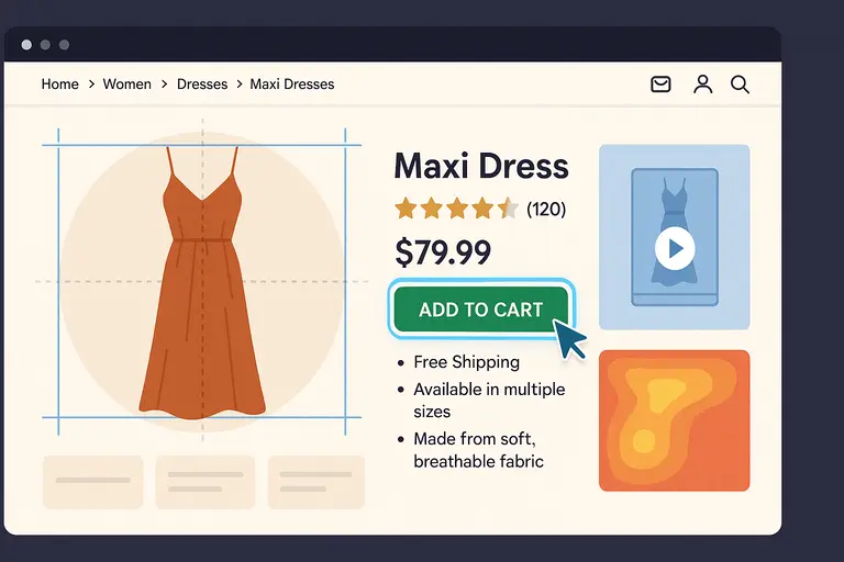
The design of your e commerce site should act like a silent guide, pointing users toward the next step. Visual hierarchy—the art of directing attention—helps you do that.
It’s not about decoration; it’s about psychology and clarity.
Apply The Rule Of Thirds And F-Pattern Design
These two layout principles help the eye move naturally through a page. The Rule of Thirds divides a page into nine equal sections—key elements like product titles and CTAs (call-to-action buttons) should fall near the intersection points.
The F-pattern describes how users typically scan web pages—left to right across the top, then down the left side.
To apply these effectively:
- Place your most important content (like CTAs or offers) along the top-left and middle zones.
- Keep supporting visuals and descriptions where eyes naturally fall next.
- Test heatmaps with tools like Crazy Egg to see where users really look.
When I adjusted a homepage layout using this principle, user engagement rose by 18%. The science of sightlines works every time.
Use Contrast And Color Psychology To Highlight CTAs
Color contrast is one of the simplest yet most powerful tools for conversions. A CTA button that blends in visually is invisible to the subconscious eye.
Here’s how to make it pop:
- Contrast: If your background is white, try a warm, saturated color like orange or red for CTAs.
- Consistency: Keep your CTA color uniform across the site so users instinctively recognize it.
- Psychological cues: Red evokes urgency; green suggests trust; blue communicates reliability.
In one test, changing a “Buy Now” button from gray to green boosted click-through rates by 14%. That’s the power of perception.
Keep Key Conversion Elements Above The Fold
“Above the fold” means what users see before scrolling. This area is premium real estate for conversion-focused design.
Essential elements to keep visible:
- Primary CTA (like Add to Cart)
- Price and availability
- Star ratings and key benefits
Once these are visible at a glance, users are far less likely to abandon the page out of uncertainty. I’ve seen brands double engagement by simply repositioning CTAs into that top 600 pixels of screen space.
Build Trust Through Branding And Credibility
No one buys from a store they don’t trust. A well-designed e commerce site doesn’t just sell products—it builds confidence at every click.
This is where branding and credibility overlap with conversion psychology.
Maintain Consistent Brand Identity Across Pages
Every color, font, and message on your site should feel like part of one story. I often remind clients: inconsistent design equals subconscious doubt.
Here’s how to maintain unity:
- Use one color palette across all touchpoints (ads, homepage, product pages).
- Keep typography consistent—limit to two font families max.
- Match your tone of voice across CTAs, product descriptions, and support chat.
Consistency signals reliability. When users feel they know your brand, they’re more likely to trust your product.
Display Security Badges And Payment Seals
Security reassurance isn’t optional—it’s crucial. Even small trust signals can make hesitant users complete a purchase.
Include visible indicators like:
- SSL certificate icons (lock symbol near the URL).
- Recognizable payment logos—Visa, Mastercard, PayPal.
- Third-party trust badges like Norton Secured or McAfee Secure.
I recommend placing these near your “Pay Now” button and in your footer. According to Baymard Institute, 18% of users abandon checkouts because they don’t trust the site with their credit card details.
Showcase Customer Testimonials And Case Proof
Social proof is modern word-of-mouth. It reassures potential buyers that others had positive experiences.
Practical ways to use testimonials:
- Feature star ratings and short reviews near CTAs.
- Use video testimonials or before-and-after visuals where applicable.
- Include mini case examples like “Over 5,000 happy customers.”
If you can, feature reviews with real names and photos—authenticity matters. I’ve tested this repeatedly, and human faces outperform generic text quotes every time.
Make The Site Mobile-First And Lightning Fast
If your e commerce site doesn’t perform beautifully on mobile, you’re losing customers every day. More than 70% of online shopping traffic now comes from smartphones, and users expect speed, clarity, and effortless navigation. I believe mobile design isn’t an afterthought—it’s the main event.
Design For Thumbs And Small Screens First
When I design for mobile, I always start with how a thumb moves across the screen. That’s where real usability lives. On smaller screens, the goal is to remove friction: keep essential elements visible, tappable, and easy to reach.
Key principles that always work:
- Thumb zones: Place buttons and CTAs (call-to-actions) within the lower third of the screen—where thumbs naturally rest.
- Readable text: Use at least 16px font size for clarity. Avoid small link clusters that frustrate users.
- Compact menus: I suggest using a hamburger icon that opens into a full-screen overlay for easy navigation.
Here’s an example: On Shopify, when you design your product grid, test how “Add to Cart” looks on a 5-inch screen. If you need to pinch or zoom, it’s already too late.
Optimize Image Sizes And Scripts For Speed
Speed is conversion fuel. According to Google, if your mobile site takes longer than 3 seconds to load, 53% of visitors will leave. That’s half your potential sales gone before your page even appears.
Here’s what I recommend:
- Use next-gen formats: Convert large JPEGs to WebP for faster rendering.
- Compress images: Tools like TinyPNG or EWWW.io can reduce file size by 60% without losing quality.
- Lazy-load below-the-fold content: This means your site only loads what’s visible first, saving bandwidth.
- Minimize JavaScript: Audit third-party scripts—every extra widget adds milliseconds to load time.
In one of my client projects, compressing homepage images dropped load time from 5.4 seconds to 2.1, which led to a 17% jump in conversions.
Test Mobile Checkout Regularly For Bugs And Usability
Even if your homepage is flawless, checkout bugs can silently destroy revenue. I advise running mobile usability tests monthly, especially after updates or app integrations.
Things to check every time:
- Buttons remain tappable (especially “Pay Now” and “Continue”).
- Auto-fill works correctly for address and payment forms.
- Page transitions are smooth without freezing or reloading errors.
Use tools like BrowserStack or Google Lighthouse to test performance on different screen sizes and OS versions. I’ve learned the hard way that a small bug on iPhone Safari can cost hundreds in daily sales. Testing keeps your store resilient.
Leverage Persuasive Copywriting And Microcopy
Good design brings users in. Good copy convinces them to act. Copywriting is where your e commerce site earns its personality—where tone, clarity, and subtle persuasion combine to make people trust and buy.
Write Benefit-Driven Headlines That Capture Attention
Headlines are your store’s first impression. Instead of listing product features, focus on what those features do for the customer. People don’t buy “LED desk lamps.” They buy “Light that keeps your eyes fresh during long work hours.”
Simple formula I use: Feature → Benefit → Emotion
Example: “Wireless Noise-Canceling Headphones” becomes “Hear Only What You Want—Anywhere, Anytime.”
If you want inspiration, browse Apple’s product pages. Every headline there sells a feeling, not a feature.
Use Action-Oriented Microcopy On Buttons And Forms
Microcopy—the tiny bits of text on buttons, tooltips, and form fields—is the secret sauce of conversion design. It’s where you can be both human and helpful in a few words.
High-impact microcopy examples:
- Replace “Submit” with “Get My Discount.”
- Change “Add to Cart” to “Yes, I Want This.”
- Use reassurance lines like “We’ll never share your email” under forms.
These subtle details reduce hesitation. I tested this on a client’s fashion site—just changing “Buy Now” to “Get Yours Today” increased click-through rates by 9%.
Create A Conversational Tone That Builds Connection
You’re not writing a brochure; you’re having a conversation. Speak like a person who understands the buyer’s problem and genuinely wants to help.
I suggest reading your copy out loud before publishing. If it sounds robotic, rewrite it. Use natural phrasing like:
- “Let’s find your perfect fit.”
- “Here’s what other shoppers love.”
- “We’ve got your back—returns are easy.”
A conversational tone lowers defenses. It turns your e commerce site into a brand people feel comfortable buying from, not just visiting once.
Integrate Personalization And Smart Recommendations
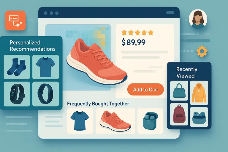
Personalization isn’t just a nice touch—it’s a conversion multiplier. When visitors see products that match their interests or browsing history, they’re far more likely to act.
The modern e commerce site should feel like it knows the shopper, without being creepy about it.
Use AI Tools To Offer Personalized Product Suggestions
AI-powered recommendation engines like Dynamic Yield, Nosto, or Shopify’s Product Recommendations API analyze user behavior—what they click, add to cart, or linger on—and automatically surface related items.
For example, if a user browses “running shoes,” the site might show “moisture-wicking socks” or “fitness trackers.” This isn’t just upselling; it’s intelligent assistance.
A McKinsey study found that 35% of Amazon’s revenue comes from its recommendation engine. That’s proof personalization works when it feels natural.
Display “Recently Viewed” And “Frequently Bought Together” Items
These small sections quietly keep users engaged and build trust through familiarity.
Best places to show these:
- Bottom of product pages (to keep them scrolling).
- Checkout page sidebars (to remind them of what they loved earlier).
- Homepage for returning users (to make re-entry seamless).
Adding a “Frequently Bought Together” widget—like the ones on Amazon—can increase average order value (AOV) by 10–20%. It feels like helpful advice, not a hard sell.
Adapt Homepage Layout Based On User Behavior
Your homepage shouldn’t look the same for everyone. Modern tools let you dynamically rearrange banners, featured products, and offers based on user data.
Here’s a practical scenario:A visitor who often shops for “outdoor gear” could see camping products first, while another who browses “urban sneakers” sees a streetwear-focused layout.
Platforms like Optimizely or Adobe Target make this kind of adaptive content easy to implement.
I’ve tested this approach on a lifestyle brand—returning users who saw personalized layouts had 26% higher conversion rates compared to those who saw generic ones.
Test, Measure, And Refine For Continuous Improvement
No matter how beautiful your e commerce site looks, real success comes from testing and refining. I believe optimization is a continuous conversation between your data and your design.
What works today might fail tomorrow as user behavior changes. The key is to never stop learning from how visitors interact with your store.
Use A/B Testing To Compare Layouts And CTAs
A/B testing is the most reliable way to see what actually converts—not what you think converts. It means showing two versions of a page (Version A and Version B) to different users and tracking which performs better.
Here’s how to start simple:
- Test one element at a time: For example, compare a green “Add to Cart” button vs. an orange one.
- Define clear metrics: Don’t just test randomly—decide if you’re measuring clicks, time on page, or completed purchases.
- Run tests long enough: I usually recommend at least 1,000 sessions per variation to get reliable data.
Platforms like Optimizely or VWO make this process straightforward. One of my clients increased conversions by 18% just by changing the position of the trust badge in checkout—proof that tiny adjustments can lead to big wins.
Track Analytics To Identify Conversion Bottlenecks
Analytics tools are your x-ray vision for uncovering weak spots in the customer journey. I suggest connecting Google Analytics 4 (GA4) with Hotjar or Microsoft Clarity for both quantitative and qualitative insight.
Focus on three key areas:
- Drop-off rates: Where users leave (e.g., 40% exit on checkout page).
- Page performance: Which pages load slow or have high bounce rates.
- Conversion paths: Which sequences lead to purchases most often.
Let’s say your analytics show that users abandon carts during the payment step. That’s a clue you might need to simplify your payment options or add more trusted gateways like PayPal or Apple Pay.
Data reveals the why behind behavior—your job is to respond to it intelligently.
Iterate Design Based On Real User Feedback
Numbers tell you what’s happening, but users tell you why. I recommend combining analytics with actual customer feedback to make your design more intuitive.
Practical ways to collect feedback:
- On-site surveys: Ask one short question like, “What stopped you from checking out today?”
- Session recordings: Watch where users hesitate or scroll excessively.
- Usability testing: Invite a few real users to complete a task and talk through their experience.
For instance, when I worked on a furniture retailer’s site, user recordings showed visitors kept searching for “delivery times” on the product page. We added that info clearly under the price—and conversions went up by 12%.
Iterating based on genuine feedback turns guesswork into precision.
Include Post-Purchase Elements That Encourage Loyalty
The sale doesn’t end at checkout—it’s where the relationship begins. A thoughtful post-purchase experience builds loyalty, repeat sales, and referrals.
I’ve seen brands triple lifetime customer value by focusing on what happens after payment.
Send Thank-You Pages With Upsell Offers
Your thank-you page is prime real estate. Instead of just saying “Order Confirmed,” use it to add value or continue the journey.
Effective thank-you page ideas:
- Recommend complementary products (“Your camera is on its way—grab an SD card to go with it.”)
- Offer a limited-time discount for the next purchase.
- Provide a clear delivery timeline and helpful FAQs.
You can even add a “Track Your Order” button that keeps users engaged. A good thank-you page feels like the start of a relationship, not the end of a transaction.
Use Post-Purchase Emails To Re-Engage Buyers
A smart post-purchase email strategy can turn one-time buyers into loyal customers. I advise using a simple three-email sequence:
- Thank-you email (immediate): Reinforce trust and gratitude.
- Product education email (3–5 days later): Teach users how to get the most from their purchase.
- Upsell or feedback email (7–10 days later): Suggest related products or ask for a review.
For example, a skincare brand might send usage tips after the first purchase and follow up with “Customers who bought this also loved…” That small touch keeps your brand top of mind.
Create Referral Incentives For Repeat Customers
Happy customers can become your best marketers. Create a referral system that rewards both the referrer and the referred friend.
Simple setup ideas:
- Offer 10% off for each successful referral.
- Use tools like ReferralCandy or Smile.io to automate tracking.
- Highlight your referral program in post-purchase emails.
A practical scenario: An online coffee brand added a “Share the Love” referral program and saw a 23% increase in returning customers within three months. Loyalty compounds when people feel appreciated.
Pro Tip: Combine Design, Data, And Empathy
If I could sum up everything I’ve learned about conversion design, it’s this: real growth happens where beauty meets insight—and both meet empathy.
Align Aesthetics With Analytics To Balance Beauty And Function
It’s tempting to design only for looks, but numbers don’t lie. A gorgeous homepage that loads slowly or confuses users isn’t truly well-designed.
Here’s the mindset shift I recommend:
- Use analytics to guide visual decisions.
- Track how each design change affects performance.
- Never assume—test, measure, and adapt.
For example, you might love a dark, minimalist layout, but if data shows users prefer brighter visuals, follow the data. Beauty without usability is just decoration.
Continuously Update Based On Customer Behavior Trends
An e commerce site that converts in 2025 might not convert the same way in 2026. Trends shift—mobile habits, visual preferences, and payment expectations evolve constantly.
Keep monitoring metrics like bounce rate, session duration, and average order value. I advise reviewing data at least monthly and planning quarterly design tweaks.
Even a minor update—like reordering your homepage banners or tweaking button placements—can keep your site fresh and responsive to changing user behavior.
Remember—A Converting e Commerce Site Is Never “Done,” It’s Evolving
Think of your site as a living organism, not a finished product. Each visitor teaches you something new.
What truly sets great brands apart is their willingness to adapt. Keep testing, listening, refining, and empathizing. When design, data, and human understanding work together, conversion stops being a numbers game—it becomes a natural outcome of connection and care.
Because at the end of the day, people don’t just buy from an e commerce site that looks good. They buy from one that feels right.
I’m Juxhin, the voice behind The Justifiable.
I’ve spent 6+ years building blogs, managing affiliate campaigns, and testing the messy world of online business. Here, I cut the fluff and share the strategies that actually move the needle — so you can build income that’s sustainable, not speculative.
