Table of Contents
Some links on The Justifiable are affiliate links, meaning we may earn a small commission at no extra cost to you. Read full disclaimer.
What makes a company logo unforgettable? How do you design one that actually stands out without looking like every other brand in your industry? And is it possible to create something that looks professional—even if you’re not a designer?
If you’ve been asking these questions, you’re not alone. Your company logo plays a huge role in how people perceive your business. It’s often the first thing they see and remember, so getting it right is more than just a creative task—it’s a smart business move.
In this guide, we’ll walk through what makes a logo effective, how to design one that reflects your brand, and the biggest mistakes to avoid. Whether you’re starting from scratch or looking to refresh your current logo, you’ll find practical tips to help you create something that feels both unique and professional.
Why Your Company Logo Matters More Than You Think
A company logo isn’t just a symbol—it’s often the first thing people notice about your brand. It communicates who you are, what you do, and whether you’re worth remembering.
A Logo Sets the Tone for Your Brand Identity
Your company logo shapes how people see you before they read a single word about your business. A great logo captures your personality, values, and professionalism in one glance. Whether it’s playful, elegant, modern, or traditional, your logo helps customers instantly decide if your brand is a fit for them.
Think about Nike’s swoosh or Apple’s bitten apple—simple, memorable, and packed with meaning. A strong company logo builds trust. It makes your business feel legitimate, established, and easy to recognize. And in crowded industries, that recognition can make all the difference.
Consistency Builds Credibility
When your logo appears consistently on everything from your website to packaging, it reinforces your brand in people’s minds. This kind of repetition breeds familiarity—and familiarity builds trust. A scattered or inconsistent logo sends mixed messages and can make even the best businesses look unprofessional.
A clear, well-designed company logo ties your branding together. It aligns your website, marketing materials, social profiles, and even invoices into one coherent visual story.
What Makes a Company Logo Effective?

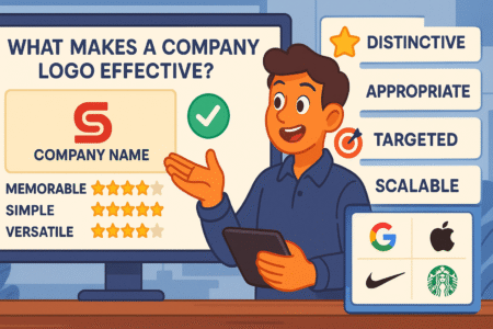
There’s no one-size-fits-all answer, but there are core elements that make any logo work. A strong company logo is simple, scalable, relevant, and timeless.
Simplicity Is Powerful
Logos need to work on everything—from billboards to Instagram icons. That’s why simplicity is so crucial. Overly complex logos are hard to remember and harder to scale. Simple logos, on the other hand, are easy to recognize and incredibly flexible.
You don’t need fancy gradients or complicated patterns. Clean lines, balanced shapes, and clever use of space often outperform designs that try to do too much.
Make It Relevant
Your logo should reflect your industry and your personality. A law firm might use a classic serif font and muted color palette to signal professionalism and trust. A children’s toy company, meanwhile, could use bright colors and playful fonts to capture imagination.
It’s not just about looking good—it’s about looking right for your audience.
Timelessness Over Trends
It’s tempting to chase trends, but what’s hot today may look dated in just a few years. The best company logos stand the test of time. Avoid visual gimmicks or “of-the-moment” styles. Instead, aim for something clean, enduring, and built around your core values.
How to Start Designing Your Company Logo
The process of designing your company logo should be thoughtful and intentional. Let me break it down into a few clear steps to help you get started.
Step 1: Understand Your Brand
Before sketching anything, you need to clarify what your brand stands for.
- What are your core values?
- Who’s your target audience?
- What feeling do you want people to have when they see your logo?
This kind of self-discovery shapes every design decision that follows. If your business is all about innovation, for example, your logo might use dynamic shapes and modern fonts. If you’re rooted in heritage, something more classic and grounded might make sense.
Step 2: Look at the Competition
Research logos from others in your industry. What patterns do you notice? What stands out or falls flat? You’re not trying to copy anyone—you’re trying to understand what works and spot gaps where you can stand out.
This step is especially helpful for identifying clichés to avoid. If every plumbing company in your area uses a pipe wrench in their logo, maybe there’s room for something more unique.
Step 3: Choose a Design Style
Your style choice will guide everything from colors to font selection. Some popular logo styles include:
- Wordmark (just the company name, like Google)
- Lettermark (initials, like IBM)
- Pictorial mark (symbol/icon, like Twitter’s bird)
- Combination mark (text + symbol, like Adidas)
- Emblem (text inside a shape, like Harley-Davidson)
Each has strengths and trade-offs. Wordmarks are simple and clear, while combination marks offer flexibility across platforms.
Elements That Make or Break a Company Logo
Designing a logo isn’t just about looks—it’s about how everything works together. From color to typography, every detail influences how your brand is perceived.
Color Psychology Is Key
Colors evoke emotion. They influence perception and can even affect purchasing decisions.
Here’s a quick breakdown:
- Blue: Trust, security, professionalism (used often in finance and tech)
- Red: Energy, urgency, excitement (great for food, entertainment)
- Green: Growth, nature, wellness (used by eco-friendly brands)
- Black: Luxury, sophistication, power (popular in fashion)
Pick colors that align with your brand personality—and stick with a limited palette to keep things clean and recognizable.
Typography Tells a Story
Fonts do more than spell your name—they communicate tone. A bold, geometric font might suggest strength or innovation. A flowing script could convey elegance or creativity.
Avoid overly trendy fonts or hard-to-read styles. Stick with one or two complementary fonts max, and make sure they’re legible in all sizes.
Shape and Symbolism
Shapes can communicate mood and intent, even subconsciously. Circles suggest unity and community. Squares feel stable and structured. Triangles bring energy and movement.
If you use symbols in your logo, make sure they’re meaningful and not just decorative. A great symbol adds depth and memorability.
Tools and Services to Design a Logo You’ll Love
You don’t need to be a designer to create a professional-looking company logo. There are excellent tools and services to help bring your vision to life—whether you’re doing it yourself or working with a pro.
DIY Logo Design Tools
If you’re just starting out or working with a small budget, try one of these user-friendly platforms:
- Canva: Offers drag-and-drop templates and customization. Ideal for beginners.
- Looka: Uses AI to generate logo concepts based on your preferences.
- Hatchful by Shopify: Great for ecommerce entrepreneurs looking for fast, clean designs.
- LogoMakr: Gives you more control for fine-tuning your own designs.
These platforms help you visualize your ideas quickly, but be careful not to rely too heavily on templates. You want a logo that feels original—not one a dozen other businesses are also using.
Hiring a Designer or Agency
If you’re after something truly custom and high-quality, consider working with a freelancer or creative agency. Platforms like:
- 99designs: Connects you with designers through contests or one-on-one projects.
- Fiverr: Budget-friendly option with thousands of logo designers to choose from.
- Upwork: Great for hiring long-term freelancers for ongoing brand work.
This approach takes more investment, but you’ll get expertise, revisions, and a logo tailored specifically to your business.
Common Logo Mistakes to Avoid

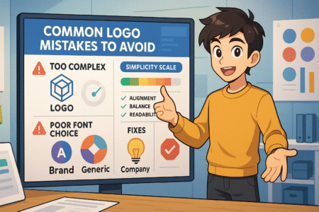
Designing a logo might seem simple at first—but it’s surprisingly easy to miss the mark. A few common mistakes can make your company logo look amateur or confusing, even if your business is top-notch.
Trying to Cram in Too Many Ideas
One of the biggest pitfalls is trying to say everything through your logo. Maybe you want to show what you sell, who you are, and your brand story—all at once. The result? A cluttered, hard-to-read design that confuses people instead of drawing them in.
The best logos are focused and clean. Think of Apple’s logo—it doesn’t show phones or laptops. It just shows Apple. It’s memorable because it’s simple. If you find yourself layering icons, adding extra symbols, or squeezing in multiple fonts, it’s time to step back.
Ask yourself: What’s the one emotion or idea I want people to remember?
Using Too Many Fonts or Colors
Too much variety makes a logo look messy and unprofessional. Mixing several fonts or using a rainbow of colors may feel creative in the moment, but it often ends up distracting instead of enhancing.
A solid rule of thumb:
- Stick with one or two fonts (that pair well together).
- Limit your color palette to two or three max—and make sure they work well in black and white too.
Simple choices can feel much more polished.
Copying Other Logos
It’s tempting to take “inspiration” from a competitor’s logo that looks great. But copying—even unintentionally—can make your brand forgettable or even get you into legal trouble.
Worse, it confuses your audience. If two logos look nearly identical, how will customers remember which one belongs to you?
Create something original that reflects your story and values. It’s okay to be inspired, but always aim to put your own twist on the concept.
Ignoring How It Looks in Different Sizes
Logos need to work on everything from giant signs to tiny app icons. If your design only looks good in one size—or loses detail when it shrinks—it’s going to cause problems.
Thin lines, tiny text, or intricate graphics often don’t hold up when scaled down. On the flip side, bold shapes and simple icons tend to be more adaptable.
Always test your logo at small sizes. Ask yourself: Can I still recognize it when it’s just 50 pixels wide?
Skipping the Versatility Test
Your logo won’t always live on a clean, white background. It needs to work on different surfaces, in different formats, and across a variety of media.
Here’s what to test:
- Does it still work in black and white?
- How does it look on dark backgrounds?
- Can it be printed on fabric, stickers, or merchandise?
- Is there a vertical and horizontal version?
The more flexible your logo is, the more valuable it becomes as a branding tool.
Choosing Style Over Substance
Trendy effects like 3D shading, drop shadows, or gradient explosions might look cool right now—but they don’t always age well. If your logo is tied too closely to what’s hot today, it may feel outdated within a year or two.
Focus on clarity and longevity instead. Simple, well-executed logos stand the test of time and require fewer updates as design trends shift.
Quick Tip: Before finalizing your logo, step away from it for a day or two—then look at it with fresh eyes. Ask a few people outside your industry what they think it says about your business. Their first impressions will tell you more than hours of tweaking ever will.
Avoiding these common mistakes can help you create a company logo that’s not just nice to look at—but one that truly works.
How to Protect and Use Your Company Logo Properly
Once your logo is ready, it’s time to think about where and how to use it—and how to protect it from misuse.
Register Your Logo for Trademark Protection
If you want to protect your logo legally, you’ll need to register it as a trademark. This gives you exclusive rights to use the design in your industry and prevents competitors from copying it.
You can file for a trademark through:
- USPTO (for businesses in the U.S.)
- EUIPO (for European Union countries)
- WIPO (for international protection)
It’s worth consulting with a trademark attorney to ensure you’re fully covered.
Create a Brand Style Guide
To keep your brand consistent, document how your logo should be used. Include:
- Logo size and spacing rules
- Approved color versions
- Placement guidelines
- Font and background rules
This makes it easier for anyone (employees, designers, partners) to use your logo correctly across platforms.
Where to Use Your Logo to Build Brand Recognition
Now it’s time to let your logo work its magic. Use it consistently across every customer touchpoint to reinforce your brand.
Must-Have Placements
- Website header and favicon
- Business cards and email signatures
- Social media profiles and cover images
- Product packaging and labels
- Invoices, proposals, and company documents
- Signage, uniforms, and promotional items
Consistency is what transforms your logo from a visual mark into a recognizable brand asset.
Key Takeaways to Remember
- Your company logo is the face of your brand. Make it memorable and meaningful.
- Keep it simple, scalable, and timeless to maximize impact.
- Choose design tools or professionals based on your needs and budget.
- Avoid trends, clutter, and inconsistency to build a strong visual identity.
- Protect your logo with trademarks and use it consistently to grow brand trust.
Pro tip: Before locking in your logo, get feedback from real customers or peers. What you see might be different from how others perceive it—and those fresh eyes can help you avoid major blind spots.
If you’re building a brand that lasts, investing in a thoughtful company logo is a smart place to start. It’s not just design—it’s the foundation of how the world sees you.
I’m Juxhin, the voice behind The Justifiable.
I’ve spent 6+ years building blogs, managing affiliate campaigns, and testing the messy world of online business. Here, I cut the fluff and share the strategies that actually move the needle — so you can build income that’s sustainable, not speculative.


