Table of Contents
Some links on The Justifiable are affiliate links, meaning we may earn a small commission at no extra cost to you. Read full disclaimer.
Want to create a marketing email that doesn’t just get opened—but actually gets read, clicked, and remembered?
If you’ve ever stared at your screen wondering why your email campaigns fall flat, you’re not alone. How do you write subject lines that actually work? What makes someone scroll instead of deleting? And how can you get more people to click without sounding pushy or desperate?
When you create a marketing email that truly connects, it doesn’t feel like marketing—it feels like a conversation. In this guide, you’ll learn exactly how to craft emails your audience can’t ignore, from the first word to the final click. Let’s break it down together.
Understand What Makes Emails Impossible To Ignore
Before you create a marketing email that actually lands, it’s crucial to understand what separates inbox gold from digital clutter. Readers don’t care how clever your copy is if it doesn’t feel relevant, useful, or trustworthy.
Know Your Audience’s Desires And Pain Points
If your email speaks directly to what your reader is going through, it’s already done half the job. The best marketing emails feel like they were written just for one person—and that only happens when you deeply understand your audience.
Start by mapping out your ideal reader:
- What are they struggling with right now?
- What do they hope to achieve this week, month, or year?
- What would genuinely make their day easier, more productive, or more exciting?
Use tools like Google Forms or short in-email polls to collect direct feedback. In my experience, the most revealing answers come from open-ended questions like “What’s the biggest challenge you face with [topic] right now?”
Then take what you learn and bake it into your subject lines, opening sentences, and calls-to-action. This insight builds the kind of emotional connection that gets emails opened—and read.
Use Data To Tailor Your Messaging Effectively
Let me break this down simply: guessing leads to generic, and generic gets ignored.
Instead, look at your analytics:
- Which email topics earn the most clicks?
- What times do your readers open emails?
- How many scroll all the way to the bottom?
Use tools like Aweber, ConvertKit, or ActiveCampaign to track these metrics. But don’t stop there—use that data to adjust your tone, timing, and even email length. If shorter emails get better results, trim the fluff. If certain phrases tank open rates, stop using them.
Tailoring doesn’t have to mean complicated segmentation. Even small tweaks based on clear behavior can make your emails more relevant and harder to ignore.
Study Winning Emails In Your Industry For Patterns
You don’t need to reinvent the wheel—just understand why it rolls. Sign up for email lists from competitors, influencers, or adjacent industries and keep a swipe file of what stands out.
Look at:
- How their subject lines are structured
- What emotional triggers they lean into
- How they use formatting, storytelling, and timing
I recommend tools like Really Good Emails for examples across niches. Over time, you’ll start to spot patterns—like how some brands always use a three-word opener, or how urgency appears in the second line of the preview text.
Apply what feels natural for your brand, but study these emails like you’re reverse-engineering a winning formula.
Avoid Common Traits Of Forgettable Emails
The inbox is crowded. And too many emails end up ignored because they:
- Start with vague intros that don’t connect
- Try to say too much in one email
- Focus on what the sender wants, not what the reader needs
- Use long paragraphs with no clear flow or direction
Forgettable emails are often over-designed or under-focused. They look nice but say nothing—or they try to say everything and end up doing neither. The goal is clarity, not cleverness.
If your email doesn’t hook someone in the first 3 seconds, it’s over. Every word should serve a purpose, and every purpose should serve the reader.
Nail The Subject Line With Proven Psychological Triggers
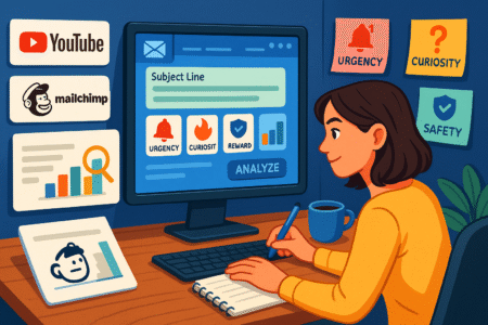
Your subject line is your first—and sometimes only—shot. It doesn’t matter how valuable the content is if the subject line never gets clicked. Learning how to create a marketing email that gets opened starts right here.
Use Curiosity, Urgency, Or Specificity—Not All At Once
The best subject lines tap into one psychological lever at a time. Here’s why:
- Curiosity makes readers want to resolve tension: “You missed this one simple trick…”
- Urgency pushes action with time pressure: “Closes at midnight. Don’t miss out.”
- Specificity signals value and clarity: “Get 3 proven outreach scripts inside.”
Trying to mix all three usually ends up sounding gimmicky. Instead, choose one based on what your reader needs right now—and match it to the tone of your message.
Avoid overused formats like “You won’t believe what happened…” unless it actually delivers. Curiosity only works if the payoff is worth it.
A/B Test Subject Lines For Performance Over Time
Even the best marketers can’t always predict what’ll hit. That’s where testing saves the day.
Here’s how I like to approach A/B testing:
- Test just one variable at a time. Changing too much means you won’t know what caused the difference.
- Use a meaningful sample size. Testing on 100 people won’t give reliable results. Wait for 500+ if possible.
- Look at opens and clicks. A subject line might win opens but still fail if it doesn’t lead to action.
Most email platforms make testing easy. MailerLite and Campaign Monitor let you set up subject line tests in minutes, and you can automate the winner to send to the remaining audience.
Don’t just test once—build a habit of testing often. Over time, you’ll uncover trends unique to your readers that no general “best practices” list could predict.
Avoid Spam Triggers That Kill Open Rates
Even if your subject line is brilliant, it won’t matter if it never reaches the inbox. Spam filters are ruthless—and they’re trained to flag:
- Excessive punctuation (!!! or ???)
- ALL CAPS SUBJECT LINES
- Words like “free,” “urgent,” “guarantee,” or “act now” (especially in combination)
- Hidden links or sketchy domains
Use tools like MailGenius or Postmark to scan your email before sending. And always test your email by sending it to your own Gmail or Outlook account first. If it lands in spam, something needs fixing.
Subject lines are the most underestimated part of email marketing. But if you get them right, everything else becomes easier. Treat them like headlines on the front page—they’re not optional. They’re the gateway.
Hook Readers Instantly With A Magnetic Opening Line
After the subject line gets the click, your first sentence has to earn the scroll. To create a marketing email that truly holds attention, you need an opening line that feels personal, relevant, and instantly valuable.
Speak Directly To The Reader’s Current State Or Challenge
One of the most powerful ways to start your email is to speak to something the reader is already feeling or thinking. When they read the first line and think, “That’s exactly what I’m dealing with,” you’ve built instant trust.
Here’s how I usually approach it:
- Start with a question: “Ever feel like your emails are being completely ignored?”
- Call out a common frustration: “You write the perfect email… and still hear crickets.”
- Offer a quick insight: “Most people skip the first line. That’s where you can win.”
The goal is to make your email feel like a direct conversation—not a broadcast. If it sounds like it’s meant for everyone, it will connect with no one.
Set Expectations While Creating Intrigue
Once you’ve caught their attention, use the next sentence to let them know what they’re about to get—while still leaving a little mystery.
This might look like:
- “Here’s how I tripled my open rates with one simple change.”
- “You’re about to learn the exact line I use to boost replies by 40%.”
- “Stick with me, because what’s coming next will change the way you write.”
The key is to make a promise and back it up. But you don’t need to reveal everything upfront. Keep a little suspense, so readers feel pulled through the rest of the message.
Match Tone And Voice To Your Brand Identity
This part is easy to overlook—but it matters more than people think.
If your brand is casual and friendly, your opening line should reflect that. If it’s more serious or data-driven, start with an insight or stat that sets the tone. Consistency here helps build trust over time.
For example:
- A playful ecommerce brand might open with: “Let’s be honest… you probably don’t need another coffee mug. But you might want this one.”
- A SaaS product might lead with: “62% of users stop using apps in the first week. Here’s how we fixed that.”
The more consistent your tone is across subject lines, openings, and body copy, the more natural and trustworthy your emails will feel.
Structure Your Email With Clear, Purpose-Driven Flow
Once your reader is hooked, the next step is guiding them smoothly through the message. A confusing or cluttered email will cause drop-off fast—even if the content is solid. The goal here is to structure your email so it’s easy to follow and leads readers exactly where you want them to go.
Use The Inverted Pyramid To Prioritize Key Information
The inverted pyramid is a classic content structure that works brilliantly in email. It helps readers scan quickly and absorb the main idea before deciding to read more.
Here’s the structure in action:
- Top: Lead with the most important info or benefit
- Middle: Add supporting details or context
- Bottom: Close with a clear call-to-action
This approach works because most people skim emails. If you bury your main message at the bottom, there’s a good chance it’ll never be seen. Instead, give value fast—and expand only if needed.
Break Content Into Digestible, Scannable Chunks
Dense walls of text kill engagement. If you want to create a marketing email that actually gets read, make it easy to skim.
Tips that help:
- Use short paragraphs (1–3 lines max)
- Insert spacing between sections
- Highlight key ideas with subheadings (when relevant)
- Use bullet points for quick lists or comparisons
For example:
Instead of:
“Here’s why our new software update will help you manage projects more effectively, improve collaboration, and cut your weekly workload by 30%…”
Try:
“Our latest update helps you:
– Manage projects with less back-and-forth
– Collaborate more efficiently
– Save 4–6 hours each week”
Small formatting shifts like this make a big difference in how much gets read.
Guide Readers With Strong Transitions And Clear CTAs
One of the easiest ways to lose someone in an email is with a weak or missing transition. You want your message to feel like a smooth, guided path—not a random collection of ideas.
Here’s what helps:
- Use bridging phrases like “Let me show you how…” or “Here’s the next step…”
- Close each section with a reason to keep reading
- Make your CTA feel like a natural next step, not a demand
When it’s time to ask for action—whether it’s a reply, a click, or a purchase—be clear, specific, and benefit-driven. Don’t just say “Click here.” Say something like “Get your free download now” or “See how it works in 2 minutes.”
And don’t overload the email with too many asks. One clear CTA almost always performs better than several competing ones.
Create Visual Hierarchy With Formatting That Converts
Design isn’t just about looking good—it’s about guiding the reader’s attention. If you want to create a marketing email that gets results, your formatting needs to work just as hard as your words.
Use Bold Headers And Spacing To Emphasize Key Points
The way your content is structured visually can determine whether it gets read or skipped. Bold headers (stylistically, not technically) and intentional spacing act like visual road signs—they help people navigate the message quickly.
Here’s what I suggest:
- Break your email into 2–3 clear sections, each with its own headline
- Add space between sections so the reader doesn’t feel overwhelmed
- Keep paragraphs short—1 to 3 lines max works best for readability
When your layout is clear and inviting, readers feel more inclined to scroll. If everything blends together, they’re more likely to abandon it halfway.
A simple before/after visual can drive this home:
Example Visual Map: Imagine a two-column layout. On the left, an email with no headers or spacing—just a solid block of text. On the right, the same email broken into structured sections with whitespace and headings. The difference in readability is immediate and powerful.
Balance Text With Supporting Visuals Or Icons
People process visuals faster than words. While great copy is non-negotiable, pairing it with the right visual elements can boost comprehension and engagement.
Consider adding:
- Icons next to bullet points or benefit statements
- Product screenshots or mockups, especially in SaaS emails
- Illustrations or lifestyle imagery if you’re selling a physical product
For example, if you’re offering a checklist, insert a clean image of that checklist preview. If you’re highlighting a product feature, use an arrow icon to draw the eye to it.
Tools like Canva, Figma, or even Loom (for GIF tutorials) can help create these assets without much design experience.
Make It Mobile-Friendly With Responsive Design
This one’s non-negotiable. Over 60% of marketing emails are opened on mobile devices—and that number keeps rising. If your layout breaks on smaller screens, you’re losing most of your audience before they even get to your message.
Best practices for responsive design:
- Use single-column layouts instead of complex grids
- Set font sizes to at least 14px for body copy and 20px for headers
- Ensure buttons are tappable (minimum 44×44 pixels)
- Keep subject lines and preview text within 40–60 characters
Email platforms like Moosend, Stripo, and BeeFree offer drag-and-drop builders with built-in responsiveness. Always preview your emails on both desktop and mobile before sending.
You could even test different layouts to see what format performs better—especially with mobile-heavy lists. It’s worth taking the extra step.
Write With Persuasion: Clarity, Emotion, And Action
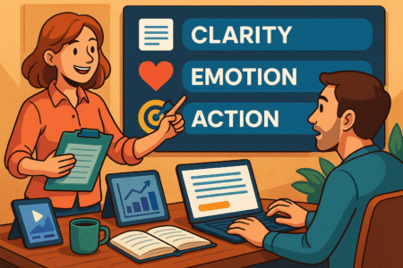
The words you choose matter just as much as what you say. If you want to create a marketing email that gets clicks, replies, or purchases, persuasive writing should be your backbone. The goal is to be helpful, clear, and emotionally engaging—without sounding manipulative or salesy.
Focus On Benefits Over Features In Every Line
A common mistake is focusing too much on what your product or offer is instead of what it does for the reader.
Here’s a quick way to reframe:
- Feature: “We built an AI-powered email tool.”
- Benefit: “Write better emails in half the time—with zero guesswork.”
Readers are always asking, “What’s in it for me?” That question should be answered in every paragraph, CTA, and subject line.
Try this simple edit trick: for every sentence, ask “So what?” If the answer leads to a clearer benefit, rewrite it to include that.
Use Power Verbs That Inspire Action Without Hype
There’s a big difference between “Submit” and “Claim Your Spot.” Words shape behavior. You want language that motivates without feeling pushy.
Here are some power verbs that often increase click-through and conversion:
- Discover
- Start
- Try
- Get
- Unlock
- Explore
- Claim
- Boost
- Save
Avoid words that feel too aggressive, like “Destroy” or “Crush”—unless they genuinely fit your brand tone. The goal is energy and excitement, not empty hype.
A/B test your calls-to-action using different verbs to see what resonates best with your audience. I’ve found that small shifts like this can lead to 10–20% higher click rates in many campaigns.
Personalize Where It Matters—Without Overdoing It
Personalization helps your email feel relevant—but only when it’s done with care. Slapping a name at the top isn’t enough.
Effective personalization looks like:
- Referring to a recent purchase or behavior (“Since you loved the spring bundle…”)
- Recommending something based on past interest
- Adjusting tone or offer based on user segment (e.g., new vs. long-time subscriber)
Use tools like ActiveCampaign or ConvertKit to personalize at scale without sounding robotic. Just make sure it always feels natural. If the personalization stands out more than the message, it becomes a distraction.
A good rule: if the email would feel awkward without the personalized element, don’t include it.
Choose The Right Call-To-Action To Drive Clicks
A strong call-to-action (CTA) is more than a button—it’s the moment your reader decides whether to act or exit. If you want to create a marketing email that drives real results, your CTA must align with what the reader needs and where they are in their journey.
Align CTA With The Reader’s Awareness Stage
The right CTA depends on how familiar your audience is with you, your offer, or their own problem. Jumping straight to “Buy Now” for someone just getting to know you can feel rushed. Instead, think about where they are in the awareness funnel:
- Unaware or Cold Audience: Focus on soft asks like “Learn More” or “See How It Works”
- Problem-Aware Readers: Try “Discover Your Solution” or “Explore Your Options”
- Ready-to-Buy Users: Use direct CTAs like “Start Your Free Trial” or “Get Access Now”
Matching your CTA to intent helps you meet your reader where they are instead of pushing them somewhere they’re not ready to go.
Make The CTA Button Clear, Visible, And Actionable
Design and placement are just as important as the words. If your CTA blends into the background or looks confusing, people will skip right past it—even if they’re interested.
Here’s what makes a CTA button work:
- High contrast color (without clashing with your brand)
- Clear action phrase (avoid vague text like “Submit”)
- Logical placement after the offer or core value
- Enough white space around it to make it easy to spot
A simple layout might look like this:
Visual example idea:
[Short benefit paragraph]
→ CTA button: “Try It Free for 7 Days”
[Optional supporting image]
This structure keeps the reader focused and nudges them naturally toward action.
Limit To One Primary CTA To Reduce Decision Fatigue
Too many options can overwhelm readers and lead to inaction. It might seem helpful to offer links to your blog, a download, and a free trial all in one email—but that often leads to confusion.
Instead:
- Choose one clear primary CTA that supports the goal of the email
- If needed, add a secondary, softer CTA (but make it visually distinct and less prominent)
- Repeat your primary CTA once more further down, especially in longer emails
Less clutter creates more clarity, and clarity helps people click with confidence.
Optimize Send Timing Based On Behavior And Intent
Even the best-written email can fall flat if it lands in someone’s inbox at the wrong time. Timing your sends around when your audience is most likely to engage can dramatically improve your open and click rates.
Analyze Email Metrics To Discover Ideal Send Windows
Start by reviewing your campaign data:
- What days of the week get the highest open rates?
- Which times produce the most clicks?
- Are there seasonal or weekly trends in behavior?
Email tools like Mailchimp, ConvertKit, and ActiveCampaign provide this data in easy-to-read dashboards. You’ll often see trends where engagement peaks around mid-morning (9–11am) or early evening—but every audience is different.
Keep an eye on both open rate and click-through rate together. One without the other won’t give the full picture.
Segment Audiences Based On Time Zones Or Activity
If you have a global list, sending at the same time across time zones rarely works well. Segment your audience based on geography when possible, or use tools that automatically adjust send times to the user’s local time.
Some platforms even allow behavior-based sends—delivering emails at the exact hour someone usually opens previous emails. This often leads to 10–20% higher engagement without changing anything else in your campaign.
You can also segment based on activity:
- Active users: send at peak times to maintain momentum
- Inactive subscribers: experiment with off-peak hours when inboxes are less crowded
Test Timing Variations And Monitor Impact
Sometimes what seems like a small tweak can have a big impact. For example, testing Tuesday morning vs. Thursday afternoon might reveal surprising preferences.
Set up time-based A/B tests where half your audience gets the message at one time, and the other half receives it later. Track how engagement differs.
Remember to control other variables. You want the timing—not the subject line or CTA—to be the only difference.
Over time, you’ll build a send-time strategy that’s customized to how your audience behaves—not just what generic studies recommend.
Test Every Element—And Track What Really Works
Email marketing shouldn’t rely on guesswork. To create a marketing email that consistently improves, you need to test your ideas, track what performs, and optimize based on real data.
Use A/B And Multivariate Testing Strategically
Start with simple A/B testing:
- Subject lines: Which phrasing gets more opens?
- CTA text: Does “Get Your Copy” outperform “Download Now”?
- Email layout: Does a plain-text version get more clicks than a designed one?
For more advanced testing, multivariate testing allows you to test several changes at once—like subject line, image, and button placement—but this requires a larger list to get accurate results.
Tools like MailerLite, Litmus, and Campaign Monitor offer built-in testing tools that simplify the process.
Focus On Metrics That Matter: CTR, Opens, And Conversions
Not all metrics are equally useful. Here’s how I break it down:
- Open Rate: Good for testing subject lines, but affected by privacy settings
- Click-Through Rate (CTR): Shows how well your message and CTA worked
- Conversion Rate: The ultimate test—did your email lead to action?
Vanity metrics like unsubscribes or list size don’t tell the full story. Focus on the metrics that reflect real engagement and business results.
Refine Based On Feedback Loops And Analytics Insights
Look at testing as a cycle, not a one-time event. Each email gives you a chance to learn something new.
Here’s a simple feedback loop:
- Plan what you want to test (e.g., button color or headline)
- Test it with a clear A/B setup
- Measure results after 24–72 hours
- Adjust the next email based on what worked
Even small changes—like switching from “Learn More” to “See How It Works”—can improve your results dramatically over time. The key is to keep testing, learning, and evolving.
Automate Wisely Without Losing The Human Touch
Automation helps you create a marketing email that scales—but it shouldn’t feel robotic. The best automated emails still sound like they’re written by a human who understands the reader’s needs.
Set Up Smart Triggers For Timely, Relevant Messages
One of the most effective ways to use automation is through triggers—specific actions or behaviors that kick off relevant emails.
Some examples include:
- A welcome email after someone joins your list
- A follow-up when someone clicks a link but doesn’t convert
- A reminder email when a cart is abandoned
These messages feel timely because they respond to what the subscriber is doing in real time. Tools like ConvertKit, ActiveCampaign, or Drip make it simple to set up these flows based on behavior, tags, or event tracking.
For instance, if someone downloads a free guide, you can trigger a nurture sequence tailored to that topic. This approach builds trust and relevance without requiring constant manual effort.
Use Behavior-Based Sequences Over Static Drip Campaigns
Traditional drip campaigns send emails in a fixed order over a set time. They’re simple but don’t adapt to what the user actually needs.
Instead, use behavior-based sequences that respond to:
- Email opens and clicks
- Product views or site activity
- Purchase history or time since last engagement
For example, if a subscriber clicks a link about pricing but doesn’t buy, you might follow up with a case study or testimonial instead of continuing the general sequence.
This kind of personalization not only boosts engagement but shows readers you’re paying attention—which builds long-term loyalty.
Always Include Opt-Outs And Maintain Deliverability
Respect for your audience starts with giving them control. Every automated email should include:
- A clear unsubscribe link
- An option to manage preferences
- Contact information and branding that builds trust
Ignoring this isn’t just bad practice—it can hurt your sender reputation and land your emails in spam.
To maintain good deliverability:
- Use verified sending domains
- Keep a clean list (remove inactive subscribers regularly)
- Monitor bounce rates and spam complaints through your email platform
Sending fewer, higher-quality emails always performs better than blasting your list blindly. Automation is a tool—but human connection is still the goal.
Avoid These Common Email Marketing Pitfalls
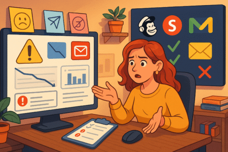
Sometimes it’s not about doing more, but doing less of the wrong things. These mistakes can quietly kill your results, even if your intentions are good.
Sending Too Often Or With No Clear Value
Over-emailing is a fast way to lose trust. If someone hears from you every day and most of it feels irrelevant, they’ll either tune out—or unsubscribe.
Ask yourself before each send:
- What value does this email offer?
- Does it serve the reader’s interest or just mine?
- Is this the right time to send it?
Instead of guessing, you can survey your audience to ask how often they’d like to hear from you or what topics they care about most.
Overdesigning Or Ignoring Mobile Experience
Too many emails are visually beautiful but practically unreadable—especially on mobile. When emails don’t load properly or are overloaded with graphics, people bounce quickly.
Stick to these mobile-friendly basics:
- Use a single-column layout
- Keep font sizes at 14px or higher
- Limit large images or background effects that slow loading
- Use responsive templates that adapt to screen size
Simple often wins. A clear, plain-text style email can outperform a polished design when done well.
Writing Copy That Sounds Robotic Or Self-Centered
People ignore emails that feel stiff, overly promotional, or all about the sender.
Instead, focus on:
- Using everyday language that sounds like you’re speaking to a friend
- Highlighting reader benefits, not just features
- Making it easy to scan and act on your message
Avoid phrases like “We’re excited to announce” or “Our new product is here!” and shift to language that centers the reader: “Here’s how you can [benefit] today.”
Make it personal, conversational, and helpful—and people will want to hear from you again.
Pro Tip: Use These Tools To Create A Marketing Email Fast
Great emails don’t have to take hours to write or design. These tools help speed up the process while keeping quality high—whether you’re a beginner or seasoned marketer.
ConvertKit: For Personalized, Automatable Email Campaigns
ConvertKit stands out for its simplicity and smart automation. It’s perfect for creators, bloggers, and small businesses that want to:
- Tag and segment subscribers
- Build behavior-based sequences
- Create beautiful forms and landing pages
Its visual automation editor makes it easy to see how emails connect, so you’re not guessing where subscribers are in your funnel.
BeeFree: To Design Clean, Responsive Emails Without Code
If you want drag-and-drop ease with professional results, BeeFree is a solid choice. It offers:
- Hundreds of responsive templates
- Mobile-first design controls
- Easy export to most major email platforms
It’s ideal for marketers who want design freedom without writing code.
Hemingway Editor: To Simplify And Sharpen Email Copy
Clarity wins every time in email. Hemingway helps you:
- Cut wordy sentences
- Remove passive voice
- Improve readability for faster scanning
Paste your email into the tool, and it highlights problem areas with color-coded suggestions. Great for writing tighter, stronger messages that connect quickly.
Litmus: To Preview And Test Email Across Devices And Clients
Even well-designed emails can break in different inboxes. Litmus lets you:
- Test emails across 90+ apps and devices
- Track how users engage with your emails
- Spot issues before they go live
It’s a must-have if you’re sending high-stakes campaigns or working with a team.
I’m Juxhin, the voice behind The Justifiable.
I’ve spent 6+ years building blogs, managing affiliate campaigns, and testing the messy world of online business. Here, I cut the fluff and share the strategies that actually move the needle — so you can build income that’s sustainable, not speculative.
