Table of Contents
Some links on The Justifiable are affiliate links, meaning we may earn a small commission at no extra cost to you. Read full disclaimer.
Are you searching for inspiration to create a high-converting Unbounce landing page? Wondering what makes some landing pages stand out while others fail to deliver results? Whether you’re aiming to boost sales, generate leads, or increase engagement, having a well-designed landing page is essential to your success.
In this article, we’ll explore the top 5 Unbounce landing page examples that work, breaking down what makes each one effective. From their design elements to their copywriting strategies, you’ll discover actionable tips to help you craft your own successful Unbounce landing page. Ready to elevate your landing page game? Let’s dive in!
Introduction to Unbounce Landing Pages
An Unbounce landing page is a powerful tool that helps businesses create conversion-focused pages without needing advanced coding skills. Whether you’re new to Unbounce or an experienced user, understanding its potential can transform how you generate leads and drive sales.
Let’s explore what Unbounce landing pages are, why they’re so popular, and the key benefits they offer.
What Is an Unbounce Landing Page?
An Unbounce landing page is a single web page designed with a clear goal in mind—whether it’s capturing leads, promoting a product, or driving specific user actions. These pages are created using the Unbounce platform, which provides a drag-and-drop editor, customizable templates, and a suite of optimization tools.
Unbounce landing pages focus on minimizing distractions, guiding visitors to take a single, measurable action, such as clicking a button or filling out a form. Unlike traditional web pages that often have multiple objectives, Unbounce landing pages zero in on one key conversion goal.
For example, a business offering free consultations might design a landing page where the primary action is filling out a form to book an appointment. These pages are all about simplicity, clarity, and performance.
With the flexibility and ease of use that Unbounce offers, marketers and business owners can create high-performing pages without needing to rely on developers. This accessibility is one of the reasons why Unbounce has become a favorite among businesses of all sizes.
Why Are Unbounce Landing Pages Popular?
Unbounce landing pages are popular because they help businesses achieve measurable results in less time. The platform’s ability to streamline the page-building process while focusing on optimization makes it an attractive choice for marketers who value efficiency and results.
The ability to quickly A/B test variations of landing pages is another reason for their widespread use. Marketers can test headlines, call-to-action buttons, or imagery and immediately see which version drives more conversions. This data-driven approach makes Unbounce indispensable for campaigns where ROI is critical.
Additionally, the platform integrates with popular tools like Google Analytics, CRM software, and email marketing platforms. This integration allows marketers to track user behavior, follow up with leads, and refine their strategies based on real-time insights.
Unbounce landing pages are also versatile. They cater to various industries, including e-commerce, SaaS, healthcare, and education, offering tailored templates to meet unique business needs.
Benefits of Using Unbounce for Landing Pages
Using Unbounce for landing pages comes with a host of benefits, making it a go-to solution for marketers and businesses looking to optimize their campaigns.
- Ease of Use: The drag-and-drop editor requires no coding knowledge, making it accessible for anyone.
- Customizable Templates: Users can choose from a wide range of professionally designed templates and tweak them to fit their brand.
- Built-In Conversion Tools: Features like A/B testing, dynamic text replacement, and pop-ups boost engagement and conversion rates.
- Speed to Market: With pre-built components, users can create and launch pages within hours, reducing time to market.
- Optimized for Mobile: Unbounce ensures that all landing pages are mobile-responsive, catering to the growing number of users browsing on smartphones.
For instance, if you’re running a holiday campaign, you can quickly design and launch a landing page highlighting seasonal discounts without relying on a developer. This agility can give businesses a significant edge in competitive markets.
Key Features of a High-Converting Unbounce Landing Page
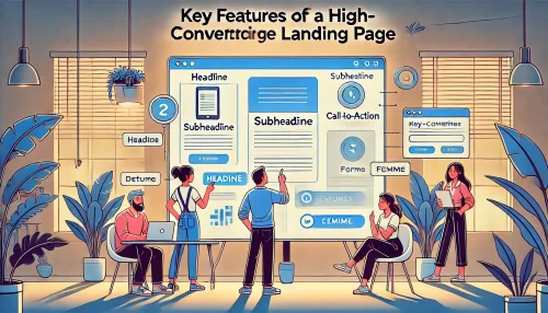
A high-converting Unbounce landing page isn’t just about looking good—it’s about delivering results. From design to functionality, every element plays a role in driving conversions. Let’s break down the essential features that make these pages so effective.
Design Elements That Drive Conversions
The design of an Unbounce landing page is its backbone. Eye-catching visuals, intuitive layouts, and compelling CTAs (calls-to-action) are critical in persuading visitors to take action.
- Hero Sections: The first thing visitors see sets the tone. A well-designed hero section with a clear headline, subheadline, and relevant image captures attention instantly. For example, a SaaS company might highlight its unique value proposition, such as “Boost Productivity by 40% With Our Tool.”
- Contrast in CTAs: Calls-to-action must stand out. Use bold, contrasting colors that grab attention while ensuring the copy is action-driven. Instead of “Submit,” use phrases like “Get My Free Trial.”
- Whitespace and Clarity: Avoid clutter. Spacing between sections makes the page feel professional and helps focus visitors’ attention on the core message.
- Trust Signals: Adding testimonials, awards, or certifications builds credibility and reduces hesitation.
These elements combine to guide the user’s journey seamlessly, ensuring every design choice contributes to conversions.
The Role of Copywriting in Unbounce Landing Pages
While design draws visitors in, copywriting is what converts them. A strong Unbounce landing page uses compelling, benefit-focused language that speaks directly to the audience’s needs.
- Emotionally Resonant Headlines: Headlines should tap into the visitor’s desires or pain points. For example, instead of saying, “We Sell Fitness Plans,” use, “Transform Your Body in Just 30 Days!”
- Scannable Copy: Use short paragraphs, bullet points, and subheadings to make the content easy to skim. Visitors should understand the value proposition within seconds.
- Social Proof in Words: Include customer reviews or success stories. A single sentence like, “I doubled my sales in a month using this tool,” can create immense trust.
Crafting persuasive, concise, and engaging copy tailored to the target audience ensures your page resonates and drives results.
Importance of Mobile Responsiveness
A landing page that isn’t mobile-responsive risks losing a significant chunk of potential leads. Over 50% of web traffic comes from mobile devices, making mobile optimization essential for Unbounce landing pages.
- Fast Loading Speeds: Ensure the page loads in under three seconds to prevent visitors from leaving.
- Simplified Mobile Layouts: Reduce unnecessary content and prioritize essential elements like CTAs and headlines.
- Thumb-Friendly Navigation: Buttons and forms should be easy to click without zooming in.
For example, an e-commerce store running an ad campaign might lose customers if its mobile landing page isn’t user-friendly. Ensuring responsiveness on all devices is crucial to maximizing conversions.
Criteria for Choosing Effective Unbounce Landing Page Examples
To identify effective Unbounce landing page examples, it’s essential to understand the criteria that separate high-converting pages from those that fall short. Factors like performance metrics, user behavior insights, and A/B testing results play a pivotal role in determining success. Let’s break these down to ensure you can identify (and replicate) winning landing pages.
Key Metrics to Evaluate Success
Measuring the success of an Unbounce landing page starts with tracking specific metrics that reveal its performance. These metrics provide insights into how well a page achieves its conversion goals.
- Conversion Rate: This is the ultimate measure of success. A high conversion rate indicates that the page effectively persuades visitors to take the desired action, whether it’s signing up for a newsletter or completing a purchase. For instance, a conversion rate above 10% is considered excellent in most industries.
- Bounce Rate: A low bounce rate suggests that visitors are engaging with the content instead of leaving the page quickly. Pages with relevant content and clear CTAs often perform better in this area.
- Time on Page: Longer time spent on a landing page indicates that visitors find the content valuable and engaging.
- Lead Quality: It’s not just about quantity. High-quality leads, such as those that result in sales, are a key indicator of success.
Tracking these metrics through tools like Kissmetrics or Unbounce’s built-in analytics dashboard ensures you have actionable data to refine your pages.
How to Analyze User Behavior on Landing Pages
Understanding how users interact with your Unbounce landing page is critical to improving its performance. Observing user behavior reveals pain points and opportunities for optimization.
- Heatmaps: These tools show where users click, scroll, or hover on a page. For example, if visitors are consistently ignoring your CTA button, it might need a design tweak or a more compelling call to action.
- Session Recordings: Watching session recordings allows you to see exactly how users navigate your page. This insight can help identify confusing layouts or areas where visitors lose interest.
- Exit Intent Tracking: Tracking when and why visitors leave your page helps address issues like unclear messaging or irrelevant offers. For instance, adding an exit-intent pop-up with a discount offer can reduce abandonment rates.
- Form Analysis: If your page includes a form, analyze which fields users tend to leave blank. Simplifying or rephrasing form fields can boost completion rates.
Incorporating user behavior analysis into your strategy ensures you’re not making assumptions but acting on real data to enhance your Unbounce landing page.
The Impact of A/B Testing on Performance
A/B testing is one of the most powerful ways to optimize an Unbounce landing page. It involves testing two or more variations of a page to determine which one performs better.
- Headlines and Copy: Experiment with different headlines to see which resonates most with your audience. For instance, a product page might test “Save Time With Our All-in-One Tool” versus “Simplify Your Workflow Today.”
- Call-to-Action (CTA): Test the size, color, placement, and wording of your CTA button. A simple change like switching “Download Now” to “Get My Free Guide” can significantly improve conversions.
- Images and Videos: Visuals play a major role in engagement. Test whether lifestyle images or product-focused visuals drive more clicks. For example, an image showing a happy customer using your product might perform better than just the product itself.
- Form Length: If your page includes a form, test shorter forms against longer ones. Often, reducing the number of fields increases submissions.
A/B testing should be an ongoing process. The insights you gain help refine your Unbounce landing page and maximize its performance over time.
Analyzing 5 Proven Unbounce Landing Pages for Maximum Conversions
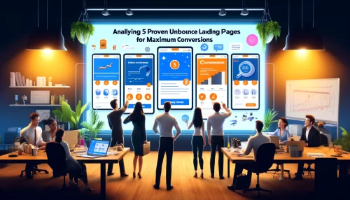
Unbounce landing pages are an effective way to maximize conversions, but what does success look like in action? Here, we’ll break down five exceptional Unbounce landing page examples and highlight the strategies they use to deliver outstanding results. These examples will give you actionable insights to apply to your own landing pages.
Example 1: High-Converting Sales Page
A high-converting sales page built with Unbounce focuses on driving purchases by leveraging a compelling mix of design, copy, and trust signals.
One example is a page created for an e-commerce brand selling skincare products. The page begins with a bold headline like, “Glow Naturally: Your Secret to Radiant Skin,” followed by an eye-catching hero image showcasing the product in use. The primary call-to-action (CTA) button, “Shop Now,” is placed above the fold and designed in a bright, contrasting color.
- Core Features: This sales page integrates testimonials from satisfied customers, providing social proof. A short video highlights the product’s unique features and benefits, helping visitors visualize how it can solve their problems.
- Why It Works: The page’s layout is clean and visually appealing, making it easy for visitors to focus on the offer. Key benefits are displayed in bullet points, while the copy directly addresses customer pain points like “dry, uneven skin.”
The result? A significant increase in purchases, proving that thoughtful design and persuasive copy can drive conversions.
Example 2: Minimalist Service-Based Page
This example focuses on simplicity, showing how a clean design can deliver powerful results for service-based businesses.
A digital marketing agency used Unbounce to create a landing page aimed at offering free consultations. The page starts with a headline that grabs attention, such as “Grow Your Business with Expert Marketing Advice.” Below it, a short subheading highlights the value of their service in a clear, no-nonsense tone.
- Core Features: The page features a minimalistic design with lots of whitespace, allowing the CTA button—”Book Your Free Call”—to stand out. A short form asks for only essential information (name, email, and business type), reducing friction for potential leads.
- Why It Works: Trust-building elements like client logos and a brief case study are subtly integrated to provide credibility. The page eliminates distractions, ensuring visitors focus solely on booking the consultation.
This approach resulted in higher form submission rates, proving that less is often more in landing page design.
Example 3: Interactive Product Landing Page
For businesses selling complex products, interactive elements can simplify the user experience and increase engagement.
An example is a tech company promoting its project management software. The landing page immediately draws visitors in with an interactive demo that showcases the software’s key features. The headline, “Simplify Your Workflow in Minutes,” is paired with an engaging animation that highlights the tool’s ease of use.
- Core Features: Visitors can explore the product through interactive screenshots or click to watch a short tutorial video. The page also features a prominent CTA: “Start Your Free Trial Today.” Below it, key benefits like “Collaborate Effortlessly” and “Save Time With Automation” are presented in a scannable format.
- Why It Works: Interactive elements create an engaging experience, helping users understand the product’s value without needing a lengthy explanation. Testimonials and a comparison chart also address potential objections, making it easier for visitors to take the next step.
The result? Higher trial sign-up rates, showing that interactive features can elevate a landing page’s effectiveness.
Example 4: Lead Generation Page for Maximum ROI
Lead generation pages are designed to collect valuable information from visitors, and this example demonstrates how Unbounce makes it seamless.
A fitness studio used Unbounce to create a landing page offering a free trial pass. The page begins with a headline like, “Try Us Free for 7 Days,” followed by a visually engaging image of a group fitness class. The form is prominently displayed on the right side of the page with a clear CTA: “Claim Your Free Pass.”
- Core Features: To build trust, the page includes a short blurb about the studio’s experience and success stories from current members. A countdown timer creates urgency, encouraging visitors to act quickly.
- Why It Works: The form is simple, asking for just a name and email address, which removes unnecessary friction. Clear benefits like “Unlimited Classes” and “No Obligations” are highlighted to address common hesitations.
This strategy helped the fitness studio significantly grow its email list and drive foot traffic to their location.
Example 5: Event Registration Page with High Engagement
When it comes to events, a great landing page can make all the difference in driving sign-ups.
One example is a conference landing page created to promote a tech summit. The headline, “Join the Future of Innovation,” sets the tone, while a countdown timer adds urgency. The page features a sleek design with a vibrant color scheme that reflects the energy of the event.
- Core Features: Key event details—like the date, location, and agenda—are prominently displayed. A video from the previous year’s event helps build excitement and shows attendees what to expect. The registration CTA, “Reserve Your Spot Now,” is repeated multiple times throughout the page to keep visitors focused on signing up.
- Why It Works: This page emphasizes FOMO (fear of missing out) with limited spots and early-bird pricing. Partner logos and speaker profiles further build credibility and generate excitement.
The result? The event sold out within weeks, proving that a well-designed registration page can drive strong engagement.
Breakdown of Each Landing Page Example
Breaking down the top Unbounce landing page examples helps us uncover the specific strategies and features that contribute to their success. From effective layouts to targeted messaging, let’s analyze what makes these pages stand out and how you can apply similar tactics to your own Unbounce landing pages.
Example 1: What Makes It Effective?
The high-converting sales page is effective because it combines powerful visuals, clear messaging, and trust-building elements to persuade visitors.
This page starts strong with a compelling headline that addresses the visitor’s primary pain point. For example, “Say Goodbye to Dry Skin—Hydrate Instantly” grabs attention while hinting at the solution. Paired with an engaging hero image of the product in action, it immediately captures interest.
Trust elements, such as testimonials and user-generated content, make the page even more persuasive. For instance, a real customer review like, “This product transformed my skin in just a week!” adds authenticity and builds confidence.
The CTA stands out because it’s positioned above the fold and uses action-oriented language like “Shop Now” or “Try It Today.” The page’s design removes distractions, focusing visitors’ attention on the product’s value and the desired action.
Takeaway: A winning sales page simplifies the user journey, builds trust, and uses bold design to guide visitors toward conversions.
Example 2: Standout Features and Insights
The minimalist service-based landing page thrives because of its clean design, direct messaging, and frictionless lead-capturing process.
Whitespace is the star of this example. The page uses plenty of space around key elements to draw attention to the headline and form. For instance, the headline, “Unlock Your Growth Potential with Expert Guidance,” is surrounded by whitespace, making it stand out instantly.
The form is simple and intuitive. Instead of overwhelming visitors with multiple fields, it only asks for essential information like name and email. This simplicity encourages more people to sign up. A single call-to-action—”Get Your Free Consultation”—remains consistent throughout the page, preventing confusion.
Trust-building elements, like client testimonials and recognizable company logos, reassure visitors of the service’s credibility. A short, compelling client story, such as “We helped XYZ Co. increase revenue by 30%,” helps establish authority.
Takeaway: Minimalist designs work best when every element serves a clear purpose. Focus on clarity, simplicity, and trust to boost conversions.
Example 3: How It Engages Visitors
The interactive product landing page stands out because it uses dynamic features to engage visitors and demonstrate the product’s value in real-time.
One key feature is an interactive demo that lets visitors explore the software’s functionality. For example, they can click through different features like task management, calendar views, and team collaboration tools. This hands-on experience helps visitors visualize how the product fits into their daily workflow.
The page also incorporates a short tutorial video that explains the product’s benefits in less than 60 seconds. A video headline like “See How It Works in Just One Minute” grabs attention and encourages clicks. This combination of interactive elements and multimedia increases engagement and reduces bounce rates.
Social proof plays a major role in keeping visitors engaged. Displaying statistics like “Over 10,000 Teams Use Our Software” reassures users of the product’s reliability. A testimonial from a real user adds authenticity, such as: “This tool cut our project completion time in half.”
Takeaway: Interactive features not only captivate visitors but also make complex products easier to understand, leading to higher engagement and conversions.
Example 4: Conversion-Boosting Strategies Used
The lead generation landing page succeeds because it simplifies the sign-up process and uses urgency to drive action.
A bold headline like, “Claim Your Free 7-Day Fitness Pass Today,” immediately conveys value while creating a sense of urgency. The page uses a countdown timer to reinforce this urgency, showing visitors how much time they have left to grab the offer.
A clean form design ensures the lead generation process is seamless. For instance, the form only asks for essential details—name and email—reducing friction and making sign-ups easy. Including benefits directly next to the form, such as “Unlimited Gym Access” and “No Long-Term Commitment,” addresses any potential objections upfront.
The page also uses visuals strategically. A vibrant image of a group fitness class in action makes the offer feel exciting and approachable. Paired with social proof, such as, “Join 500+ Members Who Love Our Classes,” the visuals and copy work together to build trust.
Takeaway: Use urgency, simplicity, and clear benefits to create lead generation pages that convert at a high rate.
Example 5: Key Takeaways for Marketers
The event registration landing page is effective because it combines excitement, credibility, and ease of use to encourage sign-ups.
The headline, “Join Industry Leaders at This Year’s Tech Summit,” immediately conveys value and targets the audience’s aspirations. Supporting elements, like a highlight video of last year’s event and speaker profiles, generate excitement and build credibility.
Limited-time offers, like early-bird pricing, create a sense of urgency. Phrases such as “Save 30% Before January 15th” motivate visitors to act quickly. This tactic works particularly well for events where FOMO (fear of missing out) drives decisions.
To make registration seamless, the form is simple and concise. It asks for only the most important information, such as name and email. The CTA button—”Reserve Your Spot Now”—is strategically placed and repeated throughout the page to encourage action.
Takeaway: Event pages thrive when they build excitement, provide social proof, and make the registration process as smooth as possible.
Tips for Creating Your Own Unbounce Landing Page
Creating an effective Unbounce landing page requires a mix of creativity, strategy, and user-centered design. With the right tools and practices, you can build a page that converts visitors into leads or customers. Let’s explore actionable tips to help you get started and ensure success.
How to Use Unbounce Templates Effectively
Unbounce offers a library of customizable templates, making it easy to get started with your landing page. Knowing how to use these templates effectively can save you time while delivering professional results.
Start by choosing a template that aligns with your goal. For example, if you’re promoting a webinar, select a template designed for event registrations. Templates are tailored to specific use cases, so starting with the right one reduces the need for heavy modifications.
When customizing, keep the layout clean and focused. Stick to one primary call-to-action (CTA), like “Sign Up Now” or “Get My Free Guide.” Avoid cluttering the page with multiple CTAs that could confuse visitors.
Next, adjust the colors, fonts, and images to match your branding. For example, replace stock images with authentic photos that resonate with your audience. A personal touch increases trust and makes the page feel more relatable.
Takeaway: Templates are a great starting point, but customization is key to making your Unbounce landing page unique and aligned with your brand’s goals.
Essential Tools for Building Custom Landing Pages
To create a standout Unbounce landing page, leveraging the right tools can make the process seamless and effective.
- A/B Testing Tools: Built directly into Unbounce, A/B testing lets you compare different versions of your landing page to see which performs better. Test elements like headlines, CTA buttons, and images to optimize conversions.
- Dynamic Text Replacement: This Unbounce feature allows you to personalize landing page text based on search terms visitors used to find your page. For instance, a visitor searching for “affordable fitness plans” might see that exact phrase on the page, increasing relevance and engagement.
- Third-Party Plugins: Tools like Crazy Egg provide heatmaps and session recordings, helping you analyze visitor behavior. These insights reveal which sections of your page are working and where users might be dropping off.
- Image Optimization Tools: Use platforms like EWWW.io to compress images without losing quality. Fast-loading visuals enhance user experience and reduce bounce rates.
Takeaway: Equipping yourself with the right tools streamlines the landing page creation process and helps you continuously refine your strategy for better results.
Common Mistakes to Avoid When Designing Landing Pages
Even the best-designed landing pages can fail to convert if certain mistakes go unchecked. Being aware of these pitfalls can save you time and resources.
One common mistake is overwhelming visitors with too much information. Avoid using long blocks of text. Instead, break content into scannable sections with headings, bullet points, or icons. Visitors should grasp your message within seconds.
Another issue is unclear or generic CTAs. For example, “Click Here” doesn’t convey urgency or value. Instead, opt for actionable and specific CTAs like “Download My Free E-Book” or “Join the Webinar Now.”
Lack of mobile optimization is another major oversight. With over half of web traffic coming from mobile devices, ensuring your page is fully responsive is critical. Test your landing page across devices to confirm that all elements, like forms and CTAs, function properly.
Lastly, neglecting trust signals such as testimonials or guarantees can hurt conversions. People are more likely to engage when they feel reassured. A quote from a happy customer or a “100% Satisfaction Guaranteed” badge can go a long way.
Takeaway: Keep your design simple, your CTAs clear, and your landing page fully optimized for mobile to maximize its effectiveness.
Tools and Integrations
Unbounce landing pages become even more powerful when paired with tools and integrations that enhance their performance and functionality. These tools help you track data, nurture leads, and improve user experience. Let’s dive into some of the best options available.
Best Analytics Tools to Track Performance
Tracking your landing page’s performance is essential to measure success and refine your strategy. Here are some of the best analytics tools you can use:
- Google Analytics: Use Monsterinsights to monitor key metrics like traffic, bounce rate, and average session duration. For Unbounce landing pages, setting up goal tracking helps measure conversions effectively.
- Unbounce Conversion Analytics: Built-in analytics on Unbounce allow you to track performance directly. You can view conversion rates for each landing page and gain quick insights into what’s working.
- Hotjar: This tool provides heatmaps, session recordings, and feedback widgets. For example, a heatmap might show that users aren’t scrolling past the hero section, signaling the need to adjust your layout.
- Facebook Pixel: If you’re running social media ads, Facebook Pixel tracks user actions on your landing page. This data helps you refine targeting and re-engage visitors with retargeting campaigns.
Takeaway: Tracking tools give you actionable insights into your Unbounce landing page’s performance, allowing you to make data-driven improvements.
Integrating CRM and Email Marketing Platforms
Integrating your landing page with CRM and email marketing platforms helps you manage leads and nurture them effectively.
- HubSpot CRM: Unbounce integrates seamlessly with HubSpot, making it easy to send leads directly to your CRM. This allows you to automate follow-up emails or segment leads based on their behavior.
- Mailchimp: Use Mailchimp to create automated email campaigns. For example, after a visitor fills out a form on your Unbounce landing page, they could receive a welcome email within minutes.
- Zapier: With Zapier, you can connect Unbounce to hundreds of apps. For instance, you could automatically send lead information to Google Sheets or Slack for quick collaboration with your team.
- Salesforce: For larger businesses, integrating Salesforce ensures leads are tracked and managed effectively within your sales pipeline.
Takeaway: CRM and email marketing integrations streamline lead management and ensure every visitor receives the attention they need to convert.
Enhancing User Experience with Chatbots
Chatbots are an excellent way to boost engagement on your Unbounce landing page and provide instant assistance to visitors.
Platforms like Tidio Live Chat and Intercom integrate easily with Unbounce, enabling you to add chat features to your landing pages. For instance, a chatbot can answer frequently asked questions, such as “How does this free trial work?” or “What’s included in the subscription?”
Using AI-powered chatbots improves response times and keeps visitors engaged. For example, a visitor considering a product might hesitate if they don’t understand the return policy. A chatbot can provide quick answers, reducing the likelihood of drop-offs.
Chatbots are also helpful for collecting leads. For instance, you can program the chatbot to ask for an email address after resolving a visitor’s query, further streamlining your lead generation process.
Takeaway: Adding a chatbot to your Unbounce landing page enhances user experience, boosts engagement, and improves lead collection.
I’m Juxhin, the voice behind The Justifiable.
I’ve spent 6+ years building blogs, managing affiliate campaigns, and testing the messy world of online business. Here, I cut the fluff and share the strategies that actually move the needle — so you can build income that’s sustainable, not speculative.
