Table of Contents
Some links on The Justifiable are affiliate links, meaning we may earn a small commission at no extra cost to you. Read full disclaimer.
Creating a website to sell products is one of those things that looks simple from the outside, but once you’re in it, you realize how many small decisions directly affect whether visitors buy or bounce.
I’ve seen great products fail online not because of price or quality, but because the website made buying feel slow, confusing, or risky.
Let me walk you through how to structure a site that’s built to convert fast, without relying on gimmicks or guesswork.
Choosing The Right Product Pages For Faster Conversions
The type of product page you use has a bigger impact on conversions than most people realize.
When creating a website to sell products, the goal is not to show everything at once, but to show the right thing at the exact moment a visitor is ready to buy.
Matching Page Types To Buying Intent Stages
Not every visitor lands on your site ready to purchase. Some are exploring, others are comparing, and a smaller group is ready to commit.
In my experience, conversion issues often come from sending all of them to the same page.
Here’s how intent usually breaks down in practice:
- Discovery intent: Visitors want to understand what you sell and whether it’s relevant.
- Comparison intent: They’re weighing options, prices, or features.
- Purchase intent: They want reassurance and a fast path to checkout.
If someone with discovery intent lands on a hard-sell product page, it feels pushy. If someone ready to buy lands on a vague category page, it feels slow.
I suggest mapping each traffic source to intent.
For example, ads and email campaigns should go straight to focused product pages, while organic search often performs better when it lands on well-structured category pages.
Data backs this up. According to Nielsen Norman Group, users decide whether a page is relevant in under 10 seconds. Intent mismatch wastes those seconds fast.
Structuring Single-Product Pages For Focused Decisions
Single-product pages work best when the decision is simple and the offer is clear. Think of them as a guided conversation, not a brochure.
What I’ve found effective is removing anything that distracts from the decision. That means no unnecessary navigation links, no unrelated product suggestions above the fold, and no long storytelling before value is clear.
A high-converting single-product page usually includes:
- Immediate clarity: What the product does and who it’s for, in one sentence.
- Visual proof: Images or short videos showing real use, not polished mockups only.
- Objection handling: Shipping details, guarantees, and FAQs placed near the buy button.
One small tweak I use often is placing a short reassurance line directly under the call-to-action, such as delivery timing or return policy. It sounds minor, but I’ve seen this lift conversions by double digits because it answers the last-second hesitation.
Using Category Pages To Reduce Choice Overload
Category pages get a bad reputation, but when done right, they’re powerful conversion tools. The key is reducing cognitive load, not increasing it.
Too many stores treat category pages like warehouses. Endless grids, no guidance, no prioritization. That overwhelms people. Psychologist Barry Schwartz’s research on choice overload shows that more options often lead to fewer decisions.
What works better is light guidance:
- Group products by use case instead of technical specs.
- Highlight a “most popular” or “best for beginners” option.
- Keep filters simple and relevant to how customers actually think.
I like to think of category pages as decision shortlists. Your job isn’t to show everything you have, but to help visitors narrow down confidently and move forward.
Creating A Website To Sell Products With Clear Structure
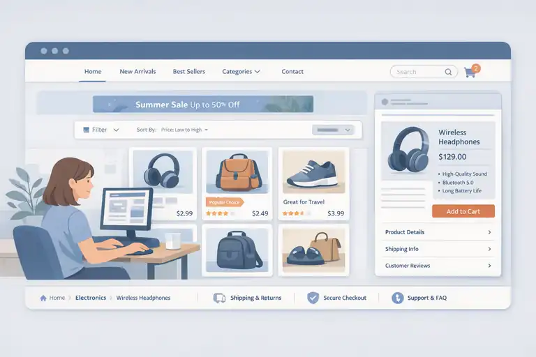
When people say a site “feels easy to use,” what they usually mean is that the structure makes sense without effort.
Creating a website to sell products that converts fast depends heavily on how quickly users understand where to go next.
Designing Navigation That Guides Users Toward Purchase
Navigation should answer one silent question: What should I do next? If it doesn’t, it’s probably hurting conversions.
In my experience, the most common mistake is overloading menus with internal labels that make sense to the business, not the buyer. Visitors don’t think in product codes or internal categories. They think in problems and outcomes.
A strong navigation setup usually:
- Limits top-level menu items to five or fewer.
- Uses language customers already use in searches and reviews.
- Prioritizes revenue-driving pages, not informational ones.
I often remove links rather than add them. It feels uncomfortable at first, but clarity beats completeness every time.
Organizing Collections For Scanning And Comparison
Most visitors don’t read product listings. They scan. That means your collections need to support quick visual and informational comparison.
Effective collections use consistency. Same image angles, similar naming patterns, and predictable pricing displays. When one product card looks different, it forces the brain to work harder.
A simple trick I rely on is adding one short comparison cue per product, such as ideal use or key differentiator. This gives scanners a mental shortcut without forcing a click. Over time, this structure trains users to trust that clicking will be worth it.
Building Logical Page Hierarchies For Buyer Confidence
Page hierarchy affects trust more than people think. When pages feel scattered or disconnected, users subconsciously question legitimacy.
Clear hierarchy means:
- Category pages link down to products, not sideways to distractions.
- Product pages link back to relevant categories naturally.
- Policy and support pages are accessible but not intrusive.
I always test hierarchy by asking a simple question: could a first-time visitor explain what this site sells after one minute? If not, the structure needs work. Confidence grows when everything feels logically connected.
Designing Trust Signals That Remove Buying Friction Online
Trust isn’t built with one element. It’s built through dozens of small cues that quietly reassure people as they move closer to purchase. When selling products online, friction usually shows up right before commitment.
Placing Social Proof Where Doubt Naturally Appears
Social proof works best when it appears exactly where hesitation happens. I’ve seen stores stack testimonials at the bottom of pages and wonder why they don’t convert.
Instead, think about moments of doubt: price, quality, delivery time, or fit. That’s where proof belongs.
Examples that consistently perform well:
- Reviews near pricing sections.
- User photos near product images.
- Short quotes near add-to-cart buttons.
According to Spiegel Research Center, displaying reviews can increase conversion rates by up to 270 percent. The key is relevance, not volume. One well-placed review often beats ten hidden ones.
Using Visual Cues That Reinforce Brand Legitimacy
Visual trust signals are often overlooked because they feel “soft.” In reality, they’re fast credibility checks.
Clean typography, consistent spacing, and real photography do more than fancy graphics. When something looks off, users feel it instantly, even if they can’t explain why.
I avoid stock-heavy designs whenever possible. Even simple phone photos of real packaging or behind-the-scenes moments outperform polished but generic visuals. They signal authenticity, which matters more than perfection.
Reducing Anxiety With Clear Policies And Guarantees
Policies are not legal footnotes. They are conversion tools.
Clear shipping timelines, easy returns, and transparent guarantees reduce perceived risk. What matters most is not generosity, but clarity.
I suggest writing policies in plain language and placing summaries near decision points. For example, a short line like “30-day returns, no questions asked” near the buy button can remove a surprising amount of friction.
From what I’ve seen, customers don’t fear bad products as much as bad outcomes. When you clearly explain what happens if things go wrong, buying feels safer—and safety converts.
Optimizing Checkout Flows On Product Selling Websites
This is where most revenue leaks happen. I’ve seen beautifully designed stores lose 30–50 percent of potential sales simply because checkout felt harder than it needed to be.
When creating a website to sell products, checkout is not the place to be clever. It’s the place to be invisible.
Eliminating Unnecessary Steps In The Checkout Process
Every extra step in checkout is a chance for someone to quit. That’s not theory, it’s behavior. Baymard Institute reports that the average checkout flow still contains nearly 12 form fields, while the ideal number is closer to 6–8.
What I suggest is ruthless simplification. Ask yourself what the customer truly needs to provide right now versus what you want to collect for your business.
Practical ways I reduce friction:
- Guest checkout by default: Account creation can happen after the purchase, when trust already exists.
- Single-page or clearly chunked checkout: Progress indicators reduce anxiety by showing how close they are to finishing.
- Remove distractions: No menus, no cross-sells, no “continue shopping” links pulling them away.
One store I worked on removed just one step—the shipping method confirmation page—and saw a 14 percent lift in completed purchases within two weeks. Less effort almost always wins.
Structuring Forms To Minimize Effort And Errors
Forms are where momentum dies if you’re not careful. The goal isn’t just fewer fields, but fewer thinking moments.
I like to design forms that feel obvious. Labels above fields, clear examples inside inputs, and smart defaults where possible. For example, auto-detecting country reduces friction immediately.
Here’s what consistently helps:
- Logical field order: Name, email, address, payment. No jumping around.
- Inline error handling: Show mistakes as they happen, not after submission.
- Mobile-first spacing: Large tap targets prevent frustration on phones.
A small but powerful trick is explaining why you ask for something. A short note like “Phone number is used only for delivery updates” can significantly reduce abandonment at that field.
Addressing Objections At The Final Purchase Moment
Right before clicking “Buy,” people hesitate. Not because they dislike the product, but because they imagine worst-case scenarios.
Common last-second fears include delivery delays, return hassle, or payment security. I try to answer those before the thought fully forms.
Effective reassurance near the final button often includes:
- Clear delivery expectations: Dates beat vague promises.
- Risk reversal: Money-back guarantees stated simply.
- Security cues: Plain-language payment safety, not just icons.
I’ve learned that clarity beats persuasion here. When buyers know exactly what happens next, clicking feels safe instead of risky.
Writing Copy And CTAs That Drive Immediate Action Today
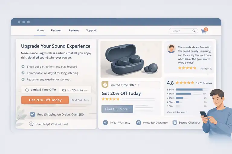
Words don’t just inform, they move people. On a product-selling website, copy should feel like a helpful nudge, not a sales pitch.
When done right, it removes hesitation instead of creating pressure.
Framing Value Around Customer Outcomes Not Features
Features tell. Outcomes sell. This shift alone can change how people respond to your pages.
Instead of listing specifications, I suggest translating each feature into a real-life result. For example, “stainless steel housing” becomes “won’t crack or rust after years of daily use.”
A simple exercise I use is asking “So what?” after every feature. Keep answering until the benefit feels human.
Strong outcome-driven copy often:
- Connects to a daily frustration or desire.
- Uses simple, concrete language.
- Reflects how customers describe the product, not internal jargon.
When customers feel understood, they stop analyzing and start imagining ownership. That’s when conversion happens.
Crafting Calls To Action That Match Buyer Readiness
Not everyone is ready to “Buy Now.” And that’s okay.
High-intent visitors want speed. Lower-intent visitors want reassurance. I usually match CTAs to context instead of forcing one universal button.
Examples that work well:
- High intent: “Add To Cart” or “Buy It Today.”
- Medium intent: “See How It Works” or “Check Availability.”
- Low intent: “Explore Options” or “Find Your Fit.”
In my experience, softer CTAs earlier in the journey often lead to stronger final conversions because they reduce resistance instead of triggering it.
Using Urgency And Clarity Without Feeling Pushy
Urgency should feel helpful, not manipulative. Fake countdowns and vague scarcity damage trust fast.
What works better is honest urgency tied to reality. Limited stock, shipping cutoffs, or seasonal availability are all legitimate when communicated clearly.
Effective urgency usually:
- Explains why time matters.
- Uses calm, straightforward language.
- Avoids flashing graphics or aggressive phrasing.
A line like “Order within 3 hours to ship today” respects the buyer’s intelligence and helps them decide faster. That’s the sweet spot.
Testing And Improving A Website Built To Sell Products
No website converts perfectly out of the gate. The difference between average and high-performing stores is not talent, it’s iteration.
Creating a website to sell products is an ongoing process, not a one-time launch.
Identifying Conversion Bottlenecks Through User Behavior
Before changing anything, you need to know where people get stuck. Guessing is expensive.
I usually start by watching behavior, not opinions. Scroll depth, drop-off points, and repeated actions tell clearer stories than surveys alone.
Key signals to watch:
- High exits on product pages.
- Drop-offs between cart and checkout.
- Rage clicks or repeated taps on non-clickable elements.
Even without advanced tools, session recordings and basic funnel data can reveal obvious friction within an hour of review.
Running Meaningful Experiments On Pages That Matter
Testing everything at once rarely works. I focus on pages closest to revenue first.
Good experiments test one clear change tied to one clear goal. For example, changing CTA wording, moving trust signals, or simplifying a form.
What I’ve learned to avoid:
- Testing tiny cosmetic changes with no hypothesis.
- Running tests without enough traffic to matter.
- Declaring winners too early.
One well-designed test on a checkout page can outperform ten tests on blog layouts. Prioritization is everything.
Iterating Based On Data Instead Of Assumptions
This is where humility pays off. Some of my strongest opinions have been proven wrong by real users.
Data doesn’t replace intuition, but it should challenge it. When results surprise you, that’s a signal to dig deeper, not defend your idea.
A healthy iteration loop looks like this:
- Observe behavior.
- Form a clear hypothesis.
- Test one meaningful change.
- Learn and refine.
Over time, this process compounds. Small gains stack up, and suddenly the site that once struggled starts converting consistently. That’s when creating a website to sell products feels less like guesswork and more like a system you can trust.
I’m Juxhin, the voice behind The Justifiable.
I’ve spent 6+ years building blogs, managing affiliate campaigns, and testing the messy world of online business. Here, I cut the fluff and share the strategies that actually move the needle — so you can build income that’s sustainable, not speculative.
