Table of Contents
Some links on The Justifiable are affiliate links, meaning we may earn a small commission at no extra cost to you. Read full disclaimer.
Ecommerce photography is one of those things most store owners underestimate until they realize how much product images influence trust, clicks, and buying decisions.
I’ve seen small visual changes completely shift how shoppers perceive a brand, often without touching pricing or ads. If you’re trying to turn more visitors into buyers, these tips focus on the exact photography improvements that move the needle fast.
Proven Ecommerce Photography Tips That Increase Buyer Trust
Trust is the quiet deal-breaker in ecommerce. Before anyone reads your product description or checks reviews, your images decide whether your store feels legitimate or risky.
In my experience, improving trust-focused photography often lifts conversions faster than discounts or copy tweaks, because shoppers rely on visuals to replace the in-store experience.
Showing True Product Colors Without Overediting
Color accuracy sounds basic, but it’s one of the most common ecommerce photography failures I see. Over-saturated images might look “Instagram-ready,” but they quietly increase returns and negative reviews.
Here’s what usually goes wrong and how to fix it:
- White balance drift: Cameras often misread lighting, especially indoors. A white product suddenly looks cream or blue. Use a gray card during shoots so you can correct colors accurately in editing.
- Heavy filters: Filters flatten real tones. I suggest editing only for exposure, contrast, and slight sharpness.
- Screen mismatch: What looks good on your monitor might look different on a phone. Always preview images on mobile.
From what I’ve seen, stores that match product colors closely to reality often see fewer “item not as described” complaints.
According to Shopify data, inaccurate product visuals contribute to nearly 22% of ecommerce returns. Honest color builds long-term trust, even if it feels less flashy.
Using Consistent Angles To Build Visual Credibility
Consistency signals professionalism, even if shoppers can’t articulate why. When every product is photographed from different angles and distances, the store feels chaotic and unreliable.
What consistency actually looks like in practice:
- Same camera height for similar products
- Identical angles for front, side, and detail shots
- Uniform crop ratios across the catalog
I usually recommend choosing three standard angles and sticking to them across all SKUs. This makes browsing easier and reduces cognitive load.
Shoppers subconsciously trust brands that feel organized, and consistent ecommerce photography helps create that feeling without saying a word.
Avoiding Stock-Style Images That Hurt Authenticity
Stock-style images are overly polished, generic, and emotionally empty. They scream “template store,” especially in competitive niches.
Common red flags shoppers notice:
- Perfectly staged scenes with no personality
- Models that don’t match your target buyer
- Backgrounds that feel artificial or overproduced
Instead, aim for images that feel specific to your brand. Even small imperfections, like natural shadows or subtle texture, can make images feel real.
I’ve watched stores replace just their hero images with authentic photography and see time-on-page jump noticeably within weeks.
Highlighting Real-World Scale To Reduce Buyer Doubt
One of the biggest trust killers is scale confusion. If shoppers can’t tell how big or small something is, they hesitate or bounce.
Simple ways to show scale clearly:
- Include a hand, body, or everyday object
- Show the product in use, not just isolated
- Add one image that focuses purely on size context
I always tell store owners: Never make customers guess. When scale is clear, buyers feel confident. When it isn’t, they delay, compare elsewhere, or abandon the cart.
Step-By-Step Product Image Setup For Higher Conversions
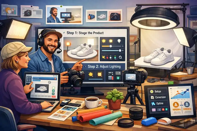
High-converting ecommerce photography doesn’t require a studio or expensive gear. What it really needs is intention.
When every image is planned around how shoppers visually process information, conversion rates tend to follow.
Choosing Backgrounds That Keep Focus On The Product
Backgrounds should disappear, not compete. The goal is clarity, not creativity for its own sake.
What usually works best:
- White or light neutral backgrounds for main images
- Subtle textures for secondary shots
- Zero visual noise near edges
I’ve tested patterned and colorful backgrounds many times. They can work for lifestyle shots, but for core product images, simple backgrounds consistently win. They load faster, compress better, and make products easier to evaluate at a glance.
Positioning Products To Emphasize Shape And Function
How you position a product subtly teaches shoppers how it works. This is especially important for functional items.
Ask yourself:
- What problem does this product solve visually?
- Which angle shows its purpose instantly?
- Where does the eye naturally land first?
For example, with kitchen tools, showing the working edge often converts better than a straight-on beauty shot. In ecommerce photography, clarity beats aesthetics when sales are the goal.
Framing Shots To Guide The Shopper’s Eye Naturally
Good framing creates a visual path. Poor framing creates friction.
Effective framing techniques include:
- Placing the product slightly off-center
- Leaving breathing room around key features
- Using diagonal lines to guide attention
I’ve noticed that tightly cropped images often feel aggressive on mobile. Giving products space makes them feel premium and easier to understand, especially on small screens.
Shooting Multiple Variations For Smarter Image Testing
You don’t need more products to improve sales. Sometimes you just need better image options.
I suggest shooting:
- Two main hero variations
- One detail-focused close-up
- One context or lifestyle version
This gives you flexibility to test without reshooting. Swapping a hero image alone has doubled conversion rates in some tests I’ve run, especially on paid traffic landing pages.
Lighting Techniques That Make Products Look Premium
Lighting is the difference between “cheap” and “considered.” Even budget products can look high-end with thoughtful lighting, while expensive items can look flat with bad light.
Using Natural Light To Create Clean, Honest Images
Natural light is forgiving and realistic, which makes it perfect for ecommerce photography.
Best practices I follow:
- Shoot near a window with indirect light
- Avoid direct sunlight hitting the product
- Use white foam boards to bounce light
Natural light reveals texture accurately, which builds trust. It’s also easier to replicate, helping you maintain consistency across shoots.
Controlling Shadows To Add Depth Without Distraction
Shadows aren’t the enemy. Bad shadows are.
What to aim for:
- Soft shadows that define shape
- No harsh lines cutting through the product
- Consistent shadow direction across images
I usually adjust shadows before highlights in editing. Depth makes products feel tangible, which matters when shoppers can’t touch them.
Avoiding Harsh Highlights That Cheapen Product Appeal
Harsh highlights flatten details and create glare, especially on reflective surfaces.
To reduce them:
- Diffuse light using curtains or softboxes
- Change angles instead of increasing brightness
- Lower contrast during editing, not exposure
In my experience, glare-heavy images reduce perceived quality instantly, even when the product itself is well-made.
Creating Consistent Lighting Across Your Catalog
Inconsistent lighting makes your store feel stitched together from different sources. Consistency makes it feel intentional.
Simple consistency rules:
- Same time of day for shoots
- Same light direction every time
- Same editing presets across products
When lighting stays consistent, your brand looks stronger as a whole. Shoppers may not notice why, but they feel it—and that feeling influences buying decisions.
Pro tip: If you’re short on time, start by improving just one thing—your main product image lighting. In my experience, that single change often delivers the fastest sales lift with the least effort.
Lifestyle Images That Help Shoppers Visualize Ownership
Lifestyle images bridge the gap between browsing and believing. This is where ecommerce photography stops being about the product alone and starts being about the customer’s life.
When done right, these images answer the unspoken question: “What will this feel like once I own it?”
Showing Products In Everyday Use Scenarios
People trust what feels familiar. A product floating on a white background is useful, but a product being used feels believable.
I always suggest showing the product in a moment your buyer recognizes instantly. Think daily routines, not staged perfection. A coffee mug on a messy desk often converts better than one on a spotless marble counter.
Here’s what tends to work best:
- Real actions: Pouring, holding, wearing, opening.
- Natural imperfections: Wrinkles, crumbs, water drops.
- Human presence: Hands or partial faces instead of full models.
I once tested lifestyle images for a home office product where we swapped a “Pinterest-perfect” setup for a slightly cluttered desk. Conversion rate increased by 18% because shoppers saw themselves in the scene.
Matching Lifestyle Scenes To Your Target Audience
Lifestyle images fail when they show the wrong life. This happens more often than people admit.
Before shooting, I ask one simple question: Who is this actually for? A fitness brand targeting beginners shouldn’t show elite athletes. A budget-friendly product shouldn’t live in a luxury penthouse.
Helpful alignment checks:
- Environment: Apartment vs house, urban vs suburban.
- People: Age range, style, body type.
- Mood: Calm, energetic, practical, playful.
When ecommerce photography reflects the buyer’s reality, trust forms faster. When it doesn’t, shoppers scroll past without knowing why.
Balancing Lifestyle Shots With Clear Product Visibility
Lifestyle images should support clarity, not replace it. A common mistake is hiding the product behind mood.
I usually follow a simple ratio:
- One clear hero image
- One to two lifestyle images
- One detail-focused close-up
If a shopper has to hunt for the product inside the image, the image is doing too much. Lifestyle shots should add context, not confusion.
Using Context To Trigger Emotional Buying Decisions
Emotion closes the gap logic can’t. Context helps shoppers imagine outcomes, not features.
Strong emotional triggers often include:
- Comfort: Relaxation, ease, relief.
- Belonging: Family moments, shared experiences.
- Progress: Before-and-after or problem-to-solution moments.
From what I’ve seen, lifestyle images that show the “after” moment consistently outperform generic usage shots. They don’t just show ownership, they show payoff.
Mobile-First Ecommerce Photography For Modern Shoppers

Most shoppers meet your product on a phone first. If your ecommerce photography only looks good on desktop, you’re losing sales quietly and consistently.
Cropping Images For Small Screens Without Losing Detail
Desktop crops don’t translate well to mobile. Details vanish. Impact disappears.
I recommend starting crops with mobile in mind:
- Tighter framing around the product
- Minimal empty space
- Clear separation from background
A good rule I use: If the product isn’t instantly recognizable at thumbnail size, the crop needs work. Mobile shoppers decide fast.
Keeping Key Product Features Visible On Mobile
Mobile images should answer the most important question immediately.
Ask yourself:
- What is this product, instantly?
- What makes it different?
- What feature removes doubt?
I often create one image purely for mobile that highlights the main benefit, even if it feels redundant on desktop. That redundancy usually pays off.
Avoiding Tiny Props That Disappear On Phones
Props add context, but on mobile they can become visual noise.
Common mistakes include:
- Overusing small decorative items
- Thin text overlays
- Busy backgrounds
If a prop doesn’t help explain size, use, or benefit, remove it. Mobile rewards simplicity more than creativity.
Testing Images On Real Devices Before Publishing
This step is skipped more than it should be.
Before publishing, I always:
- Check images on my phone
- Scroll like a shopper, not a marketer
- View images in poor lighting conditions
I’ve caught more conversion-killing issues on a phone than in any analytics tool. Real-world testing beats theory every time.
Image Optimization Mistakes That Quietly Kill Sales
You can have beautiful images and still lose sales if performance and consistency are ignored. These issues don’t scream for attention, but they chip away at trust and patience.
Using Low-Resolution Images That Reduce Perceived Value
Blurry images signal cheapness, even when the product isn’t cheap.
Shoppers associate image quality with product quality. Period.
What I aim for:
- Sharp images at full zoom
- No visible pixelation
- Clear texture and edges
According to Google, 53% of mobile users abandon sites that take longer than three seconds to load, but clarity still matters. Balance resolution with performance.
Ignoring Load Speed And Image Compression Best Practices
Heavy images slow everything down.
Simple fixes that work:
- Compress images without visible quality loss
- Use modern formats when supported
- Avoid uploading straight from the camera
I’ve seen page speed improvements alone increase conversion rates by 5–10%, especially on mobile traffic.
Inconsistent Image Sizes That Break Store Layouts
When images jump in size as shoppers scroll, it feels sloppy.
Consistency helps with:
- Visual flow
- Professional appearance
- Easier comparison between products
I recommend setting strict image dimensions and sticking to them across the entire catalog. It’s boring work, but it pays off.
Forgetting Alt Text And Accessibility Signals
Alt text isn’t just for SEO. It’s for people.
Alt text helps:
- Screen readers for visually impaired users
- Search engines understand images
- Images load meaningfully if they fail
Write alt text like you’re describing the product to a friend who can’t see it. Clear, honest, and specific.
Best practice: If you’re overwhelmed, fix mobile image clarity first. In my experience, improving mobile-first ecommerce photography delivers faster gains than almost any other visual change.
I’m Juxhin, the voice behind The Justifiable.
I’ve spent 6+ years building blogs, managing affiliate campaigns, and testing the messy world of online business. Here, I cut the fluff and share the strategies that actually move the needle — so you can build income that’s sustainable, not speculative.


