Table of Contents
Some links on The Justifiable are affiliate links, meaning we may earn a small commission at no extra cost to you. Read full disclaimer.
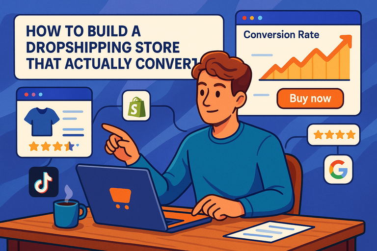
Build an ecommerce store today and you’ll find more tools, templates, and platforms than ever. The hard part isn’t getting online—it’s turning visitors into buyers.
You can have polished visuals, smooth navigation, and a full product catalog, yet still struggle with sales if the store isn’t built to convert.
Traffic without purchases is just noise. What actually matters is creating an ecommerce store that guides users, builds trust, and makes buying feel effortless.
In this guide, I’ll walk you through how to build an ecommerce store that turns browsers into buyers. What truly makes an ecommerce store convert—and how can you design, write, and optimize every element to make that happen?
Let’s break it down step-by-step.
Identify Your Ideal Ecommerce Audience
Before you sell anything, you need to know exactly who you’re talking to. Understanding your audience is what separates a struggling ecommerce store from one that thrives effortlessly.
When you know who you’re selling to, every design choice, headline, and product description becomes sharper and more persuasive.
Define Your Target Customer Persona
A customer persona is a semi-fictional profile of your ideal buyer. It helps you create content, offers, and designs that speak directly to them. Think of it as building a real person from your data.
Start by looking at:
- Demographics: Age, gender, location, and income range.
- Psychographics: What they value, their hobbies, and how they make buying decisions.
- Behavioral data: How often they shop, what devices they use, and which products catch their eye.
For example, if your ecommerce store sells eco-friendly skincare, your ideal customer might be “Sophie,” a 28-year-old urban professional who values sustainability and avoids synthetic ingredients. Once you have Sophie in mind, you can tailor everything—from imagery to ad copy—to match her lifestyle.
I suggest using analytics tools like Google Analytics (Audience > Demographics > Overview) and Meta Audience Insights to collect real data before shaping your persona. Don’t rely on guesswork; real numbers guide profitable decisions.
Understand Buying Triggers and Pain Points
People don’t buy products—they buy solutions to their problems. The trick is identifying what pain point your product relieves and what emotional trigger drives the purchase.
- Pain points: These could be time-saving, money-saving, or emotional. For instance, someone buying noise-cancelling headphones isn’t just after better sound—they crave focus and peace.
- Triggers: Discounts, urgency, social proof, and personal identity all play major roles in buying decisions.
In my experience, interviewing 5–10 past customers often reveals insights that analytics can’t. You’ll uncover phrases like, “I just wanted something that…” and that’s your golden copy.
Map the Customer Journey to Your Store Experience
Once you know who your customer is and what drives them, map out how they’ll interact with your ecommerce store—from discovery to checkout.
A simple Customer Journey Map might include:
- Awareness: They find your store through a Google search or Instagram ad.
- Consideration: They browse your homepage and product listings.
- Decision: They read reviews, compare prices, and proceed to checkout.
- Post-purchase: They receive your follow-up email or loyalty discount.
Each stage needs tailored messaging and UX design. For example, during the “consideration” stage, having a comparison table or FAQ section on the product page can remove hesitation.
I advise using tools like Hotjar or Microsoft Clarity to visualize user sessions. Watch how people actually move through your store—where they pause, click, or drop off—and adjust accordingly.
Choose the Right Ecommerce Platform for Growth

The foundation of your ecommerce store determines how far and how fast you can scale. Choosing the right platform isn’t about trends—it’s about matching your business goals with the right tech ecosystem.
Compare Leading Platforms: Shopify, WooCommerce, and BigCommerce
Let’s get real—these are the heavyweights. Each has its strengths depending on your goals and technical comfort.
| Platform | Best For | Pros | Cons |
| Shopify | Beginners to mid-size brands | Easy setup, beautiful themes, powerful integrations | Monthly fees, limited code flexibility |
| WooCommerce | WordPress users who want full control | Highly customizable, open-source, large plugin library | Requires hosting and updates |
| BigCommerce | Scaling or enterprise businesses | Handles large catalogs, strong SEO structure | Slightly steeper learning curve |
If you want an easy start with minimal hassle, Shopify is fantastic. But if you prefer flexibility and already use WordPress, WooCommerce gives unmatched control.
BigCommerce shines when you’re ready to scale without switching platforms later.
Evaluate Scalability, Customization, and Ease of Use
I believe the best ecommerce store platform grows with you, not against you.
- Scalability: Shopify Plus and BigCommerce Enterprise handle high traffic effortlessly, while WooCommerce depends on your hosting plan.
- Customization: WooCommerce wins for deep customization (ideal if you like tweaking code or design).
- Ease of Use: Shopify’s drag-and-drop builder makes setup fast even for non-tech users.
Try each platform’s free trial. You’ll quickly see whether the dashboard feels intuitive or frustrating. If you can’t navigate it easily now, scaling later will be painful.
Select the Best Platform Based on Your Business Goals
Your platform decision should always come back to goals. Are you optimizing for speed to market, creative control, or long-term scalability?
For example:
- If your goal is to launch fast and validate an idea, go with Shopify.
- If your priority is building brand uniqueness and SEO control, WooCommerce is ideal.
- If you already handle large inventories or multiple channels, BigCommerce is your best bet.
My personal approach is to list your must-haves (like multi-currency checkout or subscription billing) and test how easily each platform supports them. Let your requirements—not marketing hype—lead the choice.
Design a High-Converting Store Layout
Your ecommerce store’s design isn’t just about beauty—it’s about psychology. The right layout gently guides visitors toward making a purchase without them even realizing it.
Structure Pages for Seamless Navigation
Visitors should never have to “think” about how to get from one place to another. The navigation bar, categories, and filters should be self-explanatory.
Here’s a simple best-practice flow:
- Top menu: Home, Shop, About, Contact, and a visible Cart icon.
- Product filters: Sort by price, popularity, and category for faster discovery.
- Sticky header: Keeps key links visible while users scroll.
I recommend testing navigation clarity by asking a friend or family member to find a specific product. If they take longer than 10 seconds, simplify your layout.
Use Visual Hierarchy to Guide Buyer Attention
Visual hierarchy is how you direct the eye—bigger elements get more attention. Think of it like storytelling with design.
- Hero banner: Showcase one flagship product or offer at the top.
- CTA (Call-to-Action) buttons: Use strong action verbs like “Get Yours” or “Add to Cart.”
- Whitespace: Give elements breathing room; clutter kills conversions.
In my experience, subtle contrasts in color or font weight (not size alone) can improve clarity dramatically. If you use Shopify, the “Dawn” theme already has great built-in hierarchy to work with.
Optimize Product Pages for Clarity and Impact
This is where your visitors decide to buy—or bounce. Product pages need to blend persuasive content, visuals, and trust signals seamlessly.
Focus on:
- Above-the-fold info: Include product image, price, and “Add to Cart” button visible immediately.
- Detailed yet skimmable descriptions: Lead with benefits, then explain features.
- Trust builders: Show reviews, guarantees, and shipping info near the CTA.
A study by Baymard Institute found that 70% of ecommerce sites fail basic UX tests on product pages. Small fixes like clearer CTAs or improved image galleries can lift conversions by 20–30%.
I suggest revisiting your top-selling product page and viewing it as a first-time visitor. Ask yourself: “Would I buy this without hesitation?” If not, refine your message until the answer is yes.
Expert Tip: Every ecommerce store should be designed like a guided conversation, not a catalog. You’re not just displaying products—you’re leading people to a confident “yes.”
Write Compelling Product Descriptions That Sell
Your product descriptions can make or break a sale. The best ecommerce store copy feels like a helpful conversation — not a sales pitch.
You want readers to see themselves using your product and to feel like it was made just for them.
Use Benefit-Driven Copy Instead of Just Features
People don’t buy a product because of what it is — they buy it because of what it does for them. A feature describes; a benefit convinces.
Let’s say you’re selling wireless earbuds. A feature might say, “Bluetooth 5.2 technology.” That’s factual, but it doesn’t sell. A benefit version could say, “Experience crystal-clear sound and zero dropouts, even when you’re on the move.”
Here’s how to make that shift:
- List all features first, then rewrite each one as a benefit by asking “So what?”
- Use the word “you” to personalize. Example: “You’ll enjoy seamless listening without tangled wires.”
- Paint a quick outcome: Show what life looks like after owning the product.
I believe every product description should be a short story about transformation — how the buyer’s day improves because they chose your product. That emotional framing is what sticks.
Integrate Persuasive Storytelling for Emotional Connection
Every product has a story, even if you haven’t told it yet. Storytelling turns a generic ecommerce listing into an emotional experience.
You could share:
- The origin story: Why you created the product or what problem inspired it.
- The user story: How a real person used it to solve a pain point.
- The transformation: What changed after using it.
For example, if you sell handmade candles, tell how they’re crafted by local artisans using sustainable wax. That instantly creates authenticity.
In my experience, stories outperform sterile descriptions by up to 30% in conversion rates. Platforms like Shopify even let you add a “Product Story” section under the description. Use it — people love to connect before they click “Add to Cart.”
Include Power Words and Sensory Details to Boost Conversions
Power words trigger emotion. Sensory details trigger imagination. When you combine the two, your product descriptions become irresistible.
- Power words include terms like “luxurious,” “instant,” “exclusive,” and “guaranteed.”
- Sensory words appeal to sight, touch, and emotion — “silky,” “crisp,” “aromatic,” or “vibrant.”
Example rewrite: Instead of “Our sheets are made from premium cotton,” say, “Wrap yourself in silky, hotel-quality cotton sheets that stay crisp and cool all night.”
I recommend reading your descriptions out loud. If they sound flat, they’ll read flat. Rewrite until they feel like an experience rather than a statement.
Optimize Product Images and Videos for Trust
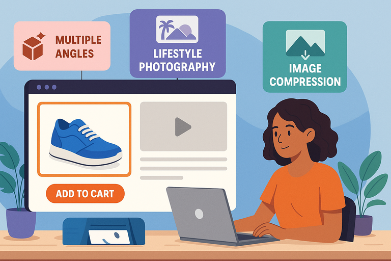
Images sell faster than words — but only when they build trust. Customers can’t touch or test your product, so visuals need to create certainty, not doubt.
Showcase Products from Multiple Angles and Contexts
People want to know exactly what they’re buying. Show your product from every practical and emotional angle.
- Front, side, and close-up views help customers understand details.
- Context shots show the product in use. For example, a backpack on a person, not just floating on a white background.
- Zoom feature: Ensure images open in high resolution when clicked.
If you’re using Shopify, go to Products > Media > Add Files. Upload at least 4–6 high-quality images per item. In WooCommerce, you can add multiple gallery images under Product Data > Product Gallery.
I’ve found that including at least one “scale reference” image — like a hand holding the product — significantly reduces return rates because customers understand real-world size.
Use Lifestyle Photography to Increase Emotional Appeal
Lifestyle photography helps customers imagine your product in their own lives. It turns “a shirt” into “your new favorite weekend outfit.”
Here’s what works:
- Tell a story visually: A fitness brand could show someone lacing up shoes at sunrise.
- Match your brand aesthetic: If your ecommerce store sells minimalist decor, keep the photos clean and airy.
- Feature real people: Stock photos feel sterile; authentic faces build trust.
I suggest A/B testing your main product image — one clean product shot versus one lifestyle shot. In many cases, lifestyle images improve click-through rates by up to 20%.
Compress and Format Images for Speed Without Losing Quality
Even the best images fail if your store loads slowly. According to Google, a delay of just 1 second can drop conversion rates by 7%.
Here’s how to fix that:
- Compress images: Use tools like TinyPNG or EWWW to reduce file size without quality loss.
- Use the right format: JPG for photos, PNG for transparent graphics, and WebP for balance between quality and size.
- Lazy loading: Load images only when users scroll to them (Shopify and WooCommerce both support this).
I recommend testing your site speed with Google PageSpeed Insights. Aim for a score above 90 on mobile — that’s where most ecommerce traffic comes from.
Simplify the Checkout Process to Reduce Abandonment
Cart abandonment is the silent killer of ecommerce stores. Roughly 70% of shoppers who add products to their cart never complete the purchase. The simpler your checkout, the better your conversion rate.
Minimize Steps and Required Fields
Your checkout should feel effortless — not like filling out a government form. Every unnecessary step is a potential exit point.
- Limit checkout to one or two pages. One-page checkouts often outperform multi-step ones.
- Ask only essential details: Name, shipping address, and payment method.
- Use autofill: Pre-populate returning customers’ details when possible.
If you’re using Shopify, you can edit checkout settings under Settings > Checkout > Customer Information. Reduce fields like “Company Name” or “Address Line 2” unless absolutely needed.
I believe in testing the process yourself once a month. Pretend you’re a first-time customer and see if anything feels confusing or slow.
Offer Guest Checkout and Multiple Payment Options
Some people just want to buy and go. Forcing account creation can kill momentum.
Enable guest checkout alongside account creation. Offer several payment options like:
- Credit/Debit cards
- PayPal
- Apple Pay or Google Pay
- Buy-now-pay-later services like Klarna or Afterpay
In my experience, adding digital wallets alone can increase mobile conversion rates by up to 25%. Shoppers trust the familiar, so give them options they already use.
Use Trust Signals Like SSL Badges and Return Policies
Trust is non-negotiable in ecommerce. If customers sense even a hint of risk, they’ll back out before hitting “Pay Now.”
Add these visible trust signals:
- SSL certificate: Ensure your URL starts with https://. Most ecommerce platforms include this automatically.
- Security badges: Display recognizable ones like Norton or McAfee Secure.
- Clear return policy: Place a short, reassuring note near the “Buy” button, like “30-day hassle-free returns.”
I suggest also showing social proof — a few recent reviews or a “Verified Buyer” badge next to the product. That’s the subtle nudge customers need to feel confident.
Pro Tip: A high-converting ecommerce store removes friction at every stage — from product description to checkout. The goal isn’t just to sell; it’s to make buying feel effortless, safe, and rewarding.
Leverage Psychological Triggers That Drive Sales
Selling online isn’t just about having the right product — it’s about understanding why people buy.
The most successful ecommerce stores use subtle psychological triggers that appeal to emotion and logic at the same time.
These aren’t manipulative tactics; they’re proven ways to guide hesitant shoppers toward confident decisions.
Apply Scarcity and Urgency the Right Way
Scarcity and urgency are powerful motivators because they tap into our fear of missing out. But there’s a right way and a wrong way to use them.
When done well, scarcity should inform your customer, not pressure them. Instead of flashing aggressive countdown timers, create natural, believable prompts.
Here’s how to apply it smartly:
- Show real inventory counts: “Only 3 left in stock — order soon.”
- Use limited-time offers carefully: Offer genuine discounts that expire for a reason, like seasonal clearance.
- Highlight popularity: Phrases like “Selling fast” or “Back by popular demand” subtly signal demand.
For example, if your ecommerce store sells handmade leather bags, you might add: “Each bag is handcrafted in small batches, and restocks take 3 weeks.” That feels authentic and builds anticipation without overhyping.
I advise testing urgency triggers in moderation. Overusing them can backfire and make shoppers doubt your honesty.
Use Social Proof Through Reviews and Testimonials
Humans are wired to look for reassurance before taking action. That’s where social proof comes in. In ecommerce, reviews, testimonials, and user-generated photos do the selling for you.
Here’s what works best:
- Display star ratings near product titles: This helps shoppers judge credibility instantly.
- Show real customer photos: A photo review builds trust faster than any branded image.
- Feature short testimonials: Highlight a few sentences about how the product solved a problem.
In Shopify, go to Apps > Product Reviews to install a review app like Judge.me or Loox. On WooCommerce, enable reviews under Products > Advanced > Reviews.
I’ve seen conversion lifts of 20–40% simply from adding genuine customer feedback sections. If you don’t have many reviews yet, encourage them through post-purchase emails or loyalty rewards.
Create Anchoring with Pricing and Product Bundles
Anchoring is a pricing psychology tactic that helps customers perceive value by comparison. The first price they see sets a “mental anchor” for everything else.
You can use it like this:
- Show an original price crossed out: “$79 → Now $59.” The discount feels more tangible.
- Offer tiered pricing: Display three product versions — Basic, Plus, and Premium. Most shoppers pick the middle option because it feels like the best value.
- Bundle products: Sell complementary items together at a small discount. Example: “Buy a coffee grinder and get 20% off coffee beans.”
In my experience, bundles work especially well in categories like beauty, fitness, and electronics — anywhere customers buy sets. It’s a simple strategy to boost average order value without increasing traffic.
Optimize for Mobile Shopping Experience

More than 70% of ecommerce traffic now comes from mobile devices. If your store isn’t optimized for small screens, you’re losing sales every single day.
Mobile optimization isn’t just resizing content — it’s about rethinking how users browse and buy on the go.
Ensure Responsive Design Across All Devices
A responsive design means your website automatically adapts to different screen sizes. Text, buttons, and images adjust without breaking layout or functionality.
Here’s what I suggest checking:
- Font size: Minimum 16px for readability.
- Buttons: Make them thumb-friendly (at least 48px tall).
- Test across devices: Use Chrome DevTools (right-click → Inspect → Toggle Device Toolbar) to preview your site on mobile and tablet.
If you’re using Shopify, most modern themes (like “Dawn” or “Impulse”) are responsive by default. WooCommerce users can test their theme responsiveness with tools like Responsinator.
The goal is simple: users shouldn’t have to pinch, zoom, or scroll sideways to shop.
Simplify Navigation for Smaller Screens
Mobile users are impatient. They want to find what they’re looking for in a few taps. Cluttered menus and endless scrolling kill conversions fast.
To simplify navigation:
- Use a hamburger menu: Keeps navigation clean and collapsible.
- Add a sticky “Cart” and “Search” icon: Keeps key actions always accessible.
- Use predictive search: Suggest results as users type. Shopify offers this feature natively under Online Store > Navigation > Search Settings.
I recommend analyzing mobile heatmaps using Hotjar or Microsoft Clarity. You’ll literally see where users get stuck or lose patience — and where to streamline design.
Test Mobile Checkout Performance Regularly
Even small checkout friction can cause mobile users to drop off. Every extra tap or slow load adds risk.
To optimize mobile checkout:
- Use auto-detect fields: Automatically fill city/state when zip code is entered.
- Enable digital wallets: Let users pay via Apple Pay, Google Pay, or PayPal with one tap.
- Streamline confirmation pages: Show order summary and reassurance in a clean, minimal layout.
From what I’ve seen, reducing checkout steps from three to two can improve mobile conversions by 20% or more. Test it monthly — user expectations evolve quickly.
Improve Site Speed and Performance for Conversions
Speed is silent persuasion. A fast ecommerce store tells visitors, “This brand values your time.” A slow one silently loses trust — and traffic.
Every second of delay after the first three seconds can lower conversions by up to 7%.
Analyze Load Times Using Tools Like Google PageSpeed Insights
Start by running your store through GTmetrix. These tools break down what’s slowing you down — images, JavaScript, or hosting issues.
Pay attention to three metrics:
- LCP (Largest Contentful Paint): Should load under 2.5 seconds.
- FID (First Input Delay): Should be below 100ms for smooth interactivity.
- CLS (Cumulative Layout Shift): Should stay under 0.1 to avoid layout jumps.
I recommend running separate tests for both mobile and desktop. Mobile often performs worse due to image weight and third-party scripts.
Optimize Images, Scripts, and Hosting Infrastructure
Once you know your performance bottlenecks, tackle them one by one.
- Images: Compress them with TinyPNG or convert to WebP.
- Scripts: Minify and defer non-critical JavaScript using apps like Litespeed Cache or WP Rocket.
- Hosting: Choose a fast, reliable provider. On WPengine, Inmotion Hosting and Hostinger are solid. For Shopify, your hosting is already optimized.
I believe investing in speed is one of the best ROIs in ecommerce. Even a 1-second improvement can increase conversions, reduce bounce rate, and improve SEO ranking.
Implement Lazy Loading for Faster User Experience
Lazy loading is a simple but powerful trick. It loads images and videos only when users scroll to them, reducing the initial page weight.
You can enable it easily:
- In Shopify: Most modern themes have lazy loading built-in. If not, install a free app like “LazyLoad by Magic ToolBox.”
- In WooCommerce: Use plugins like a3 Lazy Load or WP Rocket.
I suggest testing your store after enabling it — especially product pages with multiple images. You’ll likely notice faster perceived load times and smoother browsing.
Expert Tip: A high-performing ecommerce store feels invisible — everything loads quickly, looks great on mobile, and gently nudges customers to buy without friction. The secret isn’t adding more; it’s removing what slows, distracts, or confuses.
Implement SEO Strategies for Ecommerce Visibility
If you want your ecommerce store to bring in steady, qualified traffic, SEO isn’t optional—it’s essential. The goal isn’t just to rank high on Google, but to attract buyers, not browsers.
I believe good SEO blends search psychology, user experience, and technical structure into one seamless ecosystem.
Research and Target High-Intent Product Keywords
Every ecommerce SEO strategy starts with keyword intent. High-intent keywords are the ones that show buying signals—words like “buy,” “discount,” or “free shipping.” These aren’t just searches; they’re digital footsteps of people ready to purchase.
Here’s how to find them:
- Use tools like Ahrefs. Type in your main product (e.g., “wireless earbuds”) and look for transactional phrases like “best wireless earbuds under $100.”
- Check autocomplete suggestions on Google and Amazon. These are real phrases people type before purchasing.
- Analyze competitors. Search your product category and see which keywords top-ranking stores target in their titles and meta descriptions.
Example: If your store sells eco-friendly skincare, keywords like “organic face moisturizer for dry skin” or “vegan anti-aging serum” attract buyers who already know what they want.
I suggest creating one main keyword per product page, supported by 2–3 semantic variations. This prevents keyword cannibalization and strengthens relevance.
Optimize Metadata, URLs, and Product Schema
Once you know your keywords, the next step is to make search engines understand your store’s content clearly. Metadata and structured data are your behind-the-scenes sales reps.
- Title tags: Keep under 60 characters and include your main keyword naturally. Example: “Vegan Face Moisturizer – Hydrating & Cruelty-Free | GlowSkin.”
- Meta descriptions: Write for humans first. Include a benefit and a soft CTA like “Shop now for free shipping.”
- URLs: Keep them short and descriptive (e.g., yourstore.com/products/vegan-face-moisturizer). Avoid auto-generated strings like ?p=12345.
- Schema markup: Add Product Schema to help Google display price, ratings, and availability directly in search results.
If you’re using Shopify, go to Online Store > Preferences to edit title and meta tags. For WooCommerce, install a plugin like Rank Math—it automatically handles structured data.
I’ve seen stores gain a 25–40% increase in organic CTR (click-through rate) just by cleaning up metadata. It’s one of the simplest SEO wins you can implement.
Build Internal Linking and Category Hierarchies Strategically
Search engines love clear architecture. When your ecommerce store has a logical flow—categories, subcategories, and product pages—it becomes easier for both users and Google to navigate.
Here’s what works:
- Keep the structure flat: No page should be more than three clicks from the homepage.
- Use descriptive anchor text: Instead of “click here,” link with “shop waterproof hiking boots.”
- Create contextual links: Mention related products or complementary items within blog posts or product descriptions.
For example, if your store sells outdoor gear, your category hierarchy might look like:
Home > Hiking > Footwear > Waterproof Hiking Boots.
I advise using tools like Screaming Frog to crawl your site. It shows broken links and pages that lack internal connections. Fixing these not only boosts SEO but improves user experience too.
Use Email Marketing to Recover and Retain Customers

Email marketing remains one of the highest-ROI channels for ecommerce. According to HubSpot, every $1 spent on email can generate up to $36 in return.
But the secret isn’t sending more emails—it’s sending the right ones at the right time.
Set Up Abandoned Cart Sequences That Convert
Abandoned carts are painful but fixable. Roughly 70% of shoppers leave items in their carts. Automated recovery emails can reclaim up to 15–20% of those lost sales.
Here’s an effective three-email sequence:
- Email 1 (1 hour after abandonment): A friendly reminder—“Did something go wrong?”
- Email 2 (12–24 hours later): Add value—highlight benefits or include a short testimonial.
- Email 3 (48 hours later): Offer a small incentive like free shipping or a 10% discount.
Most ecommerce platforms like Shopify have abandoned cart automation under Marketing > Automations. In Klaviyo, you can build this workflow visually and segment based on total cart value.
I’ve tested this personally—adding just one reminder email often recovers 5–8% of lost checkouts. It’s one of the easiest automation wins you can implement.
Personalize Post-Purchase Follow-Ups for Loyalty
Once a customer buys, the relationship is just beginning. Personalized follow-up emails help build loyalty, encourage reviews, and promote repeat purchases.
Ideas that work well:
- Order confirmation: Make it friendly and on-brand, not robotic.
- Product care tips: Help customers get the most out of what they bought.
- Reorder reminders: Perfect for consumables like supplements or beauty products.
For instance, if someone buys a reusable water bottle, a follow-up email two weeks later could say: “How’s your hydration journey going? Here are 3 ways to keep your bottle sparkling clean.”
I believe showing genuine care after the sale makes your brand unforgettable. Customers remember helpfulness more than discounts.
Segment Audiences for Better Email Relevance
Sending every email to everyone is a quick way to lose subscribers. Segmentation ensures each message feels personal and relevant.
Segment by:
- Behavior: Browsing history or abandoned products.
- Purchase frequency: First-time buyers vs loyal customers.
- Location or interests: Seasonal promotions for specific regions.
In Klaviyo, you can create segments like “Customers who haven’t purchased in 90 days” or “Browsed but didn’t buy.” This lets you tailor messages perfectly.
I recommend starting with three key segments: New customers, repeat buyers, and inactive subscribers. From there, you can refine further. Even small personalization tweaks can increase open rates by 20–30%.
Analyze Data and Continuously Optimize Performance
Your ecommerce store isn’t a “set it and forget it” system. The best stores evolve constantly—measuring, testing, and refining every part of the funnel.
Track Key Metrics Like Conversion Rate and Bounce Rate
You can’t improve what you don’t measure. Every decision should be backed by data, not gut feelings.
Focus on these essential metrics:
- Conversion rate: Percentage of visitors who buy. A healthy range for ecommerce is 2–4%.
- Bounce rate: If it’s above 50%, visitors aren’t finding what they expected.
- Average order value (AOV): Measures upselling effectiveness.
- Customer lifetime value (CLV): Tracks long-term profitability.
You can track all of this using Google Analytics 4 (GA4). Go to Reports > Monetization > Overview to view revenue and conversion data.
I recommend setting a monthly analytics review to identify trends and drop-offs. Small, consistent adjustments add up faster than big, infrequent overhauls.
Use A/B Testing to Validate Design and Copy Changes
A/B testing (also known as split testing) compares two versions of a webpage or element to see which performs better.
Examples of what to test:
- Headlines: “Free Shipping on All Orders” vs “Free Shipping Today Only.”
- CTA buttons: Color, size, or wording.
- Product images: Lifestyle vs studio photography.
Shopify users can install apps like “VWO” or “Neat A/B Testing.” WooCommerce users can use “Nelio A/B Testing.”
From what I’ve seen, even minor changes—like rewording a headline—can boost conversion rates by 10–15%. But don’t guess; let data make the call.
Iterate Based on Customer Behavior and Feedback
Your customers will tell you exactly what to improve—if you listen carefully.
Here’s how to collect and act on insights:
- Post-purchase surveys: Ask “What almost stopped you from buying today?”
- Heatmaps and recordings: Use Hotjar or Microsoft Clarity to see where users click or hesitate.
- Support ticket trends: Repeated questions often reveal UX issues.
I advise creating a monthly “insights log.” Record recurring feedback and patterns. Then prioritize fixes that directly impact the buying experience.
Ecommerce optimization is never truly finished—it’s a living, evolving process. The brands that win long-term are the ones that keep learning faster than their competitors.
Pro Tip: A profitable ecommerce store doesn’t just run on ads or design—it runs on clarity, data, and empathy. SEO brings people in, email nurtures them, and analytics keeps you improving. Treat each step as a dialogue with your customers, not just a transaction.
Add Upsells, Cross-Sells, and Loyalty Programs

Adding upsells, cross-sells, and loyalty programs isn’t about squeezing more money from customers—it’s about delivering more value.
When done right, these strategies help your ecommerce store create better shopping experiences, build stronger relationships, and increase customer lifetime value naturally.
Implement Smart Product Recommendations
Smart product recommendations feel like a helpful nudge, not a pushy upsell. They guide shoppers toward what truly complements their purchase.
Here’s how to make it work:
- Use behavior-based logic: Recommend products based on browsing or purchase history. For example, if someone buys a DSLR camera, show compatible lenses or tripods.
- Add “Frequently Bought Together” bundles: This small UI feature on Shopify (enabled under Apps > Frequently Bought Together) can boost order value by up to 20%.
- Include recommendations in the cart page: Subtly list “You might also like” products before checkout.
If you’re using WooCommerce, plugins like Recommendation Engine or Product Add-Ons Ultimate can automate this. The goal is to make every recommendation feel personalized—almost as if you’re reading the shopper’s mind.
I suggest A/B testing placement. Sometimes, recommendations work best right after adding a product to cart; other times, they perform better on product detail pages.
Use Loyalty Rewards to Encourage Repeat Purchases
Loyalty programs are powerful because they flip the mindset from “buy once” to “earn every time you shop.” It’s not about points—it’s about belonging.
Key ways to build an effective loyalty system:
- Create clear, easy-to-reach tiers: Start simple, like “Earn 1 point for every $1 spent.”
- Reward engagement beyond purchases: Offer points for referrals, reviews, or social media shares.
- Highlight benefits visibly: Add a loyalty banner or popup reminding customers how close they are to their next reward.
Shopify’s Smile.io or LoyaltyLion integrations are perfect examples. They let you create a custom rewards dashboard without coding.
I believe loyalty programs work best when paired with emotional storytelling.
For instance, a sustainable clothing brand could let customers convert points into donations for environmental causes. It builds loyalty and purpose at the same time.
Integrate Upsells During Checkout Without Distraction
Checkout upsells should feel seamless—not like an interruption. The art is in making the offer feel like a logical next step.
Practical approaches:
- Add one-click post-purchase upsells: Shopify’s Checkout Extensibility or apps like Zipify OneClickUpsell allow offers immediately after checkout.
- Bundle logical add-ons: Offer extended warranties, gift wrapping, or accessories.
- Keep design minimal: Use soft visuals and short copy like “Complete your order with…” instead of aggressive banners.
I advise testing one upsell per funnel. Overloading customers with options at checkout can create decision fatigue and reduce conversion rates. Keep it clean, contextual, and genuinely useful.
Build Brand Trust Through Transparency and Support
Trust is the invisible currency of ecommerce. You can have a stunning design and fast delivery, but without trust, sales stall. Building credibility starts with open communication and strong customer support.
Display Clear Shipping, Refund, and Privacy Policies
Customers want to know exactly what to expect—no hidden surprises. Clear policies reduce hesitation and refunds later.
Best practices:
- Place policy links in visible areas: Include them in your footer, product pages, and checkout screens.
- Write in plain language: Replace legal jargon with friendly, simple sentences. Example: “If something isn’t right, you have 30 days to return it—no questions asked.”
- Set realistic delivery expectations: If shipping takes 7–10 days, say so upfront. Transparency beats broken promises every time.
In Shopify, you can manage these pages under Settings > Policies. WooCommerce users can create static pages under Pages > Add New and link them in the footer menu.
I recommend updating policies quarterly to reflect new regulations or shipping partners. It shows customers your store stays reliable and compliant.
Offer Live Chat or AI-Powered Support for Quick Help
Real-time support builds trust faster than any FAQ section ever could. Customers feel safer knowing they can reach you if something goes wrong.
Consider these support tools:
- Tidio: Lets you chat directly from your store dashboard.
- AI-powered bots: Handle FAQs or product questions instantly while routing complex issues to humans.
- 24/7 presence: Even if you can’t offer human chat all day, ensure customers can leave messages.
I suggest adding a chat widget that matches your brand tone. Keep responses friendly and conversational—avoid robotic scripts. A simple “Hey there! Need help finding the right size?” feels warm and personal.
Highlight Ethical Practices and Social Responsibility
Today’s consumers care deeply about how and where products are made. Transparency about your sourcing, labor, and sustainability practices builds emotional connection.
Ways to demonstrate it:
- Show your process: Share behind-the-scenes photos or short videos about production.
- Use certifications: Display badges for fair trade, organic materials, or carbon-neutral shipping.
- Give back: Dedicate a small percentage of profits to a relevant cause.
For example, outdoor brands like Patagonia openly share repair policies and environmental commitments. That transparency translates into fierce customer loyalty.
I believe authenticity beats perfection. Even admitting where you’re improving (e.g., reducing packaging waste) makes your brand human and trustworthy.
Test, Measure, and Scale Your Ecommerce Store
Building a profitable ecommerce store isn’t a one-time project—it’s an evolving process. Continuous testing and analysis help you scale intelligently without burning resources.
Use Analytics Tools Like Google Analytics and Hotjar
Data tells the truth that assumptions often hide. Analytics platforms show exactly where your visitors come from, what they click, and where they drop off.
Key tools to start with:
- Google Analytics 4 (GA4): Tracks conversions, user flow, and average session duration.
- Hotjar: Provides heatmaps and screen recordings so you can see user behavior visually.
- Microsoft Clarity: A free alternative for tracking clicks and rage taps.
For example, if you notice users spend 20 seconds on a product page but never add to cart, your CTA might be too low or unclear. Data like this gives you direct action steps instead of guesswork.
I advise reviewing analytics weekly. Even small adjustments—like moving a button or rewriting a headline—can improve conversions over time.
Evaluate ROI on Marketing and Conversion Efforts
Scaling only works if you know what’s paying off. Track return on investment (ROI) for every marketing channel, from ads to influencer campaigns.
Here’s a simple framework:
- ROI formula: (Revenue – Cost) ÷ Cost × 100.
- Use UTM parameters: Add tracking tags to URLs to see which campaigns drive sales in Google Analytics.
- Monitor attribution: Tools like Triple Whale help identify which ads actually close the sale.
In my experience, many brands scale too fast without analyzing margins. I suggest pausing underperforming campaigns monthly to reallocate budgets toward proven winners.
Develop a Long-Term Optimization and Scaling Plan
Scaling isn’t just doing more—it’s doing better. Your ecommerce store should grow sustainably by refining what already works.
Here’s how to approach it:
- Automate repetitive tasks: Use email workflows, inventory alerts, and fulfillment automation to save time.
- Expand winning products: Double down on bestsellers by introducing variants or bundles.
- Optimize your tech stack: Add tools gradually, like Klaviyo for retention or ReCharge for subscriptions.
- Plan global expansion carefully: Localize currencies, languages, and delivery options before entering new markets.
I believe scaling is about steady, strategic growth—not explosive bursts that burn out resources. A consistent 10% monthly improvement beats random spikes any day.
Expert Tip: The best ecommerce stores evolve through curiosity, not complacency. Keep testing, keep improving, and keep listening. Every insight, review, or data point is a roadmap toward a more trustworthy, profitable, and resilient business.
I’m Juxhin, the voice behind The Justifiable.
I’ve spent 6+ years building blogs, managing affiliate campaigns, and testing the messy world of online business. Here, I cut the fluff and share the strategies that actually move the needle — so you can build income that’s sustainable, not speculative.
