
Table of Contents
Some links on The Justifiable are affiliate links, meaning we may earn a small commission at no extra cost to you. Read full disclaimer.
Creating an online store mistakes to avoid is one of those topics that looks simple until you are the one losing traffic, orders, and trust. A lot of store owners do not fail because their product is bad.
They fail because small setup decisions quietly damage conversion rates, margins, and customer experience.
In this guide, I’ll walk you through 15 expensive mistakes I see again and again, from picking the wrong platform to weak product pages, slow checkout, and poor retention.
The goal is simple: help you build a store that feels easier to buy from and much harder to ignore.
Start With The Right Foundation
Most store problems begin before the first product even goes live. If your setup is weak, every marketing effort later becomes more expensive and less effective.
Mistake 1: Choosing A Platform Based On Hype Instead Of Fit
A lot of people pick a platform because it is popular, not because it matches how they plan to sell. That usually creates friction later. You may end up with design limits, expensive add-ons, messy inventory workflows, or a checkout process that never feels right.
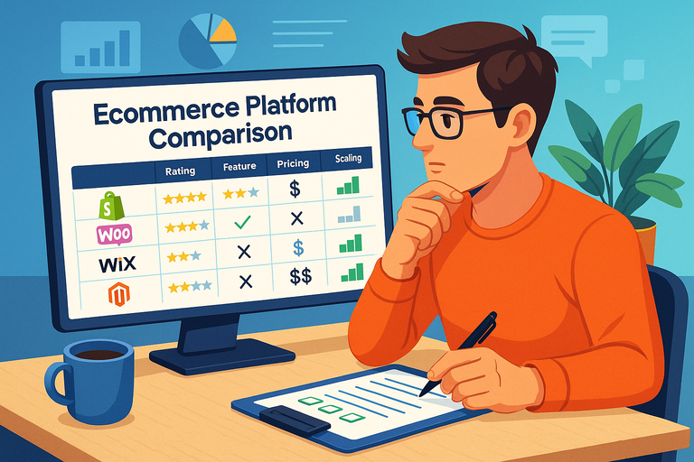
The better approach is to match the platform to your business model. If you want a fast, beginner-friendly setup with an app ecosystem, Shopify is usually the obvious short-list option. If you want more control inside WordPress, WooCommerce can make sense. If simplicity matters more than customization, Wix or Squarespace may be enough.
Here is how I suggest you think about it:
| Platform | Best For | Main Strength | Main Risk |
|---|---|---|---|
| Shopify | Fast-growing ecommerce brands | Easy setup and strong app ecosystem | Monthly costs can rise with apps |
| WooCommerce | WordPress users who want control | Flexible and highly customizable | More maintenance responsibility |
| Wix | Small stores needing simplicity | Easy to launch quickly | Less scalable for complex catalogs |
| Squarespace | Design-led small brands | Clean templates and simple editing | Fewer ecommerce-specific advanced options |
I believe this is one of the biggest online store setup mistakes because people treat platform choice like branding. It is really an operations decision. Pick for workflow, catalog complexity, budget, and growth stage.
Mistake 2: Building For Yourself Instead Of Your Customer
This mistake is sneaky because it feels creative. You pick colors you like, write copy you think sounds clever, and organize the store in a way that makes sense to you. Then visitors arrive and cannot quickly tell what you sell, who it is for, or why they should care.
Your store is not a portfolio. It is a buying environment. That means clarity matters more than originality. When someone lands on your homepage or product page, they should immediately understand the product, the benefit, the price range, and the next step.
Imagine you are selling premium dog supplements. You may love a minimalist homepage with a vague headline like “Wellness That Matters.” Your customer does not. They need “Daily Joint Support For Active Dogs” or something equally clear. Specific messaging converts because it reduces mental work.
A simple test helps here:
- Ask: Could a first-time visitor explain what I sell in five seconds?
- Check: Is the value proposition visible above the fold?
- Review: Do category names match how shoppers think, not how I talk internally?
- Simplify: Remove design elements that distract from product understanding.
In my experience, store owners often overestimate how much context shoppers have. They do not have any. Your job is to make the path obvious.
Mistake 3: Launching Without A Real Offer Positioning Strategy
A store can look polished and still feel weak because the offer is generic. “High quality products” is not a positioning strategy. Neither is “great customer service.” Those are expected, not differentiators.
You need a reason to buy from you instead of the next tab. That reason might be better bundling, a more specific niche, faster shipping, stronger education, cleaner ingredients, longer warranty coverage, or better product selection for a clearly defined use case.
Let me break it down. Strong positioning usually answers three things:
- Who it is for: New parents, home gym beginners, luxury skincare shoppers, busy dog owners
- What problem it solves: Saves time, reduces guesswork, improves results, lowers risk
- Why your version is better: Better format, smarter bundle, stronger materials, more targeted solution
A realistic example: Two stores sell standing desks. One says “modern desks for every office.” The other says “compact standing desks for small apartments and remote workers.” The second store is easier to remember and easier to buy from.
When you skip positioning, every ad gets more expensive because you are forcing traffic to do the interpretation work. Good positioning lowers resistance before checkout even begins.
Avoid Product Page Mistakes That Kill Conversions
Your product page is where curiosity becomes revenue. If the page creates doubt, confusion, or extra effort, the sale often disappears right there.
Mistake 4: Using Weak Product Titles And Thin Descriptions
One of the most common ecommerce mistakes is treating product descriptions like filler text. A title such as “Classic Bottle” or “Premium Hoodie” tells the shopper almost nothing. Thin descriptions make it worse. They leave out fit, use case, material, size expectations, compatibility, or actual outcomes.
A good product page does not just describe the item. It helps someone decide. That means your product title should be specific, and your description should answer the questions a cautious buyer would ask before purchasing.
Here is a stronger structure to follow:
- Title: Include product type plus useful detail, such as size, material, audience, or use case
- Opening line: State the core benefit in plain language
- Key details: Cover dimensions, compatibility, ingredients, materials, or performance specs
- Use scenario: Explain when and why someone would use it
- Risk reduction: Mention shipping, returns, warranty, or guarantees when relevant
For example, “Stainless Steel 32 oz Insulated Water Bottle For Hiking And Gym Use” beats “Adventure Bottle” because it does part of the selling immediately.
I recommend writing product pages as if the shopper cannot touch the item and does not trust marketing language. Because that is usually true.
Mistake 5: Relying On Pretty Images Without Selling The Product
Good images matter, but nice photography alone does not sell. The real job of product media is to remove uncertainty. If your images look beautiful but fail to show scale, use, texture, packaging, or important details, shoppers still hesitate.
This happens all the time with apparel, furniture, beauty, and tech accessories. The product is visible, but the buying questions remain unanswered. Is it small or oversized? Matte or shiny? Thick or lightweight? Does it fit a laptop, a carry-on, a narrow kitchen shelf, a specific skin concern?
Strong visual merchandising usually includes a mix of:
- Clean product shots: Clear angles on a neutral background
- Lifestyle images: The item in a real-world setting
- Scale references: A person, hand, room, or known object for size context
- Close-ups: Texture, finish, stitching, ingredients, ports, or packaging
- Demonstration visuals: Before-and-after or use-case images when appropriate
A simple example: If you sell a desk organizer, show it on an actual desk with pens, notebooks, and a laptop nearby. That image answers more questions than a studio photo by itself.
I have seen stores spend heavily on branding photos and still underperform because none of the images actually help the customer feel sure.
Mistake 6: Hiding Reviews, Shipping Details, Or Return Information
If shoppers have to hunt for trust signals, many of them leave. This is one of the most damaging creating an online store mistakes to avoid because it affects almost every traffic source. Paid traffic, SEO traffic, social traffic, and referral traffic all convert better when the store feels transparent.
Reviews matter because they provide social proof. Shipping details matter because customers want predictability. Return policies matter because they reduce risk. None of this should be buried in tiny footer links or hidden behind expandable sections that nobody notices.
Your product page should answer questions like these without making the visitor work:
- How long will delivery take?
- What does shipping cost?
- Is there a return window?
- What happens if the product does not fit or arrive damaged?
- Have other buyers had a good experience?
I suggest putting key reassurance close to the add-to-cart area. Not everything needs a long explanation. Often a short, visible summary is enough: fast dispatch, 30-day returns, secure checkout, verified reviews.
I believe a lot of ecommerce trust problems are not really trust problems at all. They are visibility problems. The reassurance exists, but the customer never sees it at the moment it matters.
That one change can reduce hesitation more than another homepage redesign.
Fix Store Experience Problems Before They Cost You Orders
A shopper may like your product and still abandon the purchase because using your store feels frustrating. That is why user experience is not decoration. It is sales infrastructure.
Mistake 7: Creating Confusing Navigation And Category Structure
If a customer cannot find products quickly, your acquisition cost goes up because your site is wasting the traffic you already paid for. Confusing navigation is especially common when store owners organize collections around internal logic instead of shopper intent.
The usual signs are clear: too many menu items, vague category labels, duplicate collections, or filter systems that break when the catalog grows. This problem gets worse on mobile, where space is tighter and patience is lower.
A better category structure follows how people actually shop. They usually think in terms of product type, use case, audience, problem, or style. They do not think in terms of your internal warehouse logic.
A practical way to improve navigation:
- Group by intent: “Running Shoes” is clearer than “Performance”
- Use plain labels: Avoid clever names unless the meaning is obvious
- Limit top-level choices: Too many options creates decision fatigue
- Make filters useful: Size, price, color, material, fit, compatibility
- Check search terms: Customer site searches often reveal missing categories
Imagine a skincare store with categories called “Glow,” “Renew,” and “Balance.” It sounds nice, but many shoppers would rather see “Cleansers,” “Serums,” “Moisturizers,” and “For Acne-Prone Skin.”
I suggest thinking like a tired shopper on a small phone. That mindset catches most navigation mistakes fast.
Mistake 8: Ignoring Mobile Experience Until After Launch
Many store owners still design on desktop first and assume mobile will be fine. It often is not. Buttons get crowded, images push important information too far down, sticky elements block content, and forms become annoying enough to kill conversions.
This matters because mobile shopping behavior is now normal, not secondary. Even when customers finish buying on desktop, they often discover products on mobile first. A weak mobile experience damages both direct conversions and return visits.
Here is where mobile pain usually shows up:
- Slow first impressions: Large media files delay loading
- Cluttered product pages: Important information gets buried under galleries and banners
- Difficult taps: Buttons or size selectors are too small
- Messy forms: Checkout fields feel tedious on a phone
- Poor sticky behavior: Popups and bars cover key content
I recommend auditing your store with one hand on an actual phone. That sounds obvious, but many people only preview mobile inside a builder. That is not the same thing as shopping on a real device while distracted.
A useful mini scenario: If a customer taps from Instagram during a lunch break, they should understand the offer, view the product, choose options, and add to cart within seconds. If your page makes that simple action feel like work, mobile is costing you money.
Mistake 9: Letting Site Speed Slip Because “It Still Loads”
Slow sites usually do not fail dramatically. They bleed revenue quietly. Pages load just slowly enough to create friction, lower engagement, and increase abandonment. That is why speed issues are dangerous. They feel tolerable until you compare them against faster competitors.
A lot of speed problems come from choices that seemed harmless at the time: oversized images, too many apps, auto-playing videos, bloated themes, unused scripts, or excessive tracking tools.
You do not need to become a developer to improve this. Start with a practical cleanup:
- Compress images: Especially homepage banners and product galleries
- Remove app clutter: Every extra script has a cost
- Use lightweight design choices: Fancy motion is rarely worth lost speed
- Test key pages: Homepage, collection pages, product pages, and checkout
- Review performance tools: PageSpeed Insights can help identify obvious bottlenecks
If you run on WordPress, caching and performance plugins such as WP Rocket may help, but I would still fix heavy assets and unnecessary features first.
In my experience, stores often obsess over conversion copy while ignoring speed. But a better headline cannot fix a page that feels slow and annoying to use.
Remove Checkout And Payment Friction
The closer a customer gets to paying, the more sensitive they become to friction. At checkout, small annoyances suddenly feel huge.
Mistake 10: Forcing Account Creation Before Purchase
This is one of those classic online store conversion mistakes that keeps showing up because it feels useful to the store owner. Yes, customer accounts can improve retention. But forcing sign-up before purchase often hurts first-order conversion.
A new shopper is not emotionally invested yet. They are trying to buy a product, not join a system. When checkout asks them to create a password before they can pay, you introduce extra work at the worst possible moment.
The smarter approach is simple:
- Offer guest checkout first
- Invite account creation after purchase
- Save benefits for later, such as order tracking or faster reordering
- Keep the path to payment short and obvious
Think about the psychology here. At the cart stage, motivation is still fragile. Every additional field creates another reason to delay. “I’ll come back later” often means never.
I usually recommend making account creation optional and framing it as a convenience, not a requirement. After the order is placed, you can offer a one-click account setup using the email they already entered.
That way you keep the conversion and still create a path to retention. You do not need to choose one or the other.
Mistake 11: Offering Limited Or Mismatched Payment Methods
Payment friction does not always come from technical failure. Sometimes the available methods simply do not match customer expectations. If a shopper reaches checkout and does not see a payment option they trust, conversion drops fast.
This matters even more in international selling, mobile commerce, and higher-ticket purchases where confidence matters. A card form alone may be enough for some stores, but many customers feel safer when they see familiar options.
Common choices include Stripe for flexible card processing and wallet support, plus PayPal for buyers who prefer not to enter card details directly. The right mix depends on geography, product type, and audience behavior.
A practical payment review should cover:
| Payment Question | Why It Matters |
|---|---|
| Do shoppers see a familiar trusted option? | Trust affects completion rates |
| Are mobile wallets available? | Faster checkout on phones |
| Are fees understood? | Margin protection matters |
| Is the payment flow clean on mobile? | Many payment drop-offs happen there |
| Are refund and chargeback processes clear? | Reduces support and risk |
I suggest checking actual cart behavior before adding every possible payment method. Too many choices can also create noise. The goal is not maximum variety. It is relevant variety.
Mistake 12: Surprising Customers With Costs Late In Checkout
Unexpected shipping fees, taxes, or delivery timelines are conversion killers. The customer feels one price in their head, then sees a higher total at the last moment. Even if the amount is reasonable, the surprise creates resistance.
This is especially painful when the product price looks attractive up front but the final checkout cost feels inflated. It can make your whole brand seem less transparent than you intended.
You can reduce this by being clear earlier in the buying journey:
- Show shipping expectations on product pages
- Add delivery estimates before checkout when possible
- Explain threshold offers clearly, such as free shipping over a minimum spend
- Avoid hidden fees or vague calculators
- Use cart messaging to prepare the customer before they hit checkout
A realistic example: a customer adds a $42 item to cart expecting a straightforward order, then discovers $11 shipping at checkout. Even if the total is still fair, the emotional reaction is often, “That is more than I planned.”
I believe stores should optimize for price confidence, not just low displayed prices. Predictability converts. Surprise rarely does.
Stop Marketing And Tracking Mistakes That Waste Growth
A store can look solid and still struggle because the owner is driving the wrong traffic, measuring the wrong things, or neglecting repeat revenue. This is where many businesses plateau.
Mistake 13: Treating SEO And Content As An Afterthought
Many store owners launch, run ads, and only later realize they have no organic visibility. That is expensive. SEO is not just blog publishing. It includes category page optimization, internal linking, on-page copy, metadata, and search-friendly product architecture.
If your store titles are vague, collections are thin, and internal links are weak, search engines have less context and shoppers have fewer entry points. You end up relying too heavily on paid traffic for every sale.
A strong ecommerce SEO foundation usually includes:
- Search-friendly category pages: Clear copy, useful subcategories, filtered relevance
- Descriptive product titles: Not generic branded fluff
- Internal links: Products to categories, categories to guides, guides back to collections
- Helpful supporting content: Buying guides, comparisons, sizing help, care instructions
- Technical visibility tools: Google Search Console and Google Analytics 4 to monitor queries, clicks, and behavior
If you manage SEO in WordPress, plugins such as Yoast SEO or Rank Math can help with implementation, but the strategy still matters more than the plugin.
In my experience, stores that treat content as part of the sales journey usually build more durable traffic over time than stores that only chase immediate paid conversions.
Mistake 14: Launching Ads Before You Understand Conversion Data
This one burns cash fast. A new store launches Meta or Google ads with excitement, but there is no real conversion baseline, weak pixel setup, and no clarity on which products or pages actually deserve paid traffic.
Before scaling acquisition, you need basic tracking discipline. Otherwise you are making decisions on noise. You do not need a huge analytics stack, but you do need clean visibility into sessions, add-to-cart behavior, checkout starts, purchases, and traffic source quality.
A sensible setup often includes:
- Traffic and ecommerce tracking: Via analytics and platform reporting
- Ad platform event tracking: Such as Meta Pixel
- Behavior observation: Tools like Hotjar can help identify rage clicks, drop-offs, and scroll patterns
- Email capture visibility: Know where returning visitors come from
- Product-level insight: Identify top viewed and top converting SKUs separately
Imagine paying for traffic to a product page with a 1.1% conversion rate when another page already converts at 3.4% organically. That is not just a media issue. It is a decision issue.
I suggest proving that your store converts reasonably with warmer or lower-cost traffic before pouring budget into scale. Ads amplify reality. They do not fix a weak store.
Mistake 15: Focusing Only On The First Sale And Ignoring Retention
A lot of store owners act like the sale is the finish line. It is really the start of customer value. If you ignore retention, every month begins at zero again. That makes growth harder, less stable, and more expensive.
Retention does not mean spamming buyers with discounts. It means giving them a reason to come back. That could be replenishment reminders, education, bundles, new arrivals, loyalty perks, post-purchase support, or useful email sequences.
For email and lifecycle marketing, tools like Klaviyo, Omnisend, or Mailchimp are relevant when you are ready to automate follow-up. But the logic matters more than the software.
Here is a simple retention flow that works for many stores:
| Stage | Customer Need | Smart Follow-Up |
|---|---|---|
| After purchase | Reassurance | Order confirmation and what happens next |
| After delivery | Confidence | Usage tips, setup help, care guidance |
| 2–4 weeks later | Continued value | Cross-sell, refill, accessories, related products |
| 30–60 days later | Re-engagement | New arrivals, loyalty reminder, review request |
I suggest treating post-purchase communication as part of the product experience, not just marketing. When it feels genuinely helpful, repeat orders stop feeling forced.
Retention is where healthier margins often begin.
A Practical Pre-Launch Check Before You Go Live
You do not need a perfect store before launch, but you do need a store that removes obvious buying friction. A smart pre-launch review saves a lot of wasted traffic later.
Use This Simple Store Review Framework
Before you send a single paid click or influencer campaign to your site, review the basics like a customer, not like the owner. That mindset changes everything because it exposes blind spots fast.
Run through this checklist:
- Message clarity: Can a new visitor understand the product and who it is for immediately?
- Product confidence: Do titles, descriptions, images, reviews, and policy details answer key questions?
- Navigation flow: Can shoppers find categories, filters, and search results without confusion?
- Mobile usability: Can someone comfortably browse and buy from a phone?
- Checkout simplicity: Is guest checkout available, and are pricing and payment options clear?
- Tracking readiness: Are your core analytics and event signals working properly?
- Retention path: Do you have at least one useful post-purchase follow-up in place?
I recommend placing one real test order yourself and one more from a different device. Better yet, ask someone unfamiliar with the store to buy a product or simulate a purchase. Watch where they hesitate. Those moments are usually where your conversion rate is leaking.
For many of us, the biggest ecommerce mistakes are not dramatic technical failures. They are the small decisions we normalize because we already know our own store too well.
Final Thoughts
If there is one takeaway I want to leave you with, it is this: most online store mistakes are fixable, but they become expensive when ignored for too long. You do not need to rebuild everything at once.
Start with the mistakes closest to revenue: Weak product pages, confusing navigation, slow mobile experience, and checkout friction. Then improve tracking, SEO, and retention so your growth becomes more stable over time.
Creating an online store mistakes to avoid is not just a beginner topic. Even experienced store owners keep relearning the same lesson: the easiest store to manage is not always the easiest store to buy from. Always optimize for the buyer first. That is where better conversion, better trust, and better long-term growth usually come from.

I’m Juxhin, the voice behind The Justifiable.
I’ve spent 6+ years building blogs, managing affiliate campaigns, and testing the messy world of online business. Here, I cut the fluff and share the strategies that actually move the needle — so you can build income that’s sustainable, not speculative.
Related posts:
 Dropshipping Guide: Build a Store That Actually Sells
 Ecommerce Platform Comparison: Which One Fits Your Brand?
 Why the Salehoo Wholesale Directory Helps You Scale
 Debutify Theme Review For Shopify: Hidden Wins & Flaws
 Doba Worth It For New Dropshippers: Profit Reality Check
 Ecommerce Marketing Strategies That Increase Sales: 13 Proven Wins