Table of Contents
Some links on The Justifiable are affiliate links, meaning we may earn a small commission at no extra cost to you. Read full disclaimer.
The best ecommerce websites don’t just sell products—they sell experiences. You know the kind: smooth navigation, irresistible visuals, lightning-fast checkout, and the subtle magic that makes you click “buy now” without hesitation.
But what really makes these online stores stand out from the rest? Is it the design, the psychology, or the technology working behind the scenes?
In this guide, we’ll explore ecommerce sites that master both sales and user experience, uncovering what they do differently—and how you can apply the same principles to your own store.
1. Shopify: Setting the Standard for Seamless UX
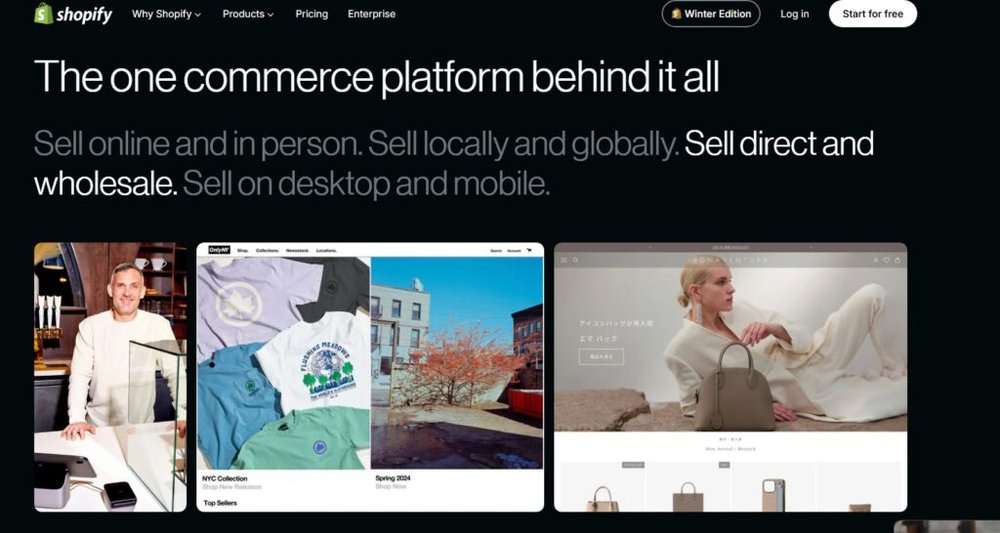
Shopify stands out as one of the best ecommerce websites because it nails simplicity and performance. It’s not just a platform—it’s a playground for both new sellers and enterprise brands.
The secret? Every design choice and UX detail leads shoppers exactly where they want to go—without friction.
Clean Design That Prioritizes User Intent
Shopify’s visual design philosophy is clarity above all. Instead of overwhelming users with options, it gives them what they need, when they need it.
When you open a Shopify store—say, browsing through Allbirds or Gymshark—you’ll notice:
- White space that lets products breathe
- Consistent color hierarchy (buttons stand out only where it matters)
- Short, scannable product descriptions
This is what UX experts call intent-led design: guiding users by predicting their next action.
For example, Shopify’s “Add to Cart” button placement is optimized for quick decision-making—typically appearing above the fold (meaning you don’t have to scroll to find it).
I recommend keeping one clear call-to-action per screen. When too many options compete, decision fatigue sets in fast. Shopify gets this balance right—it invites action without shouting.
Easy Navigation That Boosts Conversion Rates
You can have the most beautiful store in the world, but if your users get lost, they won’t buy. Shopify’s structure helps sellers create navigation logic that feels invisible yet intuitive.
Take navigation breadcrumbs (the little links like “Home > Men > Shoes > Running”). They’re built in automatically, making backtracking effortless. Search bars are smart, too—using predictive text that shortens the path from interest to purchase.
A study by Baymard Institute found that 50% of ecommerce users leave when they can’t find what they want in under 90 seconds. Shopify’s menu system, filters, and category trees directly solve that.
Here’s a quick example:
UI Path Example: Home > Collections > “New Arrivals” → Filter by “Under $50” → Product Page → Checkout
It’s simple, clear, and cuts unnecessary clicks.
Customizable Themes That Drive Brand Consistency
Shopify offers over 100 customizable themes, and each can be modified without code. This is crucial because consistent branding builds trust faster than any discount code ever will.
For instance, a store using the Dawn theme might tweak typography, color palettes, and imagery—but the grid layout keeps usability intact. This ensures no matter how “on-brand” you go, shoppers can still intuitively browse.
From what I’ve seen, many small businesses try to reinvent the wheel—custom layouts that confuse users.
I suggest starting with a standard Shopify theme, tweaking colors and fonts to fit your story, but keeping navigation and checkout default. The default templates are default for a reason: they convert.
How Shopify Balances Aesthetics and Functionality
The beauty of Shopify’s UX is invisible—the kind that just works. It’s built for conversion-first design while still allowing creative freedom.
What makes it exceptional is the fusion of commerce logic and emotional design. For example:
- Product grids are optimized for skimmability (3–4 products per row, not 6+).
- Checkout pages are distraction-free: only form fields and security reassurance badges appear.
- Load times average under 2.5 seconds—crucial since every extra second costs around 4.4% in conversion rates (Google data).
I believe Shopify mastered what most ecommerce builders miss—the sweet spot between art and utility. You don’t feel guided, yet you’re always exactly where you should be.
2. Amazon: The Benchmark for Conversion Optimization
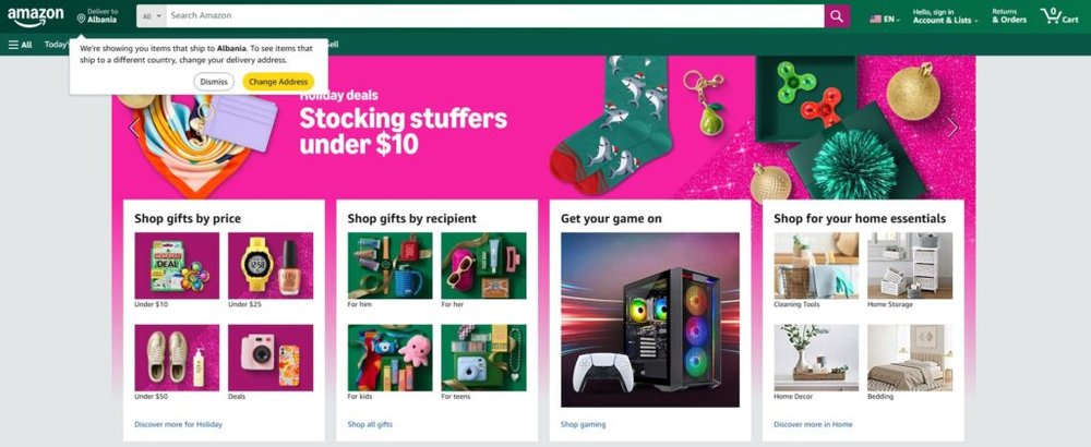
Amazon’s UX is famously “ugly but unstoppable.” While it may lack aesthetic flair, it’s a masterclass in psychology and conversion engineering. Every pixel earns its keep.
Personalization and Smart Recommendations That Sell
Amazon’s recommendation engine drives 35% of its total revenue. It’s powered by machine learning that predicts what you’ll want next based on browsing history, purchase behavior, and even dwell time (how long you pause on a product).
For example, if you’re buying a laptop, Amazon’s “Frequently Bought Together” module might suggest a sleeve, a mouse, and screen protectors—all in one glance.
These micro-upsells aren’t random—they’re data-proven pairings. I suggest you think of this as a model for your own ecommerce site: build logical product bundles that anticipate needs, not just increase cart size.
The One-Click Checkout Revolution
Amazon patented one-click checkout back in 1999, and it remains one of the most powerful conversion tools ever made. Why? It eliminates cognitive load.
Each additional step (entering address, choosing payment) introduces risk of drop-off. Amazon compresses that into one frictionless tap.
The lesson here: Speed is trust. The less time someone spends between “want” and “own,” the higher your conversion rate climbs. Even today, Shopify and WooCommerce plugins try to replicate Amazon’s model because it’s psychologically perfect: effortless, familiar, and secure.
Prime’s Role in Building User Trust and Loyalty
Prime is more than a membership—it’s a loyalty UX mechanism disguised as a benefit. By promising free shipping and fast delivery, it removes a shopper’s biggest anxiety: post-purchase uncertainty.
Studies show that 79% of Prime users check Amazon first before buying anywhere else. That’s brand gravity.
If you’re running your own store, I recommend mimicking this principle with small gestures: show shipping times upfront, add progress trackers like “Order now, ships today,” or display trust signals like “Free returns.” Those micro-assurances are UX gold.
How Amazon Uses Data to Refine UX Continuously
Amazon doesn’t design by opinion—it designs by experiment. Every color, button, and layout change goes through A/B testing.
They track everything: click-through rates, dwell times, scroll depth, even cursor speed. The UX team then iterates in real-time, which is why the interface feels static yet always evolving beneath the surface.
It’s worth remembering: good UX isn’t designed once—it’s optimized forever.
3. Apple: Emotion-Driven Design That Sells Premium Products
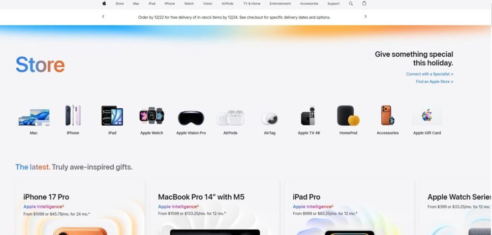
Apple’s ecommerce site is a visual symphony—each product presented like art in a minimalist gallery. It’s not about selling; it’s about making you feel something worth buying.
Minimalism That Amplifies Product Value
Every Apple page is clean to the point of near silence. That’s deliberate. By removing everything that doesn’t matter, what remains gains weight.
Notice how the “Buy” button sits alone beneath a vast product image—it’s a UX metaphor: you’re not buying an object; you’re choosing excellence.
I suggest thinking of Apple’s approach as “visual confidence.” Your store doesn’t need to shout if your layout and spacing whisper precision.
Visual Storytelling Through Product Photography
Apple’s imagery does most of the selling. Every photo feels tactile—you can almost feel the aluminum edges or screen gloss.
They use high-resolution, edge-to-edge photography with gradient lighting that mirrors luxury retail experiences.
Here’s the genius: when users scroll, animations subtly highlight features—screen refresh, battery icons, camera lenses—turning specs into sensations.
If you’re designing an ecommerce store, invest in cinematic photography. One great photo can do more than ten lines of text.
The Psychology Behind Apple’s Pricing and Layout
Apple’s product pages always start with emotion, then justify it with specs. The sequence is crucial.
For example: you see a sleek new iPhone video first (emotional hook), then pricing options and trade-in programs (rational comfort). This “emotion first, logic later” structure mirrors how human decisions actually work.
Even pricing layout plays a psychological game—Apple presents higher-end options first, framing others as value deals. It’s subtle anchoring at its best.
How Apple Creates Desire Through Simplicity
Apple’s UX genius lies in restraint. The more they remove, the more the user fills in with imagination. That’s desire creation through absence.
Even the checkout is effortless—only three fields, and Apple Pay auto-fills most of them. It’s both elegant and fast.
From what I’ve seen, many brands mistake simplicity for emptiness. Apple reminds us it’s actually about intentional reduction. Each element earns its place.
4. Nike: Blending Lifestyle and Ecommerce for Maximum Engagement
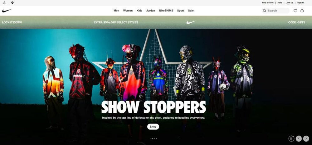
Nike isn’t just selling sneakers; it’s selling movement, aspiration, and identity. That’s why its ecommerce site feels like an experience instead of a store. Every page invites you to join a culture of performance and self-belief.
This emotional pull, layered with seamless functionality, is what makes Nike one of the best ecommerce websites in the world.
Immersive Visuals That Inspire Action
Nike’s homepage doesn’t push products—it immerses you in motion. Videos, full-screen imagery, and bold typography create the feeling of entering a live campaign.
Each product photo tells a story: runners mid-stride, athletes training, people laughing in everyday wear. It’s lifestyle-first marketing that subtly transitions into shopping.
The moment you hover over a product, it animates or zooms slightly—a cue that says, “touch this, explore this.” This kind of micro-interaction keeps users emotionally engaged.
I recommend using similar dynamic imagery even for smaller brands. For instance, instead of static images, try rotating product angles or short looping videos (less than 2 seconds) that show texture or movement. It’s subtle, but it works wonders for engagement.
Dynamic Product Pages That Encourage Exploration
Nike’s product pages feel alive. They’re structured like interactive stories: scroll, and each section reveals something new.
You might start with a large lifestyle photo, then glide down to features, size guides, and “How It’s Made” content. The layout uses progressive disclosure, meaning information unfolds as curiosity deepens.
One small but powerful touch is the “Find Your Fit” tool—an AI-driven sizing guide that uses data from thousands of buyers to recommend your size.
Here’s a quick UI path example: Home > Men > Running Shoes > Product Page > “Find Your Fit” → Add to Cart
This flow minimizes hesitation, a critical step in reducing cart abandonment.
Nike’s Use of Social Proof and User-Generated Content
Nothing builds trust like seeing real people in real gear. Nike weaves user-generated content (UGC) right into its product ecosystem.
Photos from the #JustDoIt community appear in product galleries and homepage banners. That’s social validation baked directly into the shopping experience.
Stats back this up—according to Stackla, 79% of people say UGC highly impacts their buying decisions.
I suggest encouraging customers to tag photos with your brand hashtag, then feature the best ones on your product pages or homepage. It’s free marketing and genuine social proof.
Personalized Shopping Journeys That Keep Users Hooked
Nike Membership personalizes everything—from exclusive product drops to recommendations based on browsing behavior.
The more you interact, the smarter the system gets. It learns your preferences, sizes, and interests, subtly shaping future experiences.
This personalized UX makes users feel seen and valued—something most brands overlook. For smaller stores, you can emulate this with tools like Klaviyo or Nosto to recommend products or send tailored emails based on browsing data.
I believe Nike’s genius lies in turning ecommerce into belonging. It’s not just a shop; it’s a community powered by personalization.
5. ASOS: Mastering Fashion Ecommerce Through UX Innovation
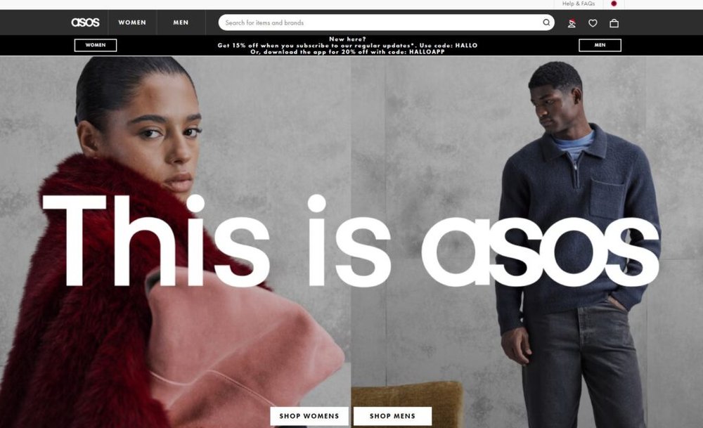
ASOS is a digital native brand that redefined what modern online fashion should feel like—fast, fluid, and fun.
It’s not only one of the best ecommerce websites in fashion; it’s also a UX lab that constantly experiments with how people shop.
Intuitive Filtering That Simplifies Choice Overload
With over 80,000 SKUs, ASOS knows users can easily drown in options. Their filtering system is a masterclass in cognitive ease.
Filters appear in sticky sidebars that stay visible as you scroll—letting users adjust without starting over. You can filter by size, color, brand, fit, material, and even occasion (like “Festival” or “Officewear”).
This small UX decision prevents decision fatigue—the silent killer of conversions.
In my experience, when building ecommerce menus, it helps to structure filters by customer intent (“looking for an outfit for…”) instead of just product attributes. ASOS does this exceptionally well.
Mobile-First Design That Drives On-the-Go Purchases
Over 85% of ASOS traffic comes from mobile, so every touchpoint is optimized for the thumb, not the mouse.
Menus are condensed into clean hamburger icons, product cards have large tappable zones, and checkout uses auto-fill fields for speed.
An example: on mobile, when you choose a size, the page doesn’t reload—it dynamically updates availability in real-time. That’s performance optimization meeting usability.
If you run your own ecommerce site, I’d advise using tools like Google’s PageSpeed Insights and BrowserStack to test mobile UX early. Don’t guess—measure.
Visual Search and AI Tools That Streamline Shopping
ASOS’s Style Match feature is a quiet revolution. You upload a photo (say, a dress you saw on Instagram), and the system finds similar items instantly.
This feature taps into visual recognition AI—an area where fashion meets tech. It removes barriers between inspiration and purchase.
AI isn’t just futuristic fluff—it solves a real problem: shoppers don’t always know how to describe what they want. I believe more ecommerce platforms should explore visual-first search, especially as camera-based browsing grows.
ASOS’s Approach to Returns and Customer Confidence
ASOS treats returns not as a hassle, but as a trust builder. Their no-questions-asked 28-day return policy is clearly displayed on every product page, right next to the “Add to Bag” button.
They also provide transparent delivery estimates and live order tracking—reducing post-purchase anxiety.
According to a Narvar study, 95% of shoppers would repurchase after a positive returns experience. ASOS nailed this psychology early.
In short: clarity and control turn buyers into loyalists.
6. Warby Parker: Making Online Shopping Feel Personal

Warby Parker’s ecommerce model humanizes technology. Its site feels friendly, approachable, and built for real people—something rare in digital retail.
This human touch is exactly why it belongs among the best ecommerce websites.
Virtual Try-On Technology That Boosts Confidence
The Virtual Try-On tool lets you see frames on your face in real time using your camera. It’s fast, accurate, and removes one of the biggest buying barriers for eyewear: uncertainty.
The UI is simple—click “Try On,” grant camera access, and your selected frame instantly appears.
This kind of AR (augmented reality) technology bridges online and offline experiences beautifully.
For other ecommerce niches—like apparel or beauty—I suggest exploring lightweight AR plug-ins that simulate try-before-you-buy experiences. They can increase conversions by up to 30%.
Storytelling That Connects With Brand Values
Warby Parker’s tone is conversational, even on product pages. Each frame has a name and backstory—like “The Durand,” inspired by vintage Parisian cafes.
This storytelling transforms a product into a personality. It’s not about specs—it’s about style identity.
I often tell clients: don’t just list what your product is. Describe what it means. Warby Parker makes shopping feel personal because every detail reinforces a sense of shared values—simplicity, transparency, and creativity.
Simplified Checkout and Transparent Pricing
The checkout is refreshingly clean. Fewer steps, clear price breakdowns, and free shipping and returns stated upfront. No hidden fees, no surprises.
There’s even a small progress bar that visually tracks checkout steps (Shipping → Payment → Review). That tiny UX addition reassures users they’re almost done—a classic way to reduce cart abandonment.
A case study by Baymard Institute showed that progress indicators can increase checkout completion by up to 20%. Warby Parker’s implementation proves that minimalism can also be persuasive.
How Warby Parker Humanizes Ecommerce
Everything about the site—from its warm tone to its handwritten-style icons—feels human. Even their customer support copy sounds like a friend helping you, not a bot.
Their Home Try-On program (five frames delivered free to your door) is genius UX in disguise—it turns risk into play.
What I love most is how Warby Parker proves that great UX isn’t about complexity. It’s about empathy. Every feature answers one question: “How can we make this easier, friendlier, and more human?”
7. Glossier: Turning Community Into a Sales Engine
Glossier isn’t just a beauty brand—it’s a movement built around community, authenticity, and emotional connection. It’s one of the best ecommerce websites because it doesn’t feel like ecommerce at all.
Shopping on Glossier feels like getting a personal recommendation from a friend.
Content-Driven Commerce That Feels Authentic
Glossier’s strength lies in its content-first approach. Instead of pushing products, it tells stories that blend seamlessly into shopping.
Their blog, Into The Gloss, started before the brand even existed. It featured honest interviews, skincare routines, and real conversations about beauty. When Glossier launched, readers were already emotionally invested.
Every product page feels like a natural extension of that storytelling. You’ll find user photos, tutorials, and quotes from customers, not just specs. This authenticity is why people trust Glossier more than traditional beauty giants.
If you’re building your own store, I recommend creating content that precedes your product. Build trust first, sell second. Glossier proves that commerce built on conversation sells stronger than commerce built on ads.
User Reviews as the Core of UX Design
Glossier puts reviews front and center—not tucked away below the fold. Shoppers immediately see average ratings, skin type filters, and user-uploaded images.
This visual transparency is powerful. It shifts the voice from brand to community. People aren’t told why to buy—they’re shown why others already did.
According to BrightLocal, 91% of shoppers trust online reviews as much as personal recommendations. Glossier uses that truth elegantly, turning feedback into conversion design.
A simple example: when users filter by “oily skin,” reviews dynamically change to match that concern. It’s not just social proof; it’s personalization in action.
Seamless Integration Between Social Media and Storefront
Glossier treats its social channels as extensions of its store. Instagram isn’t just for inspiration—it’s part of the shopping journey.
Product tags on posts lead directly to checkout pages. The design feels organic, not salesy. It’s like moving from a friend’s selfie to buying their lipstick in two taps.
Here’s a typical path:
Instagram Post > Tap Product Tag > Glossier Product Page > Checkout
I believe this type of social commerce loop is what future ecommerce will rely on—commerce embedded within culture.
How Glossier Builds Brand Advocacy Through UX
Every Glossier experience—from packaging to order emails—feels human. Pink pouches, handwritten thank-you notes, and friendly microcopy (“Hi, beautiful!”) make each touchpoint personal.
Glossier fans share their orders online not because they’re asked, but because the experience feels share-worthy. That’s organic brand advocacy built on emotional UX.
Their community forums even help shape future products—crowdsourced beauty, essentially. It’s a reminder that when customers feel heard, they don’t just buy; they belong.
8. Zara: Speed and UX in Fast Fashion
Zara is the perfect marriage of fashion and data. Its ecommerce strategy revolves around one idea: speed sells. Every design decision—both digital and physical—supports that mission.
Data-Driven Inventory That Matches User Behavior
Zara’s site isn’t guessing what you want—it knows. Every product click, view, and purchase feeds real-time data back to its warehouses.
When certain styles trend online, Zara shifts its manufacturing within weeks. That responsiveness is why their collections always feel fresh.
For example, if shoppers in Madrid are buying oversized jackets faster than expected, Zara’s system flags it instantly, triggering local restocks.
I suggest studying Zara’s model if you manage large inventories. Integrating analytics tools like Google Tag Manager or Shopify Flow can help you adapt faster to user demand.
UX That Reflects Urgency and Exclusivity
Zara’s website design reinforces scarcity. Products are displayed in minimalist grids with short availability notes like “Only 3 left.”
This subtle tension drives faster decisions without feeling manipulative. Shoppers know waiting means missing out.
Even product photography feels urgent—models shot mid-walk, with no pauses or perfection. It’s kinetic energy captured in pixels.
Small stores can recreate this energy through limited-edition releases or countdown timers. The psychology of scarcity works universally when used with honesty.
Consistent Online and In-Store Experience
Zara treats digital and physical as one ecosystem. Prices, stock availability, and promotions are synchronized across both.
Their click-and-collect system lets users buy online and pick up in-store—bridging ecommerce and retail seamlessly.
I’ve always admired Zara’s clean continuity. You could start browsing a jacket on your phone, try it in-store, and finish the purchase online later. The UX consistency removes friction from every angle.
How Zara Uses Limited Availability to Drive Conversions
Zara’s entire business thrives on fast turnover. Products rarely stay online for more than a few weeks. This short shelf life creates a feeling of urgency that pushes immediate purchases.
The genius lies in the illusion of constant renewal. Customers revisit often because new arrivals drop weekly.
I believe small and mid-sized stores can borrow this tactic—create a rolling “new in” experience rather than static inventory. It keeps traffic high and engagement fresh.
9. Sephora: Blending Online and Offline Shopping Experiences
Sephora is a masterclass in omnichannel retail—bridging digital discovery with physical touch. It’s one of the few ecommerce brands where the line between online and offline genuinely disappears.
Virtual Try-On and AR Features That Encourage Exploration
Sephora’s Virtual Artist lets shoppers test makeup using their camera. Lipsticks, eyeliners, and eyeshadows appear live on your face in seconds.
This AR (augmented reality) experience turns uncertainty into curiosity. Shoppers who play with it spend 2.5x more time on site and are 60% more likely to buy, according to Sephora’s own analytics.
For your own store, AR doesn’t need to be complex. Even simple preview tools—like color swaps or 3D product spins—can help reduce doubt and drive confidence.
Loyalty Programs That Reward Engagement
Sephora’s Beauty Insider program is more than points—it’s gamified UX.
Users earn rewards not only for purchases, but also for reviews, referrals, and event attendance. Each interaction strengthens the relationship.
Tiered memberships (Insider, VIB, Rouge) create natural progression and status incentives. You feel rewarded for loyalty, not trapped by it.
This structure keeps retention rates high. A Bain study found that Sephora’s loyalty members spend 15x more annually than non-members—a huge UX validation.
Smart Product Recommendations Based on User Data
Sephora leverages AI to suggest products based on skin tone, previous purchases, and browsing behavior.
The recommendations appear naturally throughout the site—after checkout, in email follow-ups, and on homepage banners.
I suggest paying attention to how contextual timing matters here. Sephora never interrupts the buying flow—it enhances it. That’s the difference between good personalization and creepy marketing.
Sephora’s Omnichannel Approach to UX and Sales
Whether you’re browsing online or walking into a store, Sephora’s experience feels identical. The same fonts, colors, and even scent are consistent.
They’ve unified systems like “Reserve Online, Try In-Store” to let customers book in-person appointments or pickup purchases easily.
This holistic UX makes Sephora feel like a personal beauty assistant rather than a retailer. It’s proof that the best ecommerce websites think beyond screens—they design journeys.
Key Takeaways From the Best Ecommerce Websites
The most successful ecommerce sites don’t just optimize for clicks—they optimize for connection.
From Glossier’s authenticity to Zara’s speed and Sephora’s hybrid UX, each proves that great design and empathy go hand in hand.
What All Top-Performing Ecommerce Sites Have in Common
- Clarity first: Clean, intuitive layouts that let users think less.
- Emotion built-in: Design that triggers trust, excitement, or belonging.
- Speed everywhere: Fast load times and frictionless navigation.
- Community engagement: Customers treated as collaborators, not just buyers.
- Personalization: Data used ethically to tailor, not pressure.
These shared traits aren’t technical secrets—they’re user-first philosophies.
How You Can Apply Their UX Principles to Your Own Store
Start small but deliberate:
- Audit your product pages. Remove anything that doesn’t serve a decision.
- Add social proof—reviews, photos, testimonials—near every call-to-action.
- Prioritize load time. Even a one-second delay can reduce conversions by 7%.
- Make checkout distraction-free. No banners, no menus, just confirmation.
- Create a tone that sounds human. Language matters as much as layout.
I suggest focusing on empathy before innovation. Fancy tools mean nothing if users feel unseen.
Pro Tips for Building Trust, Driving Conversions, and Retaining Customers
- Offer transparency—show prices, policies, and timelines upfront.
- Use microcopy that reassures (“Secure Checkout,” “Free Returns”).
- Test your UX regularly. What feels obvious to you might not be to others.
- Turn emails into conversations, not campaigns.
Retention is the quiet side of UX success. It’s easier to keep a happy buyer than win a new one.
The Future of Ecommerce UX: Where Design Meets Data
We’re entering an era where ecommerce design isn’t just visual—it’s predictive. AI, personalization, and AR are merging to anticipate needs before users express them.
But the future still belongs to brands that stay human. The best ecommerce websites will be those that use data not to manipulate, but to serve.
In the end, great UX isn’t about perfection—it’s about empathy disguised as design.
I’m Juxhin, the voice behind The Justifiable.
I’ve spent 6+ years building blogs, managing affiliate campaigns, and testing the messy world of online business. Here, I cut the fluff and share the strategies that actually move the needle — so you can build income that’s sustainable, not speculative.

