Table of Contents
Some links on The Justifiable are affiliate links, meaning we may earn a small commission at no extra cost to you. Read full disclaimer.
An Aweber landing page can be the difference between someone scrolling past your offer and someone joining your list or buying right away. But how do you design one that doesn’t just look good, but actually converts?
Should you focus more on headlines or visuals? Is the form length more important than the call-to-action button? And what role do things like social proof, templates, and integrations play in the final results?
In this guide, we’ll break down the exact steps to build a landing page in Aweber that drives real action today.
From choosing the right template to testing headlines, streamlining forms, and adding trust signals, you’ll see how each element can work together to boost conversions. By the end, you’ll know exactly what to do to turn visitors into subscribers or customers.
This isn’t just theory—it’s a practical playbook you can apply immediately.
Choose The Right Aweber Landing Page Template
Picking the right Aweber landing page template is where your conversion journey begins.
Templates aren’t just “designs” — they shape how visitors move through your page, what they notice first, and whether they feel compelled to take action.
Understanding Conversion-Focused Templates
When you open Aweber and head to Landing Pages > Create a Landing Page, you’ll notice dozens of ready-to-use templates. At first glance, they might all look sleek, but not every template is built to convert. Conversion-focused templates usually have:
- A clean, single-column layout that reduces distractions
- A strong headline section above the fold
- Space for a bold call-to-action (CTA) button
- Mobile responsiveness (test by shrinking your browser window; if elements stack neatly, it’s a winner)
I’ve found that the “Simple Opt-in” or “Minimalist Sales” templates work best for lead generation because they eliminate clutter. Think of it like setting a dinner table: too many plates, and no one knows where to sit.
Matching Templates to Your Campaign Goals
Not every campaign needs the same style of landing page. Your goal should dictate the design:
- Lead magnet signups: Use a streamlined template with a short form and space to showcase your freebie (like a PDF guide or webinar).
- Product sales: Choose a template with room for product images, testimonials, and pricing blocks.
- Event registrations: Go for a template that highlights date, time, and urgency front and center.
Inside Aweber, you can filter templates by category. I recommend starting with a goal-first mindset rather than picking one that “just looks nice.”
Ask yourself: What’s the single action I want a visitor to take? Your answer points directly to the right template.
Customizing Layouts for User Experience
Once you’ve chosen a base template, customization makes it yours. The drag-and-drop editor lets you add elements like video blocks, countdown timers, or extra text sections. But restraint is key here. Too many elements = confusion.
Here’s how I customize for a smoother user experience:
- Shorten forms: Reduce to name + email unless you absolutely need more.
- Visual hierarchy: Place your headline and CTA in contrasting colors so they pop.
- Spacing: Use white space around important elements so they breathe.
I like to preview my page on mobile before publishing. Nearly 60% of landing page traffic now comes from phones, and a clunky mobile view can kill conversions fast. If your button takes more than a thumb tap to find, it’s time to adjust spacing or resize fonts.
Craft Compelling Headlines That Grab Attention
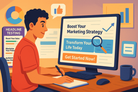
Even the most beautiful Aweber landing page will flop without a headline that stops someone in their tracks. Your headline is the first thing people see, and in many cases, it decides whether they scroll or click away.
Writing Benefit-Driven Headlines for Your Audience
A headline shouldn’t just say what your offer is — it should highlight why it matters. People want outcomes, not features. Instead of:
- “Free Email Marketing Guide”
Try:
- “Get More Subscribers With This Free Email Marketing Guide”
See the difference? The second headline speaks to a benefit. I always suggest writing at least five headline drafts before choosing one. The first is usually bland. By the fifth, you’ve pushed past the obvious.
A quick formula that works: Number + Benefit + Specificity. For example:
“3 Proven Email Templates to Book More Clients in 7 Days.”
Using Emotional Triggers Without Overpromising
Emotion fuels action, but trust keeps someone around. You can use words that spark curiosity, urgency, or aspiration, but don’t stretch the truth.
If your free checklist really helps with daily productivity, say that — don’t call it “the ultimate secret billionaires don’t want you to know.” That kind of hype damages credibility.
Some reliable emotional angles I’ve used in headlines:
- Curiosity: “Are You Making These Email Mistakes?”
- Urgency: “Register Today Before Seats Fill Up”
- Aspiration: “Grow Your List While You Sleep”
The key is balance: tap into desire, but ground it in reality.
Testing Variations of Headlines for Better CTR
Here’s where Aweber’s built-in tools give you an edge. From the dashboard, you can create two landing pages with slightly different headlines and run them in parallel. This is your A/B test.
Step-by-step:
- Duplicate your landing page in Aweber.
- Change only the headline — keep all else the same.
- Split your traffic (50/50).
- Track conversion rates under Reports > Landing Page Stats.
I like to test headlines that differ by angle, not just wording. For instance:
- Headline A: “Get More Clients With Done-for-You Templates”
- Headline B: “Struggling to Find Clients? Try These Templates”
One appeals to ambition, the other to pain points. The data often surprises you — and you can then scale up the winner.
Pro tip: Think of your template as the stage and your headline as the spotlight. The template sets the scene, but the headline makes people stop and pay attention.
Design a Clear and Persuasive Call-To-Action
Your call-to-action (CTA) is the heartbeat of your Aweber landing page. It’s where curiosity turns into commitment. A polished template and great headline set the stage, but if your CTA falls flat, conversions collapse.
Positioning CTAs Strategically on the Page
The placement of your CTA can make or break conversions. In Aweber’s drag-and-drop editor, you can add button blocks anywhere, but that doesn’t mean you should scatter them randomly.
A few proven spots I recommend:
- Above the fold: Place your primary CTA button right under your headline. People shouldn’t have to scroll to take action.
- Mid-page: After you’ve explained your offer, drop a second CTA to catch those who needed more context.
- End of page: For longer landing pages, close with one last button as a “final nudge.”
Think of CTAs as exits on a highway. If there’s only one, people might miss it. If there are too many, they get confused. Three strategic placements is the sweet spot.
Using Action-Oriented Language in Buttons
A generic “Submit” button feels cold and transactional. Instead, make your button text feel like an invitation. Aweber lets you edit button labels directly, so ditch the default and use words that reflect action and value.
Here’s what I’ve tested and seen work well:
- “Get My Free Guide” instead of “Download”
- “Start Growing My List” instead of “Sign Up”
- “Claim My Spot Now” instead of “Register”
The best CTAs echo the benefit promised in your headline. If your landing page headline says “Grow Your Business With Smarter Emails,” then your button could say “Send Me Smarter Emails.” It feels personal and consistent.
Creating Urgency Without Being Pushy
Urgency nudges people to act, but heavy-handed tactics can backfire. Aweber includes a Countdown Timer block, which is gold for time-sensitive offers like webinars or limited discounts.
Here’s how I use urgency without annoying visitors:
- Limited spots: “Only 25 seats left — save yours today.”
- Time-based: “Offer ends in 2 hours 13 minutes.”
- Seasonal: “Get early access before the holiday rush.”
Avoid fake scarcity. People can smell it. If you say “Only 5 left” but the page still says the same thing tomorrow, trust is gone. Use real deadlines and let the timer do the talking.
Optimize Visuals and Branding for Engagement
Visuals and branding don’t just make your Aweber landing page “pretty.” They guide the eye, set tone, and reassure visitors that you’re credible and professional. Done right, visuals do half the persuasion work for you.
Choosing Images That Support Your Offer
The images you pick should feel like part of your story, not just decoration. In Aweber, you can upload your own images or use the free stock photo library. But resist the temptation to grab a generic handshake photo — it screams “template.”
For example:
- If you’re offering a free guide, show a mock-up of the guide on a tablet or book cover.
- If you’re promoting a webinar, add a photo of you speaking on camera to build trust.
- If you’re selling a product, feature a high-quality lifestyle shot instead of a plain background image.
I suggest testing one strong hero image at the top rather than cluttering the page with multiple small images. The goal is clarity, not a collage.
Maintaining Consistent Brand Colors and Fonts
Consistency builds trust. Aweber’s editor lets you set global fonts and colors under Landing Page Settings > Design. If your website uses navy blue and bold sans-serif fonts, carry that into your landing page.
Here’s why it matters:
- People feel more confident signing up when the landing page matches the brand they saw in the ad or email.
- Consistent colors draw the eye to CTAs. If your main color is green, make your button a bolder shade of green, not an unrelated red.
- Fonts set tone. A playful script font says “casual and creative,” while a clean sans-serif says “professional and reliable.”
Think of branding as your visitor’s GPS. When all visuals feel connected, they know they’re in the right place.
Using White Space to Guide Visitor Focus
White space (the empty areas between elements) isn’t wasted space — it’s what makes your landing page digestible. Aweber makes it easy to adjust padding and spacing in the block settings.
Here’s how I use white space effectively:
- Add extra spacing above and below your headline so it stands out.
- Keep at least 20–30px of space around your CTA button — it should never feel crowded.
- Avoid putting text and images too close together; let each breathe.
A real-world example: I once tested two nearly identical pages. The only difference? One had crowded text blocks, the other had generous spacing. The spaced-out version converted 18% higher. That’s the power of letting content breathe.
Pro tip: Your CTA gets clicks when it feels urgent, your visuals build trust when they feel authentic, and your branding reassures visitors that they’re safe with you. When these three work together, your Aweber landing page feels seamless instead of “salesy.”
Build Trust With Social Proof and Testimonials

Even the sharpest-looking Aweber landing page won’t convert if visitors don’t trust you. People want to see proof that others have already taken the leap and benefited. That’s where social proof, numbers, and trust signals do the heavy lifting.
Adding Reviews and Endorsements to Build Credibility
Inside Aweber’s landing page editor, you can drag in a Text Block or Image Block to highlight customer reviews. Don’t overcomplicate it — a short testimonial paired with a photo feels real and relatable.
Instead of a bland quote like:
“Great service, would recommend.”
Use something like:
“I doubled my email subscribers in 30 days using this exact checklist. The setup took me less than an hour!” — Sarah, Freelance Designer
A testimonial with a specific result carries more weight than vague praise. If you don’t have reviews yet, consider offering your resource to a few beta users in exchange for honest feedback you can feature.
Highlighting Numbers, Results, and Success Metrics
Numbers make results feel tangible. Even simple metrics like “Trusted by 2,300+ subscribers” or “98% customer satisfaction rating” can tip the scales for hesitant visitors.
On one of my own landing pages, I added a stat: “More than 1,500 freelancers downloaded this guide in the past 6 months.” That single line bumped conversions by almost 10%.
If you don’t have your own metrics yet, borrow industry data to add weight. For example: “Email marketing delivers an average ROI of 42:1 — here’s how you can start seeing results.”
Using Logos and Trust Badges to Reduce Hesitation
Visual cues matter. Aweber lets you upload logos directly, so if your work has been featured in blogs, podcasts, or small media outlets, include those. Even niche logos can signal credibility.
You can also add payment trust badges (like PayPal or Stripe icons) if your landing page involves transactions. They reassure visitors that your process is safe.
The key is subtlety — don’t overwhelm the page with a wall of logos. A row of three to five recognizable names is enough to boost trust without stealing focus from your CTA.
Simplify Forms to Increase Conversions
Your form is the moment of truth. A visitor is deciding if they’ll hand over their email (and sometimes personal details). The simpler and friendlier you make this step, the higher your conversions.
Reducing Fields to Capture Only Essential Information
When you add a form in Aweber, you can customize fields under Form Settings. My rule of thumb: ask only for what you absolutely need.
- High-conversion opt-ins: Just name + email.
- More advanced funnels: Add one extra field, like company size, if it’s crucial for segmentation.
Every extra field creates friction. I once tested a form with four fields (name, email, phone, and company). It converted at 8%. The two-field version converted at 21%. That’s nearly triple the leads just by trimming.
Designing Mobile-Friendly Opt-In Forms
Mobile traffic now accounts for most landing page visits, and forms often break down here. Aweber automatically makes forms responsive, but you still need to test.
Tips I use:
- Increase button size so it’s thumb-friendly.
- Set form width to 100% instead of fixed pixels.
- Add generous spacing between fields to avoid “fat finger” mistakes.
From the editor, preview your landing page on mobile before publishing. If you have to zoom or pinch to fill it out, you’ll lose signups.
Personalizing Forms Without Hurting Conversions
Personalization makes forms feel warm instead of transactional. In Aweber, you can tweak placeholder text (the faded words inside the box). Instead of “Enter email,” try:
- “Yes, send me the guide!”
- “Type your best email to get access.”
This small detail feels conversational and can make visitors feel like the form is speaking directly to them.
But here’s the balance: don’t add so much personalization that it slows down the process. Keep the form short, simple, and welcoming.
Leverage Aweber Integrations to Maximize Results
A landing page isn’t an island — it should connect to the rest of your email marketing system. Aweber’s integrations are where your landing page goes from a static form to a smart, automated conversion engine.
Connecting Landing Pages With Automated Email Sequences
Once someone opts in, the follow-up matters more than the form itself. Inside Aweber, go to Campaigns > Create a Campaign, then attach your landing page form as the trigger.
Example:
- Someone signs up for your free PDF.
- Aweber instantly sends them a “Welcome” email with the download link.
- Over the next 7 days, they get a nurture sequence introducing you and your offers.
This automation ensures your landing page isn’t just collecting emails — it’s actively building relationships.
Using Tags and Segmentation for Personalization
Tags in Aweber let you label subscribers based on how they signed up. You can add tags directly in your form settings.
For example:
- If someone opts in for a “Freelancer Toolkit,” tag them as “freelancer.”
- If they sign up for a “Small Business Webinar,” tag them as “smallbiz.”
Later, you can send different offers to each group. Personalization boosts relevance, and relevance boosts conversions.
Tracking Performance With Built-In Analytics
You can’t improve what you don’t measure. Aweber includes basic landing page analytics under Reports > Landing Pages. Here you’ll see:
- Views (how many people saw the page)
- Submissions (how many filled out the form)
- Conversion rate (submissions ÷ views)
I like to track conversion benchmarks. If your landing page is under 10%, it needs work. Aim for at least 20–25% for lead magnets, and higher if the offer is especially compelling.
Pro tip: Don’t just track — test. Duplicate your page, tweak one element (like the CTA button color), and see which performs better. Over time, small optimizations stack into big results.
Your Aweber landing page becomes truly powerful when trust, simplicity, and integrations all work together. Trust gets people to fill out the form, simplicity keeps them from abandoning it, and integrations ensure that signup actually leads to meaningful engagement.
Test and Refine With Aweber’s Built-In Tools
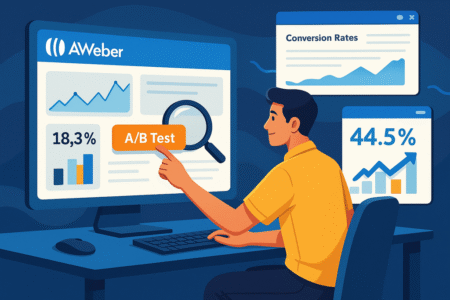
No matter how polished your Aweber landing page looks, the real magic comes from testing and refining. Guesswork rarely delivers consistent conversions — data does.
Running A/B Tests on Headlines and CTAs
Inside Aweber, you can duplicate a landing page in just a few clicks. This makes it easy to run A/B tests. The golden rule? Only test one element at a time, or you won’t know what actually caused the result.
For example:
- Duplicate your page under Landing Pages > Manage Pages.
- Keep everything the same except your headline.
- Split traffic by linking half your ads/emails to version A, and the other half to version B.
- Track conversions in Reports > Landing Page Stats.
Some headline variations I’ve tested:
- Version A: “Get More Clients With These Templates”
- Version B: “Struggling to Find Clients? Try These Templates”
That small difference — aspirational vs. pain-focused — gave me a 14% swing in conversions.
The same applies to CTA buttons. Test text, color, or placement. For instance, changing “Submit” to “Send Me My Free Guide” can double your clicks.
Measuring Conversion Rates and Drop-Off Points
Aweber’s built-in reports show you the basics: visits, signups, and conversion rate. If your page is pulling under 10%, it usually means one of three issues:
- Headline isn’t compelling enough.
- Offer isn’t clear or feels weak.
- Form asks for too much information.
I like to cross-check landing page stats with email open rates. If people are signing up but not engaging with follow-up emails, the landing page promise may not match the delivery. That’s a red flag to fix messaging.
Iterating Based on Data Instead of Assumptions
Iteration means tweaking and retesting until you consistently see better results. Too many people build once and move on. I suggest treating your Aweber landing page as a living project.
Practical example: I once ran three rounds of tests — headline, form length, then CTA color. Each change only gave me a 5–7% lift. But stacked together, the final page converted 22% higher than the original.
The takeaway: don’t chase perfection with one big swing. Small, steady refinements add up to big wins.
Add Post-Signup Elements to Boost Retention
Getting someone to sign up is only step one. What happens after the click determines whether they stick around or vanish. Post-signup elements in Aweber help you build momentum immediately.
Creating Thank-You Pages That Encourage Next Steps
After a form submission, Aweber lets you redirect to a custom Thank-You Page. Most people just write “Thanks, check your inbox.” That’s a wasted opportunity.
Instead, treat it like a bridge:
- Offer a low-ticket product.
- Share a welcome video introducing yourself.
- Point them to your most useful blog post or YouTube video.
I once added a short 90-second video on my thank-you page explaining how to get the most from the free guide. Engagement on the follow-up emails jumped because people already felt a personal connection.
Offering Lead Magnets and Exclusive Content
If your landing page promise was a lead magnet (like a PDF or toolkit), deliver it immediately on the thank-you page. Aweber lets you upload files directly or share a download link in the confirmation email.
You can also tease “next-level” content. Example: “You’ve got the checklist. Want the full video walkthrough? Grab it here.” This soft upsell feels natural because they’re already invested.
Redirecting to Communities or Webinars for Engagement
Don’t let momentum die. Aweber’s thank-you page can redirect to external links. You can send new signups straight to:
- A private Facebook group.
- A Slack/Discord community.
- An upcoming webinar registration.
This not only boosts retention but also builds deeper engagement. It’s easier to nurture leads in a group or live session than through email alone.
Pro Tips to Increase Conversions Immediately
If you want a quick conversion lift without rebuilding everything, a few advanced Aweber tricks can give you instant results.
Using Exit-Intent Popups Without Hurting UX
Aweber allows you to add sign-up forms as popups triggered by behavior. Exit-intent means the popup only appears when someone moves their cursor toward closing the tab.
Done right, it feels like a safety net:
“Wait! Don’t leave empty-handed — grab your free guide here.”
I recommend keeping exit popups clean, with one CTA and no clutter. Too aggressive, and they’ll annoy instead of convert.
Combining Countdown Timers With Exclusive Offers
Urgency drives action. Aweber’s Countdown Timer Block can be dropped directly into a landing page. Pair it with limited offers like:
- “Free bonus expires in 2 hours.”
- “Only available until Friday.”
Timers work best for webinars, launches, and seasonal promotions. They create a natural deadline without sounding like a gimmick.
Leveraging Scarcity and FOMO Tactics Correctly
Scarcity and FOMO (fear of missing out) are powerful but easy to misuse. The key is authenticity. Only use scarcity when it’s real.
Examples that work:
- Limited seats: “Only 50 registrations available.”
- Exclusive access: “This guide is only for subscribers.”
- Seasonal scarcity: “Holiday bundle closes December 24th.”
One tactic I’ve used: adding a simple line under my CTA — “Join 1,200+ people who already downloaded this guide.” That subtle FOMO boosted conversions by 9%.
Pro tip: Think of your Aweber landing page as a cycle, not a single event. You attract with the headline, persuade with the CTA, reassure with trust signals, and then lock in engagement with post-signup elements. Testing and pro tactics are just the polish that make it shine.
I’m Juxhin, the voice behind The Justifiable.
I’ve spent 6+ years building blogs, managing affiliate campaigns, and testing the messy world of online business. Here, I cut the fluff and share the strategies that actually move the needle — so you can build income that’s sustainable, not speculative.
